Search Form Component
Features
This standalone component offers an input with a dropdown and many options such as the voice recognition and a Neural Search toggle.
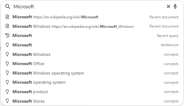 Search Form Component in Vanilla Search
Import
import { SearchFormComponent } from "@sinequa/components/search-form";

@NgModule({
  imports: [
      /*....*/
      SearchFormComponent,
      /*....*/
  ],
  /*....*/
})
This component is internationalized: If not already the case, you need to import its messages for the language(s) of your application. For example, in your app's src/locales/en.ts:
...
import {enSearchForm} from "@sinequa/components/search-form";

const messages = Utils.merge({}, ..., enSearchForm, appMessages);
API usage
The SearchFormComponent can be used with the sq-search-form selector which expects these inputs:
Required parameters:
query: The search query.
Optional parameters:
searchRoute(default:search): The route provided to theSearchServiceto navigate to after a search.autoApply(default:true): Whether a filter change is to be applied automatically.autoSubmit(default:true): Whether hitting enter performs a submit.showFilterCount(default:false): Whether the filters count should be displayed.enableVoiceRecognition(default:true): Whether the voice recognition button should be displayed (the service will also require to be available). When clicking on the linked button, it triggers the voice recognition.enableNeuralSearch(default:true): Whether the Neural Search button should be displayed (Neural Search should also be enabled in the query). When clicking on the linked button, it toggles Neural Search on or off for the performed search.neuralSearchPref(default:neural-search): The name of the Neural Search preference to fetch and update inUserPreferences.
The component also emits two events:
search: When a search has been performed. It contains a boolean on whether the text has changed compared to the input query.expanded: When the dropdown is being expanded or collapsed. It returns in a boolean value whether it is expanded or not.
Additionally, the component also requires you to provide a template for the dropdown as displayed on the example just below, or in the Autocomplete tutorial.
Examples
A more complex example could be what Pepper does which includes an sq-filters-view to allow adding filters to the query, then an sq-facet-container to display the filters when we select a category, and finally the app-autocomplete (taken from Vanilla Search) to display the suggestions.
<sq-search-form #searchForm
  [query]="searchService.query"
  [showFilterCount]="true"
  [autoSubmit]="false">

  <ng-template let-query>

    <div class="search-dropdown border-top m-2">

      <div class="small fw-bold mb-1" *ngIf="query?.filters">
        {{'msg#searchForm.currentFilters' | sqMessage}}
      </div>

      <sq-filters-view
        [query]="query"
        (filterEdit)="onFiltersChange()">
      </sq-filters-view>

      <hr *ngIf="query?.filters && facets?.length"/>

      <sq-facet-container *ngIf="facets?.length"
        [results]="searchService.results"
        [query]="query"
        [facetConfigs]="facets"
        [facetComponents]="facetComponents">
      </sq-facet-container>

      <hr *ngIf="query.text" />

      <app-autocomplete
        [inputElement]="searchForm.searchInput.nativeElement"
        [queryText]="query.text || ''"
        [suggestTypes]="autocompleteSources"
        (search)="onAutocompleteSearch($event, query)"
        (select)="onAutocompleteSelect($event, query)">
      </app-autocomplete>

    </div>

  </ng-template>

</sq-search-form>
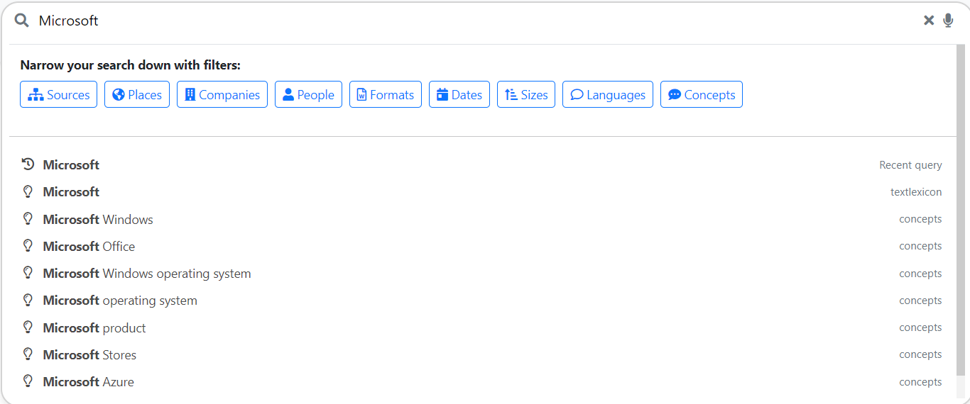 Pepper's Search Form
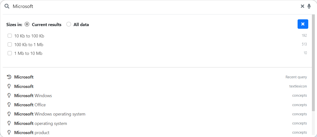 Upon selecting a filter category