Facet Module
Facets refer to the filters used to narrow down the list of results in a search interface (See Faceted Search). In the SBA framework, the definition can extend more generally to other types of components that augment the search experience.
The standard facets (list, tree...) need data from the server. This data comes in the form of aggregations in the results (Results) returned by the QueryWebService. These aggregations are configured on the server in the Query web service.
The Facet module is also documented in the tutorial.
Features
This modules provides:
FacetService: A service to manage data for the facet components and modify the search criteria (via theSearchService).sq-facet-cardandAbstractFacet: A flexible API for creating custom facets.- A list of diverse facet components using the above facet API. These components are generally styled with the Bootstrap library, and their class names start with
Bs.
Import
Import this module in your app.module.ts. Optionally include lists of of dynamic facet configuration via the forRoot() method.
import { BsFacetModule } from '@sinequa/components/facet';

@NgModule({
  imports: [
    ...
    BsFacetModule
This module is internationalized: If not already the case, you need to import its messages for the language(s) of your application. For example, in your app's src/locales/en.ts:
...
import {enFacet} from "@sinequa/components/facet";

const messages = Utils.merge({}, ..., enFacet, appMessages);
Facet Card API
Standard usage
The facet card API is based on a generic container component, sq-facet-card, and an abstract facet component for the content of the facets (AbstractFacet):
- The container displays the frame, icon, title, action buttons around the facet.
- The content can be any Angular template displayed within the facet. If the content extends
AbstractFacet, the container will automatically detect its dynamic list of actions (and other features) and display them.
For example:
Notice the list of actions returned by override get actions() in HelloWorldComponent (a method of AbstractFacet):
The API is very flexible and allows for very different types of facets:
Multiple views
It is possible to inject multiple views inside the same facet card. Views need to be wrapped inside an ng-template augmented with the sqFacetView directive.
For example, one might want to display an aggregation viewed as a facet list OR as a chart.
Adding/removing views is as easy as modifying the list of ng-templates injected into the facet card. The [sqFacetView] input is an Action object that is used to display the buttons to toggle between views.
Template customization
It is possible to inject ng-templates to customize specific parts of the facet card:
- The header template (
#headerTpl) - The "sub-header" template (
#subHeaderTpl) - The footer template (
#footerTpl) - The settings template (
#settingsTpl)
Here is an example (notice the settings button in the top right, which displays the settings template):
Note that these templates can be injected in 2 different ways:
- Either injected by the parent, as in the example above
- Or defined in the child component's template (in the example above, it would be the
sq-facet-listcomponent). The child component (which extendsAbstractFacet) can thus customize its display, when embedded in a facet card, without requiring the parent to do anything.
Custom actions display
By default all actions are displayed in the facet card's top-right corner. These actions may come from different places:
- the
[actions]input of the facet card - the
get actions()method of the child component (AbstractFacet) - the different views injected in the facet
- specific options of the facet card, like
[collapsible]="true"
For complex components, the number of buttons can grow quickly and become overwhelming or confusing. For this reason it is possible to split these actions into 3 separate groups, each with their own set of options:
- Primary actions (displayed in the top-right corner)
- Secondary actions (displayed under the primary actions)
- View actions to toggle between views (displayed in the bottom-left corner)
Secondary actions can be defined in two ways:
- The
[secondaryActions]input of the facet card. - Taken from the child component (
AbstractFacet), via the[facetActionsAreSecondary]="true"option of the facet card.
View actions are displayed separately with the [viewActionsAreSecondary]="true" option of the facet card.
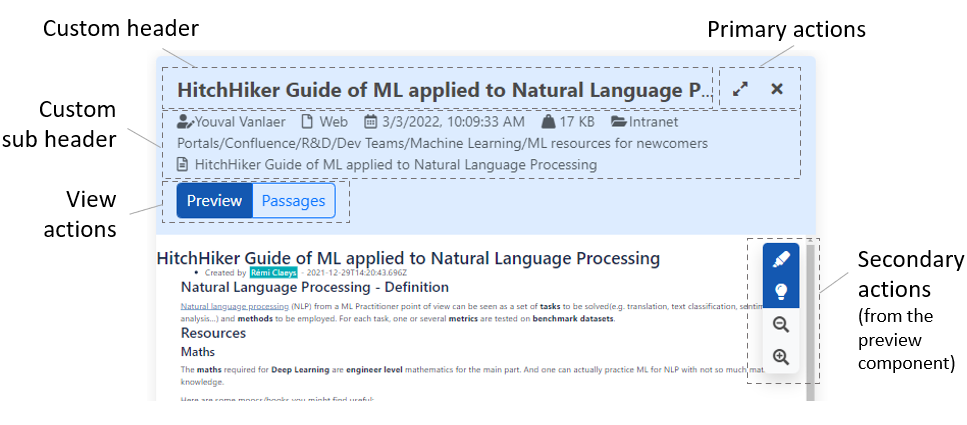
A complete example is the display of the preview:
<!-- With selected document -->
<sq-facet-card class="mb-3 facet-preview"
    [actions]="previewCustomActions"
    actionsSize=""

    [facetActionsAreSecondary]="true"
    secondaryActionsClass="position-absolute end-0 btn-group-vertical mt-4 me-3 bg-light rounded shadow on-hover"

    [viewActionsAreSecondary]="true"
    viewActionsClass="d-block btn-group mt-2"
    viewButtonsStyle="outline-primary">

    <ng-template #headerTpl>
        <sq-result-title class="flex-grow-1" [record]="openedDoc" field="title" titleLinkBehavior="open-if-url">
        </sq-result-title>
    </ng-template>

    <ng-template #subHeaderTpl>
        <sq-metadata [record]="openedDoc" [config]="metadata" class="small"></sq-metadata>
    </ng-template>

    <ng-template [sqFacetView]="{text: 'msg#facet.preview.viewPreview'}">
        <sq-facet-preview-2 #facet [record]="openedDoc" [query]="searchService.query" [height]="750"
            (previewLoaded)="previewReady($event)">
        </sq-facet-preview-2>
    </ng-template>

    <ng-template [sqFacetView]="{text: 'msg#facet.preview.viewPassages'}" [default]="!!passageId"
        *ngIf="openedDoc.$hasPassages" #passagesList>
        <sq-passage-list [record]="openedDoc" [passageId]="passageId"></sq-passage-list>
    </ng-template>
</sq-facet-card>
This results in the following view (notice the custom positioning of the secondary actions made possible by the [secondaryActionsClass] input):
Facet containers
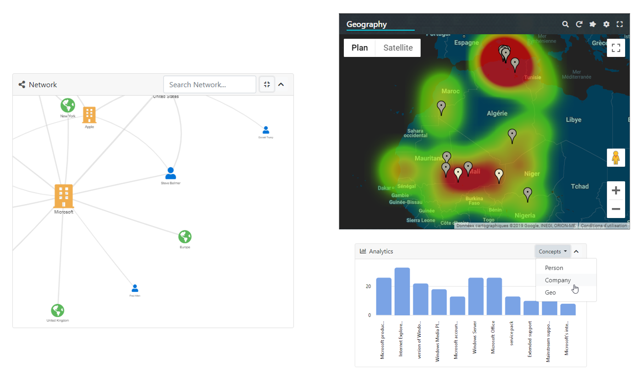
It is possible to display facets in other types of containers besides the simple facet card:
- The facet bar component displays a list of facets in a column.
- The "multi-facet" component displays one facet at a time, and menu to switch between them.
- The "facet filters" component displays facets as a horizontal bar with dropdown menus.
These containers share a similar API. In particular, they require:
- A list of facet configuration objects (
FacetConfig<T>). - The Angular components instantiated within these containers, for each facet type.
Each facet requires a set of inputs. These inputs are included within the FacetConfig interface. For example, for a list facet the facet configuration looks like this:
const config: FacetConfig<FacetListParams> = {
    name: "myfacet",
    title: "My facet",
    type: "list",
    parameters: {
        aggregation: "MyAggregation",
        showCount: true,
        searchable: true
    }
}
The FacetConfig interface has a part that is common to all facets:
typedefines the type of component to be displayedtitleandicondefine what is displayed in the facet headerincludedTabsandexcludedTabsallow to list the tabs (from theresultsobject) in which this facet should be displayed.
The parameters property is specific to the component type. In the example above, its type is FacetListParams, which corresponds to the configuration of a "list" facet component.
The Angular components displayed by the containers is provided as a MapOf<Type<any>>. By default, the containers support the standard components from the @sinequa/components/facet module:
export const DEFAULT_FACET_COMPONENTS: MapOf<Type<any>> = {
  "list": BsFacetList,
  "range": BsFacetRange,
  "refine": BsRefine,
  "tag-cloud": BsFacetTagCloud
}
But this list can be extended, to include components from other modules:
import { BsFacetDate } from '@sinequa/analytics/timeline';

public facetComponents = {
    ...DEFAULT_FACET_COMPONENTS,
    "date": BsFacetDate
};
And in the template:
<sq-facet-bar [results]="results" [facetComponents]="facetComponents">
</sq-facet-bar>
Facet Bar
The sq-facet-bar component is a container which can display a dynamic list of facets.
The Facet Service manages the list of facets displayed in the facet bar. The service allows adding, moving and removing facets dynamically. The facets' configuration and list of facets displayed by default must be injected in the Facet Service by calling BsFacetModule.forRoot() in your app.module.ts:
// List of facet configurations (of type list and tree)
export const allFacets: FacetConfig<FacetListParams | FacetTreeParams>[] = [
  {
    name: "facet1",
    type: "list",
    parameters: {
      aggregation: "Aggregation1"
    }
  },
  {
    name: "facet2",
    type: "tree",
    parameters: {
      aggregation: "Aggregation2"
    }
  }
];

// List of default facets displayed (only facet2 is displayed here)
export const defaultFacets: FacetState[] = [
  {name: "facet2", position: 0}
];


@NgModule({
  imports: [
    ...,
    BsFacetModule.forRoot(allFacets, defaultFacets)
  ]
})
This component requires at least a Results input and optionally a list of custom components (facetComponents).
<sq-facet-bar [results]="results" [facetComponents]="facetComponents">
</sq-facet-bar>
It is also possible to insert static content which will be displayed at the top of the facet bar.
<sq-facet-bar [results]="results" [facetComponents]="facetComponents">

    <!-- Static facet -->
    <sq-facet-card [title]="'Sources'" [icon]="'fas fa-sitemap'">
        <sq-facet-tree #facet [results]="results" [aggregation]="'Treepath'"></sq-facet-tree>
    </sq-facet-card>

</sq-facet-bar>
Multiple-type Facet
The "multiple-type" facet sq-facet-multi displays multiple types of metadata in the same facet. The user selects the type of metadata, which then changes the view of the facet into one of the classical views above.
This component requires at least a Results input, the list of the facets configuration (equivalent to the allFacets list of the facet bar above), and optionally a list of custom components (facetComponents). The title and icon of the facet card need to be set dynamically, as a function of the currently selected metadata.
Facet Container
The sq-facet-container component displays a list of buttons that users can click to open a facet.
This component is used in the integrated search form of the Pepper application.
Note that the style of the buttons can be customized via the buttonClass input (default: primary).
This component lets the user choose between the "current results" and "all data":
- The "current results" mode corresponds to the normal behavior of facets.
- The "all data" mode corresponds to the aggregations computed with no filters over all indexes. This data is computed by the
FirstPageServicewith a separate (potentially slow) query sent to the server. This mode is useful to display the facets on a home page, when no search has been performed yet.
Facet Filters
The sq-facet-filters components displays facets as a navigation bar where each item is a facet displayed as a dropdown component.
This component requires a:
Resultsinput.FacetConfig<T>[]: A list of facets' configuration. This list can be passed directly via the[facets]input (as for the Multiple type facet). Or it can be injected with theBsFacetModule.forRoot()method (as for the Facet bar). This 2nd option is interesting whenenableCustomizationis set totrue.facetComponents: Optionally, a map of "facet types" ("list","range","date", etc.) to facet components (BsFacetList,BsFacetRange,BsFacetDate, etc.).enableCustomization: Optionally, turns on user customization of the list of facets displayed in the component.
Facet Service
The FacetService provides the following functionality:
- Provide access to the facet data, via the following methods:
facetService.getAggregation(aggregation name, results): Returns theListAggregationorTreeAggregationfrom the results (and takes care of initializing the aggregation items).facetService.open(aggregation, item, query): Opens a collapsed node item in a tree aggregation (queries the server for the data inside that node).facetService.loadData(aggregation name, query): Loads more data from the server to append at the end of a list aggregation.
- Add and remove search filters (When a user clicks on an aggregation item in a facet):
facetService.addFilterSearch(aggregation, selected items, options, query, facet name): Add a filter to the query for a given facet and aggregation, and refresh the search.facetService.removeFilterSearch(aggregation, selected item, query, facet name): Remove a filter from the query for a given facet and aggregation, and refresh the search.facetService.clearFiltersSearch(fields, all?, query, facet name): Clears filters from a facet, and refresh the search.facetService.hasFiltered(field, query): Returns whether the query has an active filter for a field.
- Manage the presence/absence of facets in dynamic containers like the facet bar component (the states of dynamic facet is stored in the User Settings):
facetService.isFacetOpened(facet name): Test whether a facet is visible in a container.facetService.addFacet(facet state): Add a facet to a container.facetService.removeFacet(facet state): Remove a facet from a container.
Components
List Facet
The sq-facet-list component displays a regular list of metadata (aggregation). The user can click on items in the list to filter the results.
This component requires at least a Results input and the name of the aggregation to work properly.
The full list of inputs is:
results: The current search results.aggregation: The name of the regular list of metadata.name: The name of the search filter associated to this facet. If ommited, the aggregation name is used.showCount: (true by default) Show/hide the number of occurrences.searchable: (true by default) Whether the component allows to search for items in it.focusSearch: (false by default) Whether the search input should be focused automatically.allowExclude: (true by default) Allow to exclude selected items.allowOr: (true by default) Allow to search various items in OR combination.allowAnd: (true by default) Allow to search various items in AND combination.displayEmptyDistributionIntervals: (false by default) If the aggregration is a distribution, then this property defines whether empty distribution intervals should be displayed.acceptNonAggregationItemFilter: (true by default) When false, filtered items which don't match an existing aggregation item, should not be added to the filtered list.replaceCurrent: (false by default) If true, the current search filter associated to this facet will be cleared and replaced by the new value.expandedLevel: (2 by default) The number of levels the list should be expanded to.
This component can be used in two ways :
- Basic angular component and input bindings (as the example above)
- By transclusion within a parent component. This approach requires a config object implementing the
FacetListConfiginterface.
Range Facet
The sq-facet-range component displays a slider to select a range of values for a numerical (eg. document size) or temporal (eg. modified date) metadata.
The full list of inputs is:
results: The current search results.aggregation: The name of the regular list of metadata.name: The name of the search filter associated to this facet. If ommited, the aggregation name is used.min: Minimum authorized value of the range.max: Maximum authorized value of the range.stepDefs: Allow to exclude selected items.
This component can be used in two ways :
- Basic angular component and input bindings (as the example above)
- By transclusion within a parent component. This approach requires a config object implementing the
FacetRangeConfiginterface.
My Search Facet
The "My Search" facet displays the current list of search criteria.
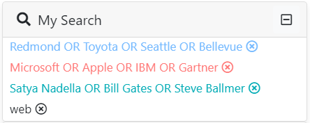
The inputs of the component are:
results: The results of the current search.allowDeletion: (true by default) Display icon to delete items.displayFieldNames: (false by default) Display each item's field.collapsible: (false by default) Make the div collapsible. It makes sens if used as breadcrumb.useBadges: (false by default) Add a badge likely style to items.ignoreText: (true by default) Ignore the search text and fielded search from being displayed.excludedFacets: (["search-form"] by default) Search filters originated from those facets will be excluded.
This component can be used in different ways :
- Basic angular component and input bindings
<sq-facet-card title="My Search" icon="fas fa-info">
    <sq-facet-mysearch #facet [results]="results"></sq-facet-mysearch>
</sq-facet-card>
Or use the following :
<div class="d-flex flex-row align-items-center flex-wrap">
    <sq-facet-mysearch [results]="results" class="flex-grow-1 flex-basis-0"></sq-facet-mysearch>
</div>
- By transclusion within a parent component. This approach requires a config object implementing the
FacetMySearchConfiginterface.
Refine Facet
The sq-refine component displays a secondary search form, including an autocomplete, to add a fulltext search criteria to a query, without removing the active filters.
This component requires at least a Results input. If the autocomplete is enabled, all the parameters of the autocomplete directive should be provided to this component.
The full list of inputs is:
results: The current search results.autocompleteEnabled: Whether or not to enable autocompletion.suggestQuery: Suggest query with which to perform autocompletion.suggestDelay: (200 by default) Minimum delay (in ms) between suggest queries.
This component can be used in two ways :
- Basic angular component and input bindings (as the example above)
- By transclusion within a parent component. This approach requires a config object implementing the
FacetRefineConfiginterface.
Tag Cloud Facet
The sq-facet-tag-cloud displays multiple types of metadata in the same facet. It provides a direct access to the most relevant filters, belonging to the supplied metadata.
The inputs of the component are:
results: The results of the current search.aggregations: List of aggregations to be considered in collecting data.limit: (50 by default) Maximum number of data to be displayed.uniformRepartition: (false by default) Define the way data are collected from given aggregations: equal repartition between them or most relevant among all of them.showCount: (false by default) show/hide number of occurrences of each item.proportionalWeight: (true by default) Define the size of each displayed item: common size for all or proportional size based on item's count.countThreshold: (0 by default) Lowest count under which items will not be taken into account.shuffleData: (false by default) Wether data are rendered sorted according to their count or randomly.
This component can be used in two ways :
- Basic angular component and input bindings (as the example above)
- By transclusion within a parent component. This approach requires a config object implementing the
FacetTagCloudConfiginterface.