Labels Module
Features
This module provides functionality to display the labels of a document, as well as components to manage them:
LabelsService: manages the different operations that can be applied to the labels of a document in Sinequa.- A list of components to display and manage the labels. These components are styled with the Bootstrap library, and their class names start with
Bs.
Import
import { BsLabelsModule } from '@sinequa/components/labels';

@NgModule({
  imports: [
      /*....*/
      BsLabelsModule,
      /*....*/
  ],
  /*....*/
})
This module is internationalized: If not already the case, you need to import its messages for the language(s) of your application. For example, in your app's src/locales/en.ts:
...
import {enLabels} from "@sinequa/components/labels";

const messages = Utils.merge({}, ..., enLabels, appMessages);
Labels Service
The LabelsService provides a variety of methods.
So far, if your component wants to know the index columns, use the following :
-
publicLabelsField(): string | undefinedThis method returns the index column for the public labels.
-
privateLabelsField(): string | undefinedThis method returns the index column for the private labels.
Public labels can have specific access rules. If your components need to respect users rights and the label's configuration on the server side, use the following :
-
allowPublicLabelsManagement(): booleanThis method indicates if the configuration of the Sinequa server is globally allowing to manage (create/rename/delete) public labels.
-
allowPublicLabelsEdition(): booleanThis method indicates if the configuration of the Sinequa server is globally allowing to edit (add/remove/bulkAdd/bulkRemove) public labels.
-
userLabelsRights(): LabelsRightsThis method retrieves the logged in user's rights to manage and edit public labels.
Actually, the Labels Module defines three levels of actions that could be applied to labels :
Navigation bar menu actions
As for global actions, the menu, in the navigation bar, uses the ModalService to open a popup dialog and perform following actions :
-
renameLabelModal(): Promise<ModalResult>This method renames the label(s) in the index. Be careful, this action is irreversible.
-
deleteLabelModal(): Promise<ModalResult>This method deletes the selected label(s) from the index. Be careful, this action is also irreversible.
-
bulkRemoveLabelModal(): Promise<ModalResult>This method unassign the given label(s) from all results reported by the engine (not only from the first page).
-
bulkAddLabelModal(): Promise<ModalResult>This method assign the given label(s) to all results reported by the engine (not only to the first page).
Note that the methods _modalProperties(action: number): ModalProperties and _getModalRadioButtonsConf(publicRight: boolean): any are used to full-fill the properties of each modal.
Selection menu actions
If you are targeting a specific selected documents, the selection menu actions is the right place to edit their labels.
-
buildSelectionAction(): Action | undefinedthe syntactic sugar to append the labels edit action to the selection menu.
Therefor, two use cases can be distinguished :
-
For a single document selection, a popup dialog with one autocomplete input is used to update the labels of this document. Thus, it can be an assign, unassign or even both actions at the same time.
-
For a multi-selection, the popup dialog is getting divided into two blocs to separately, defining which labels to be assigned to all the selected documents and which ones to be unassigned from them.
Both cases are using the same method:
-
editLabelModal(): Promise<ModalResult>This method edits the labels of the current selected documents.
Displayed labels actions
Each Document's labels are displayed just below its extracts.
Selecting a label will filter the current results page while keeping documents whose labels are given in the list. Here you will be using selectLabels(labels: string[], _public: boolean): Promise<boolean>.
The LabelsService also provides the LABELS_COMPONENTS injection token which can be used to override the UI components
used in this module.
To do that you need to declare your component with the Angular providers in app.module.ts
/* ... */
import { NgModule } from "@angular/core";
import { LABELS_COMPONENTS } from "@sinequa/components/labels.service";
/* ... */

@NgModule({
  /* ... */
  providers: [
    /* ... */
    { provide: LABELS_COMPONENTS, useValue: MyCustomLabelsComponents },
    /* ... */
  ]
  /* ... */
})
/* ... */
This MyCustomLabelsComponents object needs to be
{
    renameModal: Type<any>;
    labelsAutocompleteComponent: Type<any>;
    deleteModal: Type<any>;
    addModal: Type<any>;
    editModal: Type<any>;
}
If your component wants to manipulate the labels of the a document itself, without using the LabelPipe (ie sqLabel),
The LabelsService provides here some methods that you may need:
LabelsService.privateLabelsPrefix: returns the prefix that are to be pre-appended to private label value.addPrivatePrefix(labels: string|string[]): string|string[]: prepends the private label prefix to the given label list.removePrivatePrefix(labels: string|string[]): string|string[]: removes the private label prefix from the given label list.split(labels: string): string[]: transform a semicolon-delimited label list string into a list of labels.sort(labels: string[], _public: boolean): string[]: sorts the labels list in ascending order with respect to the current locale.
Components
The LabelsModule comes with a set of components :
-
The
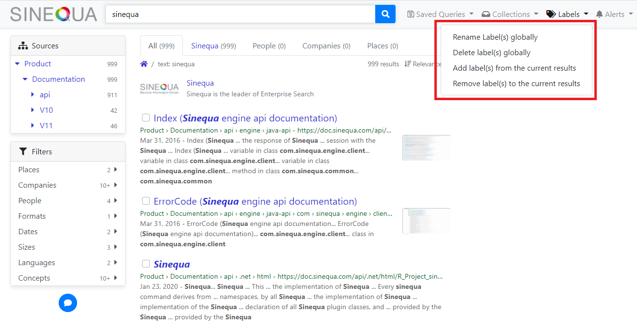
LabelsMenucomponent is used to display dropdown menu that manages public and private labels.You can see this menu in the navigation bar.
Labels menu in navigation bar
The inputs of the component are:
results: The current search results.icon: The menu icon.autoAdjust: Whether the component will adjust its display when the application is resized.autoAdjustBreakpoint: The threshold of the application size at which the display of the component changes.collapseBreakpoint: The threshold of the application size at which the display of the component changes when it is inside a parent menu.size: The display size of the component.
-
The
Labelscomponent is used to display and to manage the assigned labels of a document.Note the background color used to distinguish public and private labels.
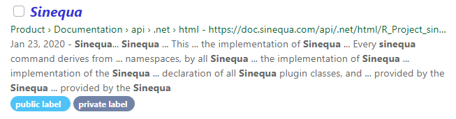
Display labels of a document
The inputs of the component are:
record: The record whose labels are to be displayed.enableDelete: Display the delete icon in the label tag.public: Whether the labels are public.
-
The
ResultLabelscomponent is used to display the assigned labels of a document. This component is backed byLabelscomponent.The inputs of the component are:
record: The record whose labels are to be displayed.caption: The caption for the labels.public: Whether the labels are public.
-
The Modals components have basically a very common behavior for the different actions on the labels.
The standard template can be seen as a(n):
- Alert texts: Explicitly explain the action to be performed on labels.
- Radio button: The type of label you want to manage. Note that it depends on the configuration of sinequa instance.
- Autocomplete input: List of labels you want to manage.
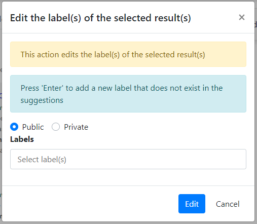
Each modal component uses the
MODAL_MODELinjection token. The object needs to be{
public: boolean;
allowEditPublicLabels: boolean;
allowManagePublicLabels: boolean;
allowNewLabels: boolean;
disableAutocomplete: boolean;
action: number;
radioButtons: ModalButton[];
}where:
public: Whether the labels are public.allowEditPublicLabels: The user right to Add, Remove, BulkAdd, BulkRemove operations.allowManagePublicLabels: The user right to Create, Rename, Delete operations.allowNewLabels: Whether considering the selection of a not existing label among the suggestions.disableAutocomplete: Turns off the autocomplete input.action: The action to be performed as result of the current popup dialog.radioButtons: Properties of the modal buttons .
-
The
BsLabelsAutocompletecomponent is the main building block of theModals components. Actually, it is an input element, hosting thesqAutocompleteLabelsdirective.Example:
<input type="text"
    class="input-autocomplete flex-grow-1"
    name="labelName"
    spellcheck="false"
    autocomplete="off"
    sqAutocompleteLabels
    [public]="public"
    [placeholder]="'msg#labels.selectLabel' | sqMessage"
    [dropdown]="dropdown"
    [allowNewLabels]="allowNewLabels"
    [allowManagePublicLabels]="allowManagePublicLabels"
    (keydown)="keydown($event)"
    (keypress)="keypress($event)"
    (itemsUpdate)="onLabelsItemsChanged($event)"
    [disabled]="disableAutocomplete"
    [off]="disableAutocomplete"
    [class.disabled]="disableAutocomplete"
    [labelsItems]="labelsItems">
The inputs of the component are:
public: Whether the labels are public.disableAutocomplete: Turns off the autocomplete input.allowNewLabels: Whether considering the selection of a not existing label among the suggestions.allowManagePublicLabels: Here it means the user right to allow adding new labels.labelsItems: Initial labels to be displayed in the container.
The component also emits a
labelsUpdateevent used to synchronize the list of selected labels and their type in the parent component.The component takes as input
public(Whether the labels are public) and emitsitemRemovedevent each time a label is getting removed from the list.
Labels Autocomplete directive
The LabelsAutocomplete provides the sqAutocompleteLabels directive. It extends and overrides the main sqAutocomplete directive.
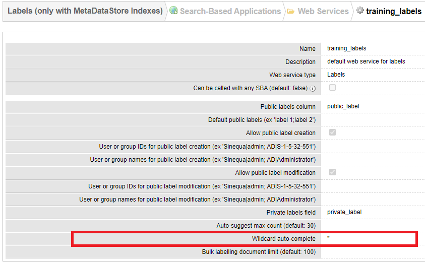
Thus, the suggestions are fetched and displayed also in case of empty input. This feature requires the labelsAutoSuggestWildcard to be configured in the sinequa server.
In addition to that, the selection of items is being possible on blur event. As a result, on blur, the value of the input is checked against the existing suggestions and then added to the list if it matches.
The inputs of the directive are:
public: Whether the labels are public.labelsItemsContainer: Container displaying the selected labels and obviously implementingLabelsItemsContainerinterface.allowNewLabels: Whether considering the selection of a not existing label among the suggestions.allowManagePublicLabels: Here it means the user right to allow adding new labels.initLabels: Initial labels to be displayed in the container.
The directive also emits an itemsUpdate event which is needed to synchronize the list of selected labels in the parent component.
Labels Pipe
Private labels are encoded before being stored in index columns.
The LabelPipe (sqLabel) is introduced to help you with displaying
the labels assigned to a document without worrying about the decoding procedure and eventually, formatting the value.
Example:
<span>Private label: </span><span style="color: red;">{{privateLabel | sqLabel:false}}</span>
<span>Public label: </span><span style="color: red;">{{publicLabel | sqLabel:true}}</span>
With a document whose private label is 'My private label' and 'My public label', the example yields
<span>Private label: </span><span style="color: red;">My private label</span>
<span>Public label: </span><span style="color: red;">My public label</span>