Metadata Module
Features
This module introduces the UI component that displays the metadata of a document in the search result page.
 Document metadata
Import
import { MetadataModule } from '@sinequa/components/metadata';

@NgModule({
  imports: [
      /*....*/
      MetadataModule,
      /*....*/
  ],
  /*....*/
})
This module is internationalized: If not already the case, you need to import its messages for the language(s) of your application. For example, in your app's src/locales/en.ts:
...
import {enMetadata} from "@sinequa/components/metadata";

const messages = Utils.merge({}, ..., enMetadata, appMessages);
API usage
This module exports 2 main components: MetadataItemComponent which displays one metadata entry, and MetadataComponent which displays a list of metadata entries with a layout.
An entry of metadata is simply a value of an index column of the considered document. Documents have many different types of metadata (mono-valued, multiple-valued, entities, tree-structured, text, numbers, dates, booleans...)
For example, some of the metadata displayed by vanilla-search are:
| Metadata title | Index column | Fontawesome Icon |
|---|---|---|
| Sources | treepath | fas fa-folder-open |
| Filename | filename | far fa-file-alt |
| Date | modified | far fa-calendar-alt |
| Authors | authors | fas fa-user-edit |
The sq-metadata-item selector
This component displays one metadata entry and it expects these inputs:
Required parameters:
record: The document whose metadata is being displayed.field: The column name to retrieve the value from.
Optional parameters:
query(default:SearchService.query): The query to apply any filter action to.label: A label to insert before the value (which will look like "label: value").icon: The Fontawesome class of the icon to insert before the label and value.fieldClass: Any additional CSS classes you want to apply to the field value.filterable(default:false): Whether you can add a filter on this metadata for the query. This will add a "Filter" button in a tooltip.excludable(default:false): Whether you can add an exclusion filter on this metadata for the query. This will add an "Exclude" button in a tooltip.showEntityExtract(default:false): Whether the entity extract should be displayed in a tooltip. Note that there are some prerequisites on the server like checking "return entity locations" in the Query web service.actions: Any additional actions for the metadata entry to display in a tooltip.collapseRows(default:true): Whether the rows are collapsible, to save space.entityExtractMaxLines(default:4): The maximum number of lines to display for the entity extract in the tooltip.actionsButtonsStyle(default:btn btn-secondary): The style to apply to the action buttons.actionsButtonsSize(default:sm): The size to apply to the action buttons.
The sq-metadata selector
This component displays a list of sq-metadata-item and facilitates the layout which can either be linear or with one entry per line. It also allows to construct sentences to include metadata entries to.
Required parameters:
record: The document whose metadata is being displayed,config((MetadataConfig | string)[]): The metadata entries of the document to be displayed, this is a list containing someMetadataConfigobjects which contain the parameters to apply for each metadata entry following whatsq-metadata-itemas inputs. There can also be strings in this array which allows you to make sentences with metadata entries in the middle of them (example below).
Optional parameters:
query(default:SearchService.query): The query to apply any filter action to.layout(default:inline): The type of layout for the metadata entries list. This can only be "inline" (all next to each other) or "table" (one per line).actionsButtonsStyle(default:btn btn-secondary): The style to apply to the action buttons.actionsButtonsSize(default:sm): The size to apply to the action buttons.
The component also emits an event when an element of the metadata is selected / clicked on.
Examples
Metadata
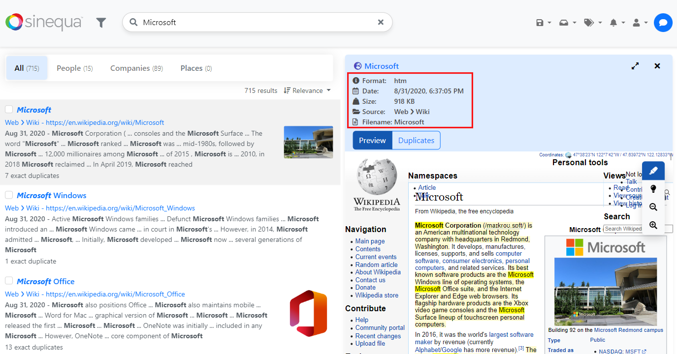
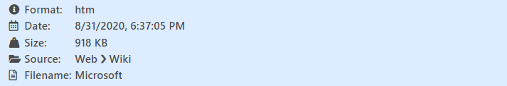
The following metadata is displayed with all the default options:
this.metadata: MetadataConfig[] = [
    {
        field: "docformat",
        label: "Format",
        icon: "fas fa-info-circle"
    },
    {
        field: "modified",
        label: "Date",
        icon: "far fa-calendar-alt"
    },
    {
        field: "size",
        label: "Size",
        icon: "fas fa-weight-hanging"
    },
    {
        field: "treepath",
        label: "Source",
        icon: "fas fa-folder-open"
    },
    {
        field: "filename",
        label: "Filename",
        icon: "far fa-file-alt"
    }
];
<sq-metadata
    [record]="record"
    [config]="metadata">
</sq-metadata>

You can also add the [layout]="'table'" input to the component to have one entry per line.
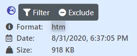
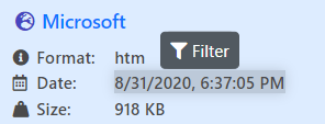
The filterable and excludable parameters can be used to display the filtering buttons when hovering the metadata entry:
this.metadata: MetadataConfig[] = [
    {
        field: "docformat",
        label: "Format",
        icon: "fas fa-info-circle",
        filterable: true,
        excludable: true
    },
    {
        field: "modified",
        label: "Date",
        icon: "far fa-calendar-alt",
        filterable: true
    },
    ...
If a metadata is an entity, you can set the showEntityExtract parameter as true to display the entity extract when you hover it:
Here is an example with a custom action:
this.metadata: MetadataConfig[] = [
    {
        field: "docformat",
        label: "Format",
        icon: "fas fa-info-circle",
        filterable: true,
        excludable: true,
        actions: [new Action({
            text: "Test",
            icon: "fas fa-user-edit",
            action: () => {
                // some code
            }
        })
    },
    ...

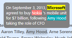
As mentioned before, the config array input can also contain strings, allowing to create full sentences containing some metadata entries inside of it. Here is an example:
this.metadata: (MetadataConfig | string)[] = [
    "The document ",
    {
      field: "filename",
      fieldClass: "mx-1 badge rounded-pill bg-secondary",
      filterable: true
    },
    " has been created the ",
    {
      field: "modified",
      fieldClass: "ms-1"
    }
];
Metadata item
While sq-metadata facilitates the layout, you can just use sq-metadata-item to display a metadata entry:
<sq-metadata-item [record]="record" [field]="'modified'"></sq-metadata-item>
Or with more parameters:
<sq-metadata-item
    [record]="record"
    [field]="'modified'"
    [icon]="'fas fa-phone'"
    [fieldClass]="'badge rounded-pill bg-secondary'"
    [filterable]="true"
    [excludable]="true"
    [label]="'Label'">
</sq-metadata-item>