Autocomplete Module
The Autocomplete module is also documented in the tutorial.
Features
Standard features
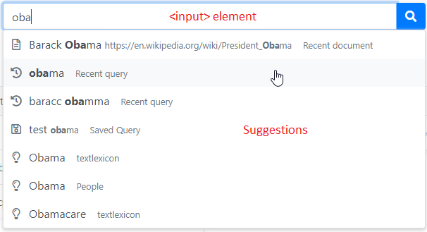
This module provides functionality to display an autocomplete dropdown panel under a search form:
- A directive applied to the form's
<input>to listen to user inputs, send autocomplete queries and process the results. - A service that sends the autocomplete queries to the backend server and provides additional services.
- A component that displays these results (styled with the Bootstrap library).
Both the directive and the component are largely extensible and customizable (See Vanilla Search).

Schematically, the code looks as follow:
<form>

    <input type="text" sqAutocomplete [dropdown]="mydropdown">

    <button type="submit">Search</button>

    <sq-autocomplete-list #mydropdown>
        <ng-template #itemTpl let-item>
            {{ item.display }}
        </ng-template>
    </sq-autocomplete-list>

</form>
Import
Import this module in your app.module.ts.
import { BsAutocompleteModule } from '@sinequa/components/autocomplete';

@NgModule({
  imports: [
    ...
    BsAutocompleteModule
Standard Autocomplete
Autocomplete Directive
The sqAutocomplete directive (applied to the <input> element) listens to user interactions (keyboard inputs, mouse inputs, blur and focus events), sends autocomplete queries to the backend (via the SuggestService) and controls the dropdown component (what to display, when to display it and what to do when an item is selected).
The directive has several inputs:
dropdown: A reference to the dropdown component. This component is not necessarilysq-autocomplete-list, but it needs to implement theAutocompleteComponentinterface.suggestQuery: The name of the "Suggest Query" configured on the server. This value can be hard-coded, or provided by via theAppService.suggestQuerieslist (post-login).off(default:false): Whether the directive is turned off or not.suggestDelay(default:200): Number of milliseconds between queries sent to the server.placeholder(default:''): Placeholder to display when no text is written in the input.
It also provides the following outputs (Event emitters):
stateChange: Emits the state of the autocomplete (OFF,INIT,START,ACTIVE,OPENED,SELECTED)submit: Fires when the users "submits" the query (by typing Enter)
Of course, other attributes and directives may be applied along with the sqAutocomplete directive. For example we may have the following:
<input type="text"
    formControlName="search"
    class="form-control"
    spellcheck="false"
    autocomplete="off"

    [sqAutofocus]="autofocus"

    sqAutocomplete
    [placeholder]="'msg#searchForm.searchFor' | sqMessage"
    [dropdown]="dropdown"
    [off]="!loginService.complete || !appService.suggestQueries"
    [suggestQuery]="appService.suggestQueries? appService.suggestQueries[0] : ''"
    (submit)="search()">
You can customize the behavior of the directive by extending it and enriching it. The following methods can be overridden:
getSuggests(): Takes the text typed by the user to get suggestions (viagetSuggestsObs()) and pass them toprocessSuggests(). This method can be overridden to modify the text read in the input element and passed togetSuggestObs().getSuggestsObs(): Makes a call to theSuggestServiceto obtain suggestions (which are then passed toprocessSuggests()). It can be overridden to obtain suggestions in a different way (this is the case in Vanilla Search).processSuggests(items): Update the dropdown component with the suggestions. This method can be overridden to post process or filters the suggestions before they are displayed.select(item)orsetAutocompleteItem(item): Methods called when an item is selected from the dropdown panel (either with the mouse or keyboard navigation). By default, the<input>text is set to the value of the autocomplete item, but other behavior can be implemented (opening a document, searching a custom query, etc.; this is the case in Vanilla Search)- State change methods:
init(),start(),active(),open(),select(). They can be overridden to insert new states or execute some custom code in specific states.
The transition between the different states is depicted below:

Suggest Service
The SuggestService provides the following methods:
-
get(suggestQuery: string, text: string, fields?: string | string[], query?: Query, maxCount = 10): Observable<ScoredAutocompleteItem<undefined,string>[]>:This method uses both
SuggestQueryWebServiceandSuggestFieldWebServiceto obtain suggestions from the server. It combines actual suggestions from suggest queries with suggestions of fields (when fielded search is active). -
async searchData<T, Tcat extends string>(category: Tcat, query: string, data: T[], primaryText: (obj:T) => string, secondaryText?: (obj:T) => string[], label?: string) : Promise<ScoredAutocompleteItem<T, Tcat>[]>:This method allows to search within a list of objects of any type (
T). It is useful to search within a small number of user objects on the client side. For example, in Vanilla Search, it is used to search within the recent queries, recent documents, saved queries and baskets.It expects the following inputs:
category: The name of theAutocompleteItemcategory to be created as a result of this search.query: The text you want to search for.data: The list of objects you want to search in.primaryText: A function that takes in an object and outputs the primary text field to search in (eg. if objects are records, the primary field could be the title).secondaryText(optional): A function that takes in an object and outputs a list of secondary text fields to search in.label(optional): The label of theAutocompleteItemcategory to be created as a result of this search.
Autocomplete List Component
The sq-autocomplete-list component is a fairly simple component that displays the list of suggestions from the directive. This component expects a ng-template named #itemTpl to be passed by transclusion, to actually display the items:
<sq-autocomplete-list #mydropdown>
    <ng-template #itemTpl let-item>
        {{ item.display }}
    </ng-template>
</sq-autocomplete-list>
In the Vanilla Search application, the template (in search-form.component.html) looks like this:
<ng-template #itemTpl let-item>
    <div class="autocomplete-item p-2">
        <i class="{{autocompleteIcon(item.category)}}"></i><!--
        --><span class="mx-2" [innerHTML]="item.displayHtml || item.display"></span><!--
        --><small *ngIf="item.category" class="autocomplete-category ml-2">{{(item.label || item.category) | sqMessage}}</small>
    </div>
</ng-template>
You can customize the component by customizing the content of#itemTpl. Note that item is an AutocompleteItem passed by the directive.
You can also write you own component entirely, as long as:
- You tag it and pass it to the directive (
#mydropdownin the example above). - Your component implements the
AutocompleteComponentinterface. This interface requires you to implement the following methods:hasItems(boolean): Whether there are any item to displayclicked(EventEmitter<AutocompleteItem>): Event emitter for clicks on an autocomplete itemselectedValue(AutocompleteItem): The currently selected item, if anyupdate(active: boolean, items?: AutocompleteItem[]): Method called to pass data to this component. Ifactive==false, the component should be closed.selectNext(): Select and return the nextAutocompleteItemin the list.selectPrevious(): Select and return the previousAutocompleteItemin the list.
Server-side configuration
The autocomplete functionality is built on top of two web services of the Sinequa REST API:
- Suggest Query Web Service (
api/v1/suggestquery) - Suggest Field Web Service (
api/v1/suggestfield)
Suggest Query Web Service
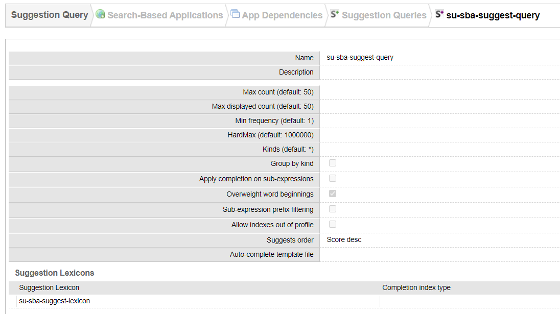
The Suggest Query web service uses a Suggestion Query configured on the Sinequa server to generate suggestions. These queries can be created and managed in the Sinequa administration, under Search-Based Applications > App Dependencies > Suggestion Queries.
 Standard configuration of a Suggestion Query
A suggestion query is associated to a Suggestion Lexicon. The lexicon contains all the terms which can be used as suggestions. These terms are generated from the index content, and each one belongs in a "kind" (by default the kind just corresponds to the name of the column from which the term is extracted).
![]() Configuration of a suggestion lexicon
Configuration of a suggestion lexicon
The "kind" (or "category") is important, as it is used in fielded search to request suggestions for a specific field. For example, when autocompleting the field company, we do not want any kind of suggestion: We want only suggestions belonging to the "company" kind / category.
⚠️ Be careful, as there are typically some differences the between the column names defined in the suggest lexicon and the field names used in your SBA, because of aliases. If you define an alias for the field "company" (and you want this field to be autocompleted), it might be a good idea to use the same alias for the "kind" of this column in the lexicon.
Suggest Field Web Service
When we request the Suggest Query web service for a specific "kind", but no results are returned, the Suggest Field Web Service is used as a fallback.
The Suggest Field web service does not use a lexicon to create suggestions. Instead, it directly queries the engine for data, using a distribution, and using the prefixes option to filter the searched text. If you search suggestions for the field person, the requests look as follow:
SELECT DISTRIBUTION('person,count=100,basicforms=true,order2=labelasc,labels=true,prefixes="Barack Oba",caseinsensitive=true') AS dist FROM index WHERE <security clause> AND entity17 CONTAINS 'Barack Oba*' COUNT 1
There are various benefits to this approach:
- The data is always up-to-date. No need to refresh a lexicon.
- This service is built-in and has no configuration attached.
- We can search in the context of a query (adding to the
WHEREclause), which means the data is more relevant and secured. - Also note that unlike the Suggest Query web service, this service resolves SBA aliases. (So if you defined an alias for the field
person, the service knows it should actually request the engine for thepersoncolumn).
However, this approach means more requests are sent to the engine, which can hinder performance. Also, the completion is limited to a simple prefix approach, unlike the Suggest queries and lexicons which have many options to manage more complex completion strategies.