Action Module
Features
This module provides the classes and directives to create menus and buttons. For example, all the menus in the navigation bar of Vanilla search are implemented using menu and action objects.
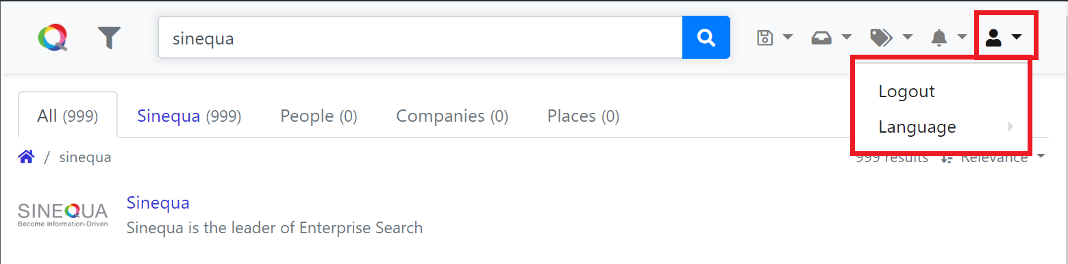 User menu in navigation bar
Import
Add import { BsActionModule } from '@sinequa/components/action'; into your app.module.ts.
Include BsActionModule in Angular import declaration of app.module.ts.
@NgModule({
    imports: [
        /*....*/
        BsActionModule,
        /*....*/
    ],
    /*....*/
})
API usage
The most important declaration of this module is the Action class.
Action class
The Action class represents an element in a dropdown menu, take for example the User menu in the above screenshot,
the button with the user icon and the two elements of the dropdown are Action object.
An Action can have zero or some children, the latter represents a dropdown menu whereas the former an action in a menu or a button.
Here are the list of commonly used properties of the Action class:
name: The name of the action, can be used as id to distinguish different actions of the sameActionparent,text: The display text of theAction,title: The tooltip to show when hovering theAction,iconoriconAfter: The icon (css class) of theAction, if thenameproperty is defined, the icon defined byiconwill be displayed before the text while that byiconAfteris shown after the action text,separator: whether theActionis used as a separator in its parentAction,selected: if true, the display of theActionwill start with a check icon (✔).disabled: if true, theActionis grayed out when it is displayed.hidden: if true, theActionis not shown.action: A function to execute when the button is clicked,updater: A function to execute before the button display is refreshed,update: When this method is called,updaterfunction is called first.headerGroup: if true, thetitleproperty of theActionis used as a dropdown header displayed before children actions.
How to create a menu action or a button
Example 1: A simple menu action that performs the logout procedure with display text
const logoutAction = new Action({
    text: "msg#userMenu.logout",
    title: "msg#userMenu.logout",
    action: () => doLogout()
});
Example 2: A simple menu action with an icon the universal-icon from fontawesome
const logoutAction = new Action({
    icon: "fas fa-universal-access",
    title: "msg#action.tooltip",
    action: () => doSth()
});
Example 3: A menu action that is shown once a condition is satisfied
const hiddenAction = new Action({
    text: "msg#action.name",    // The text to display on the action button
    title: "msg#action.tooltip",// The tooltip of the action
    hidden: true,
    action: (action) => {
        doSomething(); // The logout procedure to execute when the action is clicked,
        action.update(); // needed to call the `updater` callback
    updater: (action: Action) => {
        action.hidden = someConditionToCheck;
    }
});
Example 4: A menu action whose text is changed depending on the value of an outside variable
someCounter = 0;

const action = new Action({
    text: "msg#action.evenName",    // The text to display on the action button
    title: "msg#action.evenTooltip",// The tooltip of the action
    action: () => doSth(),
    updater: (item: Action) => {
        item.text = someCounter / 2 === 0 ? "msg#action.evenName" : "msg#action.oddName";
        item.title = someCounter / 2 === 0 ? "msg#action.evenTooltip" : "msg#action.oddTooltip";
    }
});

/*
 *Some functions that may change the value of someCounter
 */
 ...
 action.update(); // needed to call the `updater` callback
Example 5: A separator for the parent dropdown menu
const menu = new Action({
    icon: 'some-icon-class',
    title: 'msg#menu.tooltip',
    children: [
        new Action({
            text: 'msg#menu.action1.text',
            title: 'msg#menu.action1.tooltip',
            action: () => fn1()
        }),
        new Action({ separator: true }),
        new Action({
            text: 'msg#menu.action2.text',
            title: 'msg#menu.action2.tooltip',
            action: () => fn2()
        }),
    ]
});
Example 5: A dropdown header for the children dropdown menu items
const menu = new Action({
    icon: 'some-icon-class',
    title: 'msg#menu.tooltip',
    headerGroup: true, // `title` will be used as dropdown header
    children: [
        new Action({
            text: 'msg#menu.action1.text',
            title: 'msg#menu.action1.tooltip',
            action: () => fn1()
        }),
        new Action({ separator: true }),
        new Action({
            text: 'msg#menu.action2.text',
            title: 'msg#menu.action2.tooltip',
            action: () => fn2()
        }),
    ]
});
How to create a dropdown menu
A dropdown menu is simply an Action object who has children but no action to execute (i.e. action property is undefined)
Take for example the dropdown menu to manage user alert in the navigation bar, the following code snippet shows how it is defined in the navigation bar.
 Alert menu in navigation bar
Example 1: Alert dropdown menu in the navigation bar
const alertsActions: Action[] = [];
const createAction = new Action({
    text: "msg#alerts.createAlert",
    title: "msg#alerts.createAlert",
    action: () => createAlert();
});

const manageAction = new Action({
    text: "msg#alerts.manageAlerts",
    title: "msg#alerts.manageAlerts",
    action: () => manageAlert();
});

alertsActions.push(createAction);
alertsActions.push(manageAction);

const alertMenu = new Action({
    icon: "some-icon-class",
    text: "msg#alerts.alerts",
    children: alertsActions
});
Directives and components
Once you have defined your menus and buttons, you need to use one of the following directives or components to display them in the HTML template of your components
you can use the sq-action-buttons component that creates a menu of buttons.
Its input is an ActionButtonsOptions object:
items: the childrenActionelements of the menu,size: the size of the menu, the valid values are (in ascending order):"xs", "sm", "md", "lg", "xl", "xxl",style: extra css classes to apply.autoAdjust: whether to automatically change the visualisation of the menu and its children when resizing the browser window,autoAdjustBreakpoint: ifautoAdjustis activated, this property defines the size of the browser window, at which the menu size can be adjusted instead of always adjusting the menu each time a resizing happens,rightAligned: whether the menu elements are right-aligned.
Example:
<sq-action-buttons
    [sq-action-buttons]="{
        items: [action1, action2],
        autoAdjust: true,
        rightAligned: rightAligned
    }"
></sq-action-buttons>
Alternatively, you can use the sq-action-item component.
This component expects an ActionItemOptions object as input:
item: theActionobject representing the menu,size: the size of the menu, the valid values are (in ascending order):"xs", "sm", "md", "lg", "xl", "xxl",style: the CSS class of the menu,autoAdjust: whether to automatically change the visualisation of the menu and its children when resizing the browser window,autoAdjustBreakpoint: ifautoAdjustis activated, this property defines the size of the browser window, at which the menu size can be adjusted instead of always adjusting the menu each time a resizing happens,inMenu: iftrue, the menu element will havenav-linkCSS class. Otherwise, they are set todropdown-item,rightAligned: whether the menu elements are right-aligned.
Example:
<div
    class="btn-group dropdown"
    [sq-action-item]="{
        item: item,
        size: size,
        style: style,
        autoAdjust: autoAdjust,
        autoAdjustBreakpoint: autoAdjustBreakpoint,
        rightAligned: rightAligned}"
></div>
The sq-action-menu component is another way to create a dropdown menu.
This component expects the following values:
items: the childrenActionelements of the menu,size: the size of the menu, the valid values are (in ascending order):"xs", "sm", "md", "lg", "xl", "xxl",autoAdjust: whether to automatically change the visualisation of the menu and its children when resizing the browser window,autoAdjustBreakpoint: ifautoAdjustis activated, this property defines the size of the browser window, at which the menu size can be adjusted instead of always adjusting the menu each time a resizing happens,right: whether the menu elements are right-aligned.
Example:
<sq-action-menu [items]="items" [autoAdjust]="true" [autoAdjustBreakpoint]="'xxl'" [right]="true"></sq-action-menu>
Finally, there is the sq-dropdown-menu directive.
The input of the directive is an (DropdownMenuOptions object):
item: theActionobject represents the menu,rightAligned: whether the elements of the menu will be right-aligned,showMenuClass: the CSS class of the menu when it is shown.
Example:
<ul [sq-dropdown-menu]="{item: menuAction, showMenuClass: menuClass}"></ul>