Preview Module
The preview module is also documented in the tutorial.
Vanilla Search also has a documented preview component.
Features
This module provides functionality to display the HTML preview of a document in Sinequa, as well as features to interact with the content of this preview:
- A service that queries the server for the preview data (
PreviewData) and manages the different ways of displaying the preview (in a popup, in a route or in a new tab/window). - A core API to display the HTML preview and interact with its content. It is composed of three components:
sq-previewto display the preview,sq-preview-tooltip, a dynamic tooltip that can be inserted in the document, andsq-preview-minimapwhich adds a right bar with the location of the relevant extracts inside the document. - Additional components based on this core API to interact with the preview and display some related data (the extracts or entities list, etc.).
Import
Import this module in your app.module.ts.
import { PreviewModule } from '@sinequa/components/preview';

@NgModule({
  imports: [
    ...
    PreviewModule
This module is internationalized: If not already the case, you need to import its messages for the language(s) of your application. For example, in your app's src/locales/en.ts:
...
import {enPreview} from "@sinequa/components/preview";

const messages = Utils.merge({}, ..., enPreview, appMessages);
Preview CSS and JS files
In order for some features to work such as passages highlightings, entities coloring, the tooltip and the minimap, you need to load a preview.js file in your project. It is already set in Vanilla Search which contains a preview folder in its src folder, then in angular.json at the project's root:
"vanilla-search": {
    ...
    "architect": {
        "build": {
            ...
            "assets": [
                ...
                "projects/vanilla-search/src/preview/preview.js"
            ],
And then to avoid duplicates and still use it in the other projects like Hello Search:
"hello-search": {
    ...
    "architect": {
        "build": {
            ...
            "assets": [
                ...
                { "glob": "**/*.js", "input": "projects/vanilla-search/src/preview/", "output": "./preview" }
            ],
To customize further the CSS, you also need to add preview.scss in the angular.json file, which is also present in Vanilla Search:
"vanilla-search": {
    ...
    "architect": {
        "build": {
            ...
            "styles": [
                ...
                {
                    "input": "projects/vanilla-search/src/preview/preview.scss",
                    "bundleName": "preview",
                    "inject": false
                }
            ],
Because the preview is loaded in an iframe, those JS and CSS files have to be loaded separately from the rest of the application.
If despite importing the JS file you cannot see any highlights, you may want to make sure the Preview web service is properly setup on the server.
Preview Service
The PreviewService provides the following API:
-
getPreviewData(id: string, query: Query, audit = true): Observable<PreviewData>This method uses the
PreviewWebServiceto obtain thePreviewDatafor a given document and search query and also takes care of generating audit events. -
openRoute(record: Record, query: Query, path = "preview")This method navigates to a URL of the form
#preview?id=...&query=..., which means your app must have a/previewroute which takes care of extracting these parameters for the URL, queryinggetPreviewData()and displaying the preview. This is the case in Vanilla Search. -
openNewWindow(record: Record, query: Query)This method opens a new window with a URL of the form:
#preview?id=...&query=...&app=..., which means your app must have a/previewroute which takes care of extracting these parameters for the URL, queryinggetPreviewData()and displaying the preview. -
openModal(record: Record, query: Query, model: any)This method uses the
ModalServiceto open a popup dialog with the preview. The component displayed by this modal is by defaultsq-preview, but it can be replaced by your own custom component by adding it in to your providers inapp.module.ts:providers: [
...
{provide: PREVIEW_MODAL, useValue: MyPreviewPopup}
]Note that the component itself must take care of querying the
getPreviewData()method.
Core API
Preview component
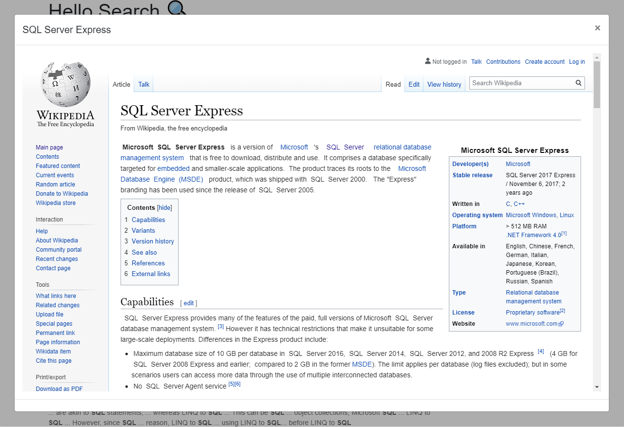
The HTML preview is a standalone webpage with its styles and scripts. It must be displayed inside an <iframe> element. This is the role of the sq-preview component.
The component expects the following inputs:
id: The ID of the document. The component will use it to download the document data and display it properly.query(Optional, defaultSearchService.query): The query to search the record data from which will impact the additional data such as the relevant extracts according to your search text.scale(Optional, default1): The default document scale.scaleIncrement(Optional, default0.1): The amount to increment/decrement when handling the scale.highlightColors(Optional): A list ofPreviewHighlightColorsto provide information about the desired colors for some CSS classes.highlightEntities(Optional, defaulttrue): Whether to highlight entities by default.highlightExtracts(Optional, defaulttrue): Whether to highlight extracts by default.highlightActions(Optional, defaulttrue): Whether to display the highlight actions.extracts(Optional, default["matchlocations", "extractslocations", "matchingpassages"]): List of highlights considered as "extracts".usePassageHighlighter(Optional, default["extractslocations", "matchingpassages"]): List of the CSS classes that the passage highlighter should consider.preferenceName(Optional, defaultpreview): Name of the preference property used to stored the highlight preferences.
By default, the highlights that are visible correspond to the highlightEntities and highlightExtracts inputs. If highlightActions is enabled, then the users have the possibility to toggle the highlights on and off.
When this happens, their preference is stored in the user settings.
Then the next time the component is displayed the preference is used instead of the highlightEntities and highlightExtracts parameters
When the HTML preview finishes loading, the component emits an empty ready event.
Preview Components
Preview Tooltip
The core API also includes sq-preview-tooltip, a customizable component which can be inserted in the HTML preview, and responds to the user's mouse movements and clicks. This enables custom features when hovering over an entity or selecting some text.
 Default Preview Tooltip when hovering over an entity
 Customized tooltip showing a "Search" action in Vanilla Search
The tooltip is inserted in the preview by transclusion. It takes custom actions (See Action Module) as inputs for either the entity hover or the text selection behaviors shown above.
For example:
<sq-preview [id]="id">

    <sq-preview-tooltip
        [textActions]="tooltipTextActions">
    </sq-preview-tooltip>

</sq-preview>
And:
this.tooltipTextActions = [new Action({
    text: "Search",
    icon: "fas fa-search",
    action: (action, event) => {
        ...
    }
})];
Preview Mini Map
The component sq-preview-minimap could be inserted within the HTML Preview to display a highlights's minimap.
 highlights mini map
The minimap is inserted by transclusion:
<sq-preview [id]="id">

    <!-- minimap injected in the preview -->
    <sq-preview-minimap></sq-preview-minimap>

</sq-preview>
Extract Panel
The sq-preview-extracts-panel component displays the relevant extracts extracted from the PreviewDocument. Clicking on a extract selects it in the preview (highlight and scroll).
The component requires the inputs previewData and preview. You may want to also provide highlights to apply some.
<sq-preview-extracts-panel
    [previewData]="previewData"
    [preview]="preview"
    [extractsNumber]="10"
    [highlights]="previewHighlights">
</sq-preview-extracts-panel>
This component is used in Vanilla Search's Preview component.
Entity Panel
The sq-preview-entity-panel component displays the lists of entities and matches in the document. The data is available in the PreviewData object. The facets displaying each type of highlight allow the user to navigate between the different occurrences and turn them on or off.
The component requires the inputs previewData and preview. You may want to also provide highlights to apply some.
<sq-preview-entity-panel
    [previewData]="previewData"
    [preview]="preview"
    [highlights]="previewHighlights">
</sq-preview-entity-panel>
This component is used in Vanilla Search's Preview component.
Search Form
The sq-preview-search-form component is a simple search form that lets users search for content within the preview.
The search is actually triggered by navigating to the same URL but updating the query.text field. ⚠️ This assumes the component lives inside a "Preview" route which listens to URL changes and updates the PreviewData via the PreviewService accordingly.