Vanilla Search
Vanilla Search is a standard Enterprise Search app designed to be simple, efficient and easy to customize into a much more complex application.
If you complete the Tutorial, you should notice a lot of similarities between your final app and Vanilla Search. This is intentional, to make it easy for developers to transition from Hello Search and the tutorial, to a full-fledged Enterprise Search app.
The application has three routes made of five components (of course, these components include many subcomponents from the @sinequa/components library):
- The App component, which is essentially a wrapper for the
<router-outlet>. - A Home route, greeting users with a search bar and some quick-access facets.
- A Search route, allowing users to browse and refine search results and access other features.
- A Preview route, allowing users to see the details of a document and navigate its relevant extracts and entities.
- Additionally, a Search Form component (which includes the autocomplete) is used within both the Home and Search routes.
The routes are configured in the app.module.ts file:
export const routes: Routes = [
    {path: "home", component: HomeComponent},
    {path: "search", component: SearchComponent},
    {path: "preview", component: PreviewComponent},
    {path: "**", redirectTo: "home"}
];
Home route
The Home route has a search bar (Search Form component), and a list of facets:
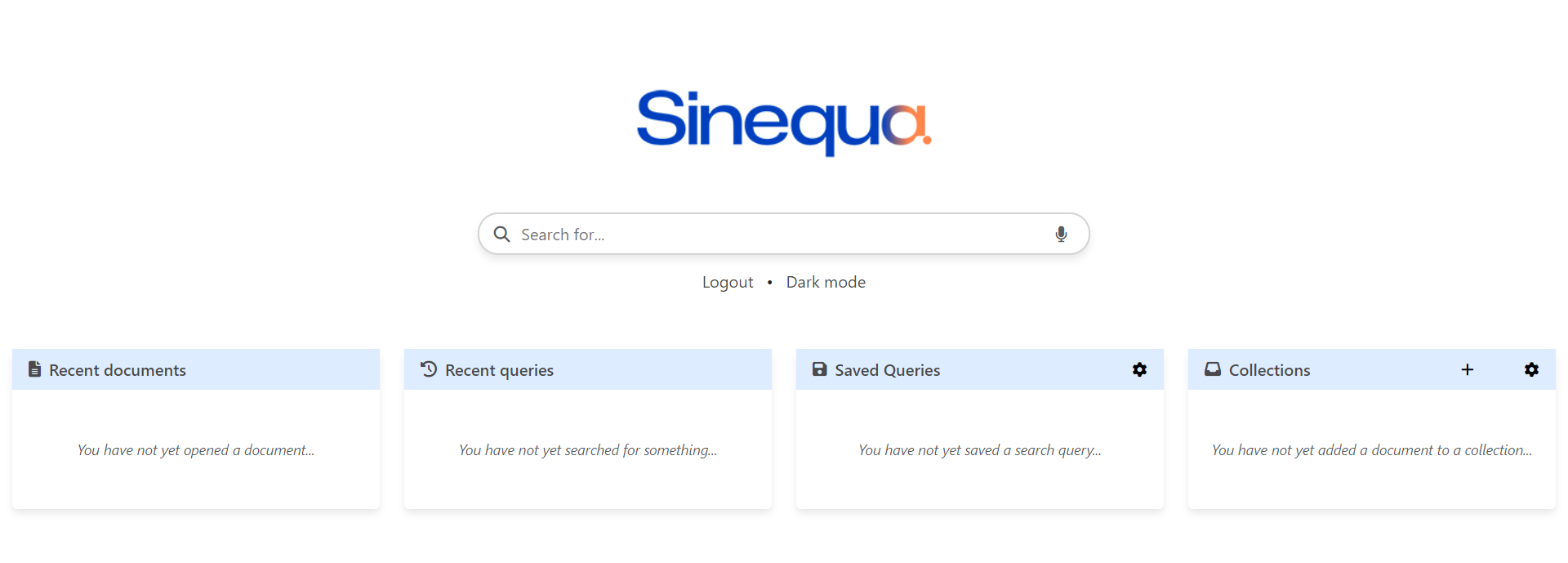
You can also switch to a dark theme, by clicking the button under the search bar.
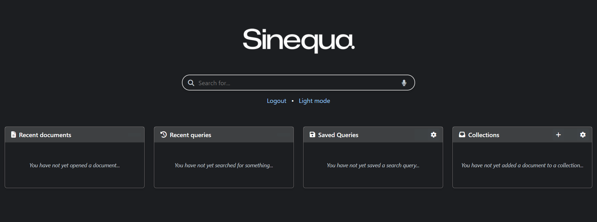
You can easily change the logo at the top of the template:
<!-- Home page logo -->
<img src="{{ (isDark$ | async) ? 'assets/sinequa-logo-dark-lg.png' : 'assets/sinequa-logo-light-lg.png' }}" id="logo" class="mb-5">
This is followed by the search form in the center.
Then, by default, the homepage includes four facets:
- Recent documents:
sq-facet-recent-documents - Recent queries:
sq-facet-recent-queries - Saved queries:
sq-facet-saved-queries - Collections (aka "Baskets"):
sq-facet-baskets
These facets can of course be added or removed, directly in the component template, or via configuration.
The controller manages:
- Login and Logout, via the
LoginService. - Light / Dark theme toggling.
- The list of facets to display and their responsive sizing.
Search route
The Search route has a navbar on top, which includes a search bar (Search Form component), and user menus coming from various libraries of @sinequa/components. Under it are a facet bar (with two facets) and the search results. It is also possible to open a preview of a document on the right, by selecting it in the results.
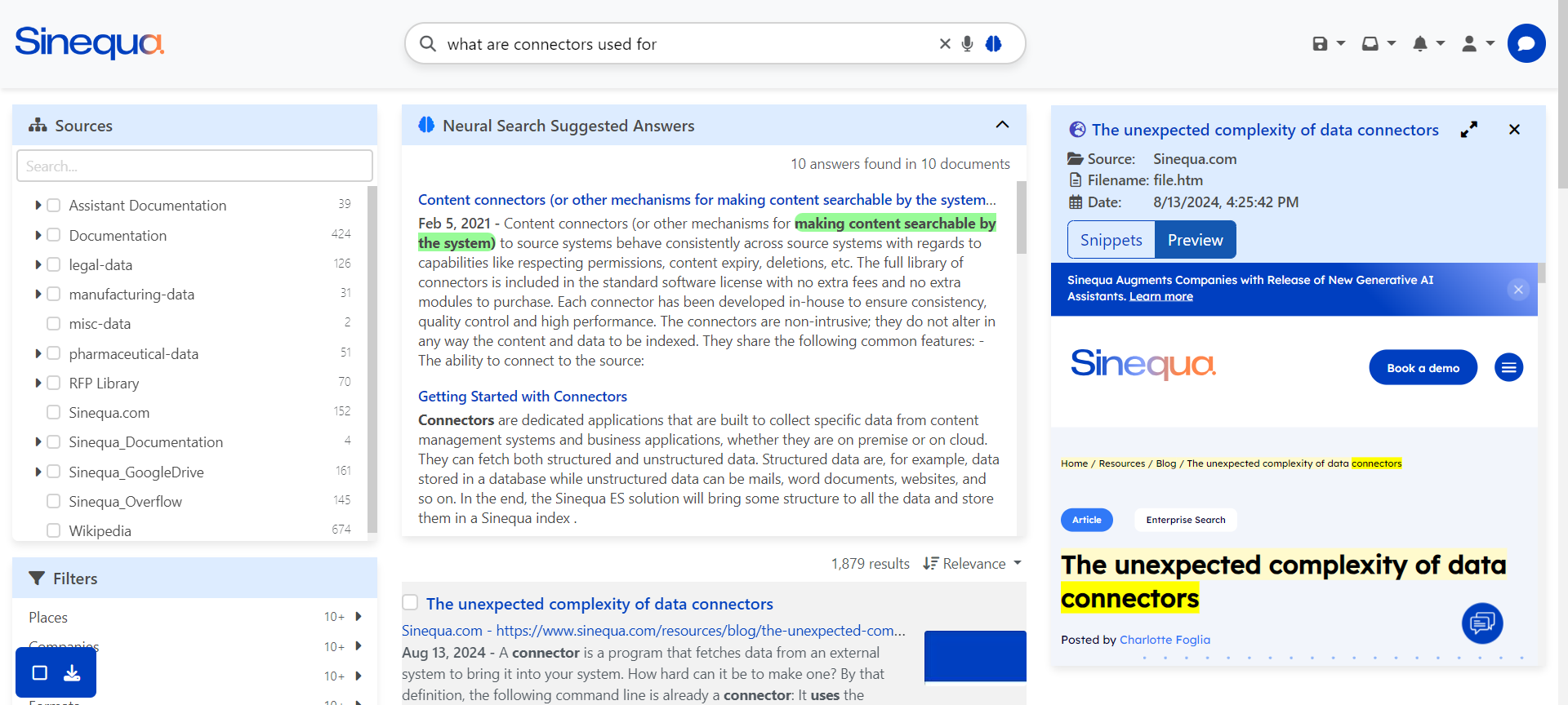
The template starts with the navbar, which contains:
- A responsive logo (
<img id="logo" src=...>) - The search form
- User menus, which include by default:
- Collections (aka "Baskets"):
sq-baskets-menu - Saved Queries:
sq-saved-queries-menu - Alerts:
sq-alerts-menu - Labels:
sq-labels-menu - General User Menu:
sq-user-menu
- Collections (aka "Baskets"):
- The navbar also includes responsive buttons to toggle the visibility of the menu and the facets. The implementation is similar to the one in the tutorial.
The main view under the navbar includes:
- A Facet Bar on the left, with by default:
- A hierarchical source facet:
sq-facet-list - A multiple metadata facet:
sq-facet-multi
- A hierarchical source facet:
- In the center, a list of results, including:
- Tabs:
sq-tabs - A "Did you mean?" component:
sq-did-you-mean - Sponsored links:
sq-sponsored-results - The filters list applied to the query:
sq-filters-view - A facet displaying the top passages:
sq-facet-cardcontainingsq-top-passages - A Results counter:
sq-results-counter - A Sort selector:
sq-sort-selector - For each document:
- A selector (checkbox):
sq-result-selector - The document's title:
sq-result-title - The document's source:
sq-result-source - The document's relevant extracts:
sq-result-extracts - The document's missing terms:
sq-result-missing-terms - The document's labels:
sq-labels - The document's duplicates:
sq-result-duplicates - The document's thumbnail:
sq-result-thumbnail
- A selector (checkbox):
- An infinite scroller:
sq-scroller
- Tabs:
- On the right, an
sq-facet-cardcontaining:- An image and description when no document is currently selected
- Document details when one is selected:
- The document's icon:
sq-result-icon - The document's title:
sq-result-title - The document's metadata:
sq-metadata - The document's passages (in a view tab):
sq-passage-list - The document's preview (in a view tab):
sq-preview - The document's duplicates (in a view tab):
sq-result-duplicates-list
- The document's icon:
- And at the bottom left corner:
- A list of actions available for the currently selected document(s):
sq-results-selector
- A list of actions available for the currently selected document(s):
The controller manages:
- The list of facets displayed within
sq-facet-multi(which can be modified via configuration). - The list of menus displayed in the navbar (which can be modified via configuration).
- The list of metadata displayed by the "mini-preview" (which can be modified via configuration).
- The opening and closing of documents in the "mini-preview" on the right.
- The (responsive) visibility of facets, results and menus, based on screen size and user actions.
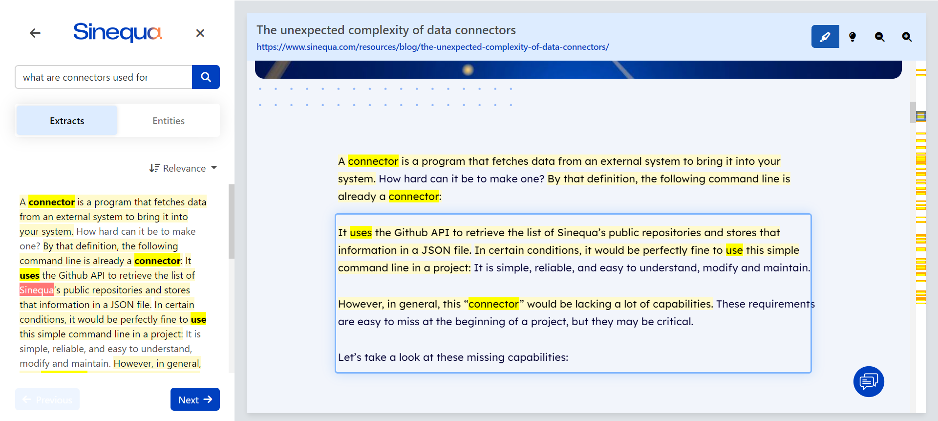
Preview route
The Preview route displays the HTML preview of the document on the right. On the left, a panel contains various tools to interact with the document:
- A search bar (
sq-preview-search-form), to search and highlight text within the document (note that it uses Sinequa NLP to recognize the language and find words in all their possible forms). - A list of relevant extracts (
sq-preview-extracts-panel), to quickly navigate to the important parts of the document. - A list of entities and relevant keywords (
sq-preview-entity-panel), to visualize the diversity of topics, navigate between them and control their highlighting.
On the right, the HTML preview is displayed within the sq-preview component. Additionally, a dynamic tooltip (sq-preview-tooltip) is inserted in the HTML preview to provide additional functionality when users hover their mouse over entities or select text, and a minimap (sq-preview-minimap) is also inserted to add a right bar to preview container that allows to identify the extracts' locations more easily.
The controller manages:
- Navigation events (fetch the preview data when the page is reloaded, or when we search for text within the document).
- Preview Tooltip custom actions (like the search button when text is selected)
- The list of entities highlights that
sq-preview,sq-preview-extracts-panelandsq-preview-entity-panelhave to display (which can be modified via configuration).
Search form
The Search Form component uses sq-search-form as the one developed in the tutorial, but with a more advanced Autocomplete component allowing to search into User Settings objects, such as the recent queries, documents, baskets, etc.
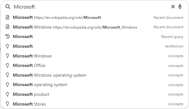
The controller includes a search method with onAutocompleteSearch() triggered when the autocomplete component emits that it should trigger the search. Additionally, it manages the list of custom features that the autocomplete can search into, like the recent documents, the recent queries, the baskets and the saved queries (this list can be configured).
The autocomplete component is responsible for getting the suggestions when typing.
-
The
getSuggests()method can search in custom objects, as mentioned above (in addition to the classical "Suggest Queries" configured on the server). Notice that, to merge the different sources of autocomplete, we use theforkJoinoperator fromrxjs:// The forkJoin method allows to merge the suggestions into a single array, so the parent
// directive only sees a single source.
return forkJoin(dataSources).pipe(
map(suggests => suggests
.flat()
.sort(this.sortComparator)
.slice(0, this.maxItems)
)
);Notice that each data source has a custom search method, leveraging the
SuggestService'ssearchData()method. For example:searchRecentDocuments(text: string): Promise<AutocompleteItem[]> {
return this.suggestService.searchData(
'recent-document',
text,
this.recentDocumentsService.recentdocuments,
doc => doc.title,
doc => ([] as string[]).concat(doc.url1, doc.treepath, doc.authors),
"msg#searchForm.recentDocument");
} -
The
selectItem()method performs custom actions, depending on the category of suggestion. For example, recent documents are directly opened, viapreviewService.openRoute(), saved queries are searched in the/searchroute, etc.
Configuration
Vanilla Search can be configured via two methods (as described in Configuration):
- A central Typescript source file:
src/config.ts, which is built with your application. - A JSON object downloaded from the Sinequa server on start-up (configured in your App's "Customization (JSON)" tab) and available via the
AppService(post-login).
The components of Vanilla Search described above use three configuration objects:
-
FEATURES: a list ofstringthat controls which features are activated in the app. This list is used to determine which facets are displayed in the homepage, which menus are displayed in the search page, which objects are searched by the autocomplete, and which options are available in the search form, such as the advanced search form or the voice recognition button. -
FACETS: a list ofFacetConfigobjects that determines the facets displayed within thesq-facet-multicomponent. Each object contains a number of options that are passed to the corresponding facet components.For example:
{
    name: "geo",
    aggregation: "Geo",
    title: "msg#facet.geo.title",
    type: "list",
    icon: "fas fa-fw fa-globe-americas",
    parameters: {
        showCount: true,
        searchable: true,
        focusSearch: true,
        allowExclude: true,
        allowOr: true,
        allowAnd: false,
        displayEmptyDistributionIntervals: false,
    }
}
Of course, these facets require a corresponding Aggregation to exist on the Sinequa server, and consequently within the
Resultsobject. -
METADATA_CONFIG: a list ofMetadataConfigto be displayed in the "mini-preview", within asq-metadatacomponent (More information in the Custom Metadata section). -
PREVIEW_HIGHLIGHTS: a list ofPreviewHighlightColorsused in the preview related components to define the highlights colors for the different entities (More information in the Custom Entities section).
The four objects above can be customized statically in the src/config.ts file. It is also possible to override their value dynamically, via the "Customization (JSON)" tab of your App (See Configuration). For example, you could configure the following object to override the features:
{
    "features": [
        "recent-queries", "saved-queries", "baskets", "labels", "alerts", "suggests"
    ]
}
The reason this works is that Vanilla Search always implement the following logic:
if server-configuration exists
    use server-configuration
else
    use config.ts
For example, in search.component.ts the metadata displayed in the "mini-preview" comes from the following method:
import { FEATURES } from '../../config'; // src/config.ts

...
public get features(): string[] {
    return this.appService.app?.data?.features as string[] || FEATURES;
}
Styles
The styles of Vanilla Search come from various sources:
-
Third-Party stylesheets, in particular Bootstrap. Third-Party stylesheets are imported in the
minimalandsinequatheme fromSinequa Themethat you can import in your global stylesheet (src/styles/app.scss):// Sinequa global theme (contains Bootstrap imports)
// @import "../../../components/theme/minimal";
@import "../../../components/theme/sinequa";Note that Bootstrap is used throughout the app (and the
@sinequa/componentslibrary) via well documented class names. See Responsive Design. -
Sinequa Modules stylesheets, which are global-level styles that could not be encapsulated in the Angular components (for good reasons). They are imported in the app's global stylesheet (
src/styles/app.scss):@import "../../../components/theme/breakpoints"; -
Components stylesheets, like
home.component.scss,search.component.scss,preview.component.scss.This is generally the preferred way of styling components (besides Bootstrap), since the CSS is well encapsulated in your component scope (there cannot be side-effects to other components) and it alleviates the global stylesheet.
-
The app's global stylesheet (
src/styles/app.scss). This file is mostly used to setup the variables and handling imports. Even though it is possible to make changes there, we advise to usesrc/styles/vanilla.scssto make custom changes. This stylesheet contains many rules that override the rules in the above stylesheets. For example, we restyle the tabs component:sq-tabs {
.nav-tabs {
margin-bottom: 0.5rem;
}
.nav-item .count {
font-size: 0.875em;
color: $secondary;
}
} -
Other styles imported by the global stylesheets:
styles/icons.scsscontains many classes defining icons.styles/vanilla.scsscontains the overrides as described above.styles/dark.scsscontains the rules that override the normal styles to produce a "dark mode". It is imported at the very end ofstyles/vanilla.scss.