Selection Module
Features
This module provides a transverse service that keeps track of selected documents and records. Documents may typically be selected by a click on a button or a checkbox. Selecting documents allows other services to operate over these documents (for example, adding selected documents to a basket, or setting a label or tag onto these documents).
The module also provides components based on this service. These components allow to select one or multiple documents, and to rearrange a given selection (changing its order, removing items).
Import
import { BsSelectionModule, SelectionOptions, SELECTION_OPTIONS } from '@sinequa/components/selection';

/* These options override the default settings */
export const mySelectionOptions: SelectionOptions = {
    resetOnNewQuery: false,
    resetOnNewResults: false,
    storage: "record"
};

@NgModule({
  imports: [
      /*....*/
      BsSelectionModule,
      /*....*/
  ],
  providers: [
      /* If you want to the default options of the selection module */
      { provide: SELECTION_OPTIONS, useValue: mySelectionOptions },
      /*....*/
  ],
  /*....*/
})
This module is internationalized: If not already the case, you need to import its messages for the language(s) of your application. For example, in your app's src/locales/en.ts:
...
import {enSelection} from "@sinequa/components/selection";

const messages = Utils.merge({}, ..., enSelection, appMessages);
API usage
Selection Service
The SelectionService offers a transverse solution to keep track of selected documents. Components use this service both to modify the selection (select or unselect documents), and to access this selection and be notified of its changes (via events).
Like any other service, it can be injected into components and other service by dependency injection:
import { SelectionService } from "@sinequa/components/selection";

@Component({
    selector: "my-component",
    templateUrl: "..."
})
export class MyComponent {

    constructor(
        public selectionService: SelectionService
    ){}
The following methods of the service are of interest:
-
getSelectedItems(): returns the list of selected items (SelectionItem). A selected item contains at least theidproperty of the associatedRecordobject.But it may contain more: If the module's
SelectionOptionsspecifiesstorage: "record"(instead of"id"), then the selection item is the record itself. Thestorageproperty may also be a function that maps a record to a custom object (which must contain at least the record'sid).⚠️ The list returned by this method is a copy of the list maintained by this service. Therefore modifying this list will have no effect on the selection. To add, remove or reorder items, one must use the appropriate methods listed below.
-
getSelectedIds(): returns the list of ids (asstring) of the selected items. This method always work in the same way regardless of theSelectionOptions(it should therefore be preferred when possible, to implement new functionality based on this service). -
haveSelectedRecords: istrueif there are selected records. -
getSelectedCount(): returns the number of selected items. -
allRecordsSelected: istrueif all records in the search service results are selected. -
toggleSelectedRecords(record?: Record, source?: string): This method allows to add or remove records to/from the selection. It takes two optional arguments:-
record: a specific record to add or remove to/from the selection. If this parameter is omitted or undefined, all the records in the search service's results or added or removed (they are all removed only if they were all selected). -
source: an identifier for the type of source which causes the selection change. The source will be included in the events emitted by the service, and it can be used by client services if they listen to these events.This method generates a
SELECTorUNSELECTevent.
-
-
moveSelectedRecord(record: Record, newIndex: number): Moves a selected record to a different index. The input record must be already in the selection. This method generates aMOVEevent. -
clearSelectedRecords(): Unselect all selected records. This method generates anUNSELECTevent.
Additionally, the service includes the following properties:
-
events: aSubjectemitting events of three types:SELECT,UNSELECTandMOVE, when the selection changes. These events (SelectionEvent) include the list of records concerned by the event, as well as the (optional) source of the event. -
selectionActions: a list ofAction(See Action module) that can be registered by other services. These actions are automatically updated when the selection changes. The actions are displayed by thesq-results-selectorcomponentFor example, the Baskets service can register an action to add the selected documents to a basket. If the action includes an update method, it can, for example, hide itself if there is no selected document.
These actions can be registered within a service or a component, typically at the start of the application. For example, in Vanilla Search, the actions are registered in the
AppComponent's constructor:this.selectionService.selectionActions.push(this.savedQueriesService.selectedRecordsAction);
this.selectionService.selectionActions.push(this.basketsService.selectedRecordsAction);
...
Result Selector
The sq-result-selector component displays a simple checkbox associated to a record (Record).
It is typically meant to be displayed in a list of results for each record.
<sq-result-selector [record]="record"></sq-result-selector>

Results Selector
Not to be confused with the previous component, the sq-results-selector displays a global list of actions including:
- The
selectionActionsfrom theSelectionService(mentioned above). - An action allowing to toggle the selection of all results in the search service's results. This action displays a checkbox and the number of selected documents.
Options are available to customize the actions' display:
rightAligned(boolean): whether the actions are aligned to the right.style(string): A Bootstrap class name to change the style of the action buttons (Typically,light,dark,primary, etc.).size(string): A Bootstrap size modifier (small:sm, large:lg).
<sq-results-selector [rightAligned]="true" [style]="'light"></sq-results-selector>

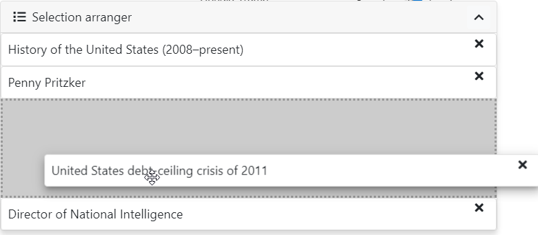
Selection arranger
The sq-selection-arranger component displays the list of selected components (using a template passed by transclusion). It allows to rearrange the selected items by changing their order (with drag & drop) or removing them.
The component directly modifies the selection via the SelectionService, using the methods described above.
<sq-selection-arranger>
    <!-- Template passed by transclusion -->
    <ng-template let-record>
        <div class="p-2">{{record.title}}</div>
    </ng-template>
</sq-selection-arranger>
This component makes use of the DragDropModule from @angular/cdk.
It is also posible to display and rearrange a list of record which is not tied to the SelectionService. To do so, simply bind the records input, and listen to selection changes via the (changes) event emitter:
<sq-selection-arranger [records]="results.record" (changes)="onChanges($event)">
    <!-- Template passed by transclusion -->
    <ng-template let-record>
        <div class="p-2">{{record.title}}</div>
    </ng-template>
</sq-selection-arranger>