Sinequa Theme
An additional theme is available to make Vanilla more modern with improvements such as better colors and paddings. All files related to this new theme are packaged inside @sinequa/components/theme.
Bootstrap provides a global set of styles and utilities that are used across the SBA framework. Our components and applications often use classes like .card, .list-group or .navbar which give them Bootstrap's "look & feel".
These styles can be customized, via SASS and CSS variables. The Sinequa Theme uses this approach by setting variables like $bg-color to redefine the color, border, padding, and many other properties of standard Bootstrap components.
Previews
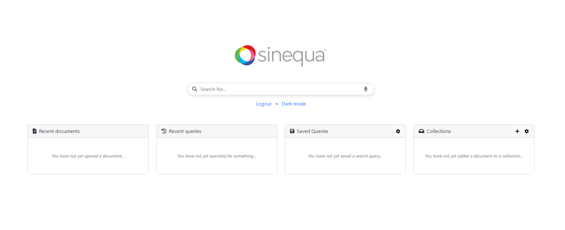
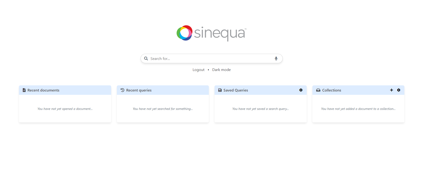
Homepage
Without the theme:
With the theme:
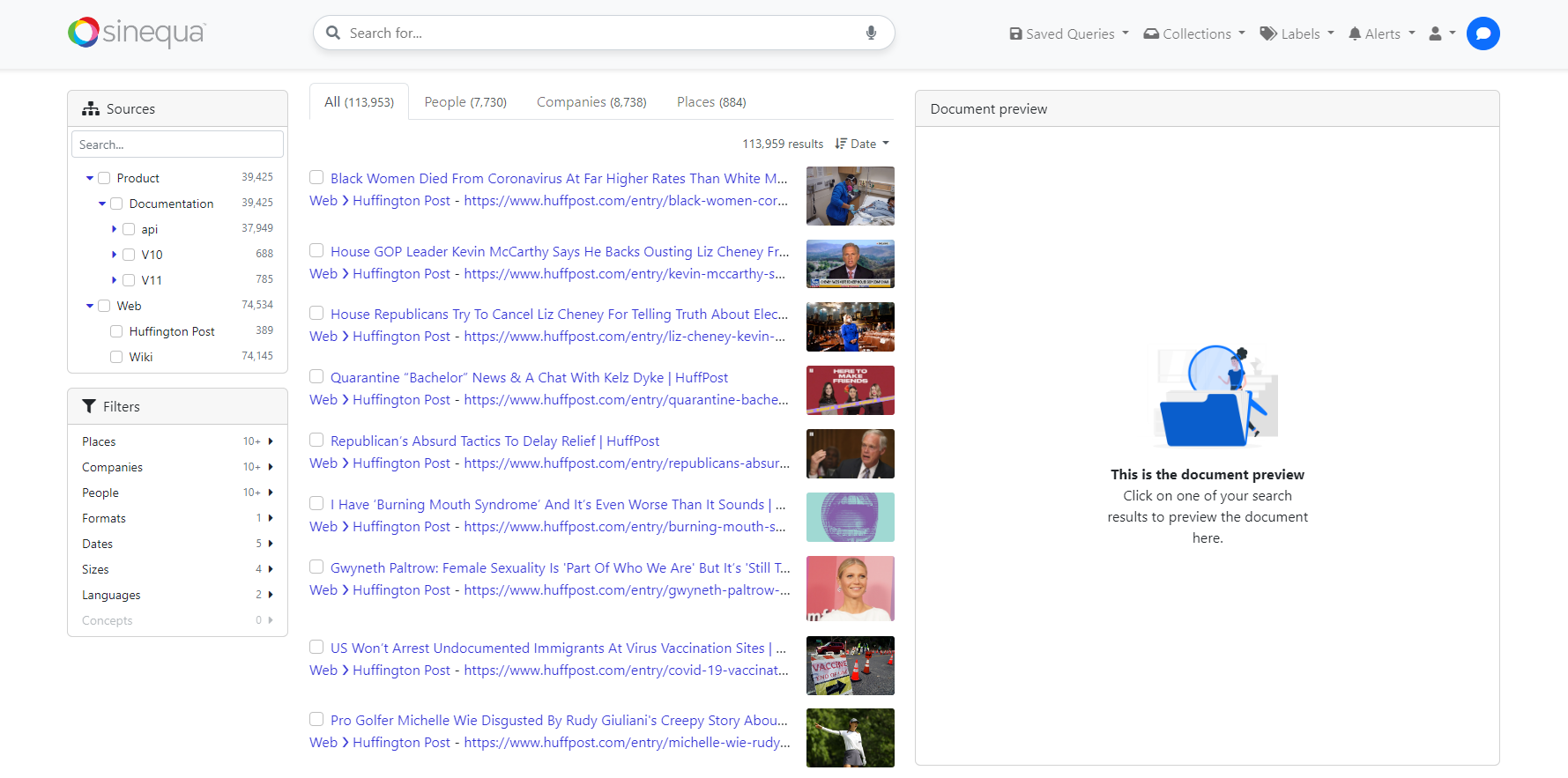
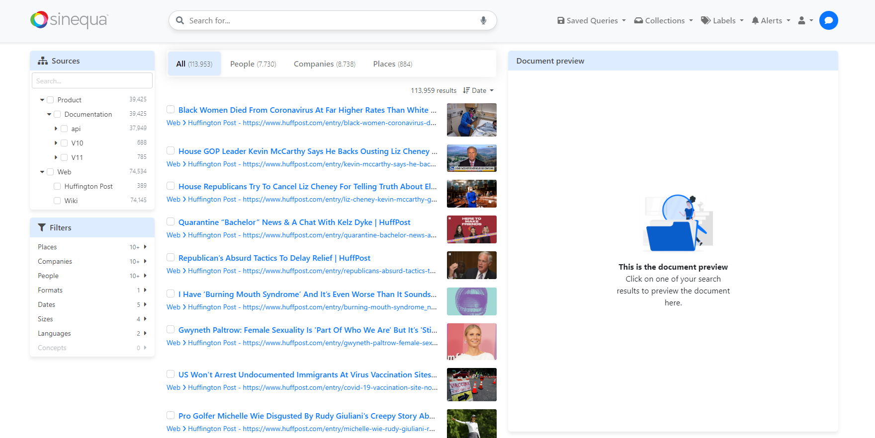
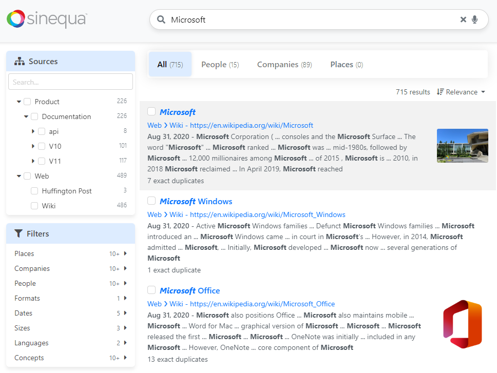
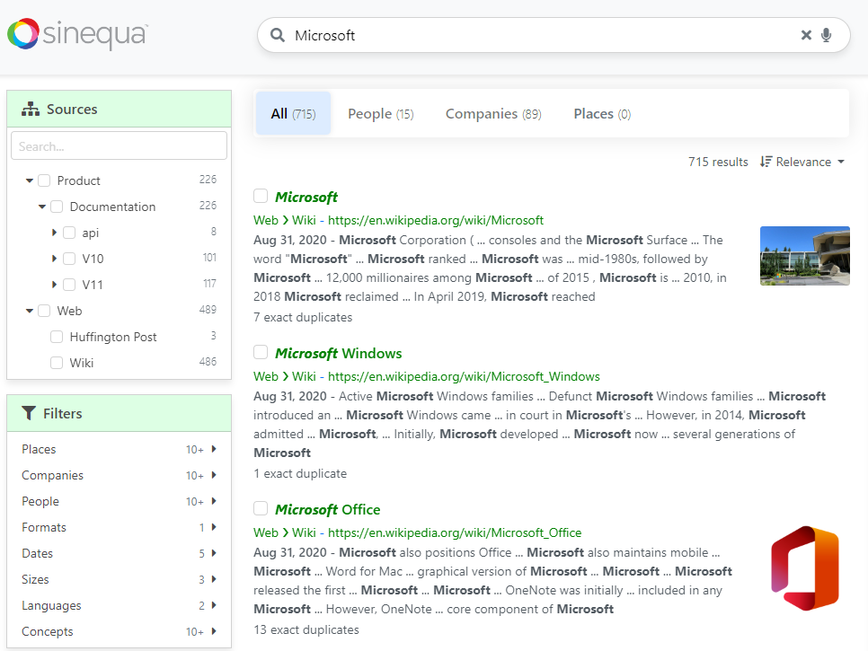
Results page
Without the theme:
With the theme:
Importing/removing the theme
In your app.scss, you have these lines:
// @import "../../../components/theme/minimal";
@import "../../../components/theme/sinequa";
To import or remove the theme, you can switch of import between minimal (the very basic one) and sinequa (with the complete theme).
Note that both files include Bootstrap imports and come with an integrated Dark theme.
Architecture
As mentioned at the beginning, all files are located inside @sinequa/components/theme. They are organized as follow:
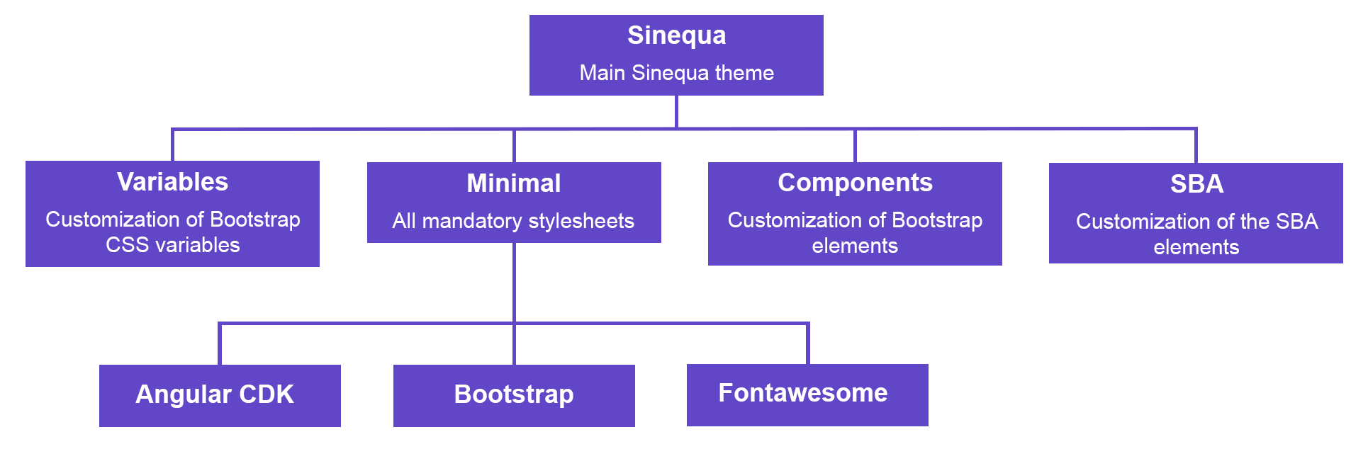
The components are designed to be minimally styled, with the least styling to be usable with Bootstrap. They are also unopiniated with the most simple and neutral customization. This styling is available while using the minimal theme which only imports the basic files such as Bootstrap, Fontawesome and the minimum of files to have everything working.
Only the sinequa theme inserts opiniated customization. It is based on minimal and imports with it all variables along with the files inside components and sba.
Customization
How to customize
Sinequa Theme overrides Bootstrap components using Sass files. If you want to customize your application, do not overrides the Sinequa Theme files. Instead:
- override Bootstrap components as Sinequa Theme does https://getbootstrap.com/docs/5.2/customize/overview/
OR
-
import our
minimalistBootstrap files and write your custom css rules@import "@sinequa/components/theme/minimal"- contains Bootstrap imports
- contains recommended imports to work with SBA components
Dark mode
If you test Vanilla Search, you may notice that a dark theme is available, and that you can dynamically switch between light and dark colors.
The CSS file (_dark.scss) is already included in the minimal and sinequa themes, so you won't need to import it if you use them.
To build this feature, the following steps are required:
-
In the case of Vanilla Search, the styles in
dark.scssare all wrapped inside abody.dark { .. }rule, which means that to toggle the theme, we simply need to toggle thedarkclass on the<body>element:document.body.classList.toggle("dark"); -
You can also test what the current theme is with:
if(document.body.classList.contains("dark")) {
    ...
} -
We need to persist the decision of the user when he chooses a theme. The
localStorageof the browser is a convenient place to do so:localStorage.setItem('sinequa-theme', this.isDark()? 'dark' : 'normal'); -
We need to activate the theme right at the beginning of the app loading, to avoid a flickering effect. To do so, we bypass Angular and add the following script in our
index.html:<script>
let theme = localStorage.getItem('sinequa-theme');
if(theme && theme === 'dark'){
document.body.classList.toggle('dark');
}
</script>
Examples
Updating a few variables
You may just want to use the whole Sinequa theme but update some properties like colors or borders. Let's say we want to :
- change the facet header background
- add a border to the facets and remove the border radius
- change the links color
You can have your app.scss like this in Vanilla Search:
// theme overrides
$card-cap-bg: #ddffe4; // facet header background
$card-border-width: .1rem; // facet border
$card-border-radius: 0; // facet border radius

// Sinequa global theme (contains Bootstrap imports)
@import "../../../components/theme/sinequa";

// SBA components custom CSS overrides
@import "vanilla";

// result title + result source color
.sq-result-title, sq-result-source a {
    color: green;
}
This will change this :
Into this:
Customize the files you want
You may also not want the whole package from what sinequa offers. In that case, you can import minimal and then any other files you need.
A possibility would be to check at the sinequa content and pick what you need. Let's say you don't need the sba files, you can have your app.scss like this:
// the variables (needed in most components and sba files)
@import "../../../components/theme/colors";
@import "../../../components/theme/variables";

// the minimal theme
@import "../../../components/theme/minimal";

// the components files
@import "../../../components/theme/components/forms";
@import "../../../components/theme/components/buttons";
@import "../../../components/theme/components/dropdown";
@import "../../../components/theme/components/tabs";
@import "../../../components/theme/components/alerts";
@import "../../../components/theme/components/pagination";

// SBA components custom CSS overrides
@import "vanilla";