Machine Learning Module
Features
This module introduces the Neural Search components displaying Answers and Passages extracted from the documents according to your search.
Prerequisites
The SBA framework requires some configuration on the Sinequa server in order to have access to Neural Search features. Note that it comes within the usual query API and not an additional one, so there is nothing to change there.
On the server, your application needs to be linked to a query web service with Neural Search enabled. To do so, you need to have an index with Neural Search configuration set, you can then link a query web service to this index and enable Neural Search in the Search Settings tab, you then can use it for your SBA application's query.
Import
import { MLModule } from '@sinequa/components/machine-learning';

@NgModule({
  imports: [
      /*....*/
      MLModule,
      /*....*/
  ],
  /*....*/
})
This module is internationalized: If not already the case, you need to import its messages for the language(s) of your application. For example, in your app's src/locales/en.ts:
...
import {enML} from "@sinequa/components/machine-learning";

const messages = Utils.merge({}, ..., enML, appMessages);
API usage
This module exports the AnswerCardComponent, TopPassagesComponent and PassageListComponent components that are responsible for displaying the Neural Search data from your query.
It also exports components for chatting with a Generative Large Language Model: ChatComponent, ChatSettingsComponent and SavedChatsComponent.
Answer Component
The answers are the possible direct answers the platform supposes from your query according to the documents it searches through.
Required parameters:
results: The query's results which includes all the necessary data to display the answers.
Optional parameters:
collapsed(default:false): Whether the components starts collapsed.showLikeButtons(default:false): Whether the Like/Dislike buttons should be shown.hideDate(default:false): Whether the dates should be hidden.dateFormat(default:{ year: 'numeric', month: 'short', day: 'numeric' }): The format for the dates.
The component also emits previewOpened, triggered when the answer has been clicked and that we should open the preview, and also titleClicked upon clicking the title.
Top Passages Component
Similar as the Answer component, the Top Passages one displays the relevant passages that Neural Search has figured from your query according to your documents.
The passages may include some answers which are included in spans with an answer class which allows to highlight them.
Required parameters:
results: The query's results which includes all the necessary data to display the passages.
Optional parameters:
collapsed(default:false): Whether the components starts collapsed.hideDate(default:false): Whether the dates should be hidden.dateFormat(default:{ year: 'numeric', month: 'short', day: 'numeric' }): The format for the dates.
The component also emits passageClicked, usually to open the preview, and documentOpened when the title is clicked.
Passage List
The passages list is used to display all of the relevant passages from the selected document in a collapsed number of lines that you can expand manually.
It is placed in the mini preview where you can switch of view between the document preview and the passages list when some are found.
Required parameters:
record: The selected document from the results list.
Optional parameters:
maxPassages: The maximum number of passages to show from the passages list of the document.passageId: The id from a passage to expand it automatically.
Chat
The chat opens a conversation instance with a Generative Large-Language Model service (such as Azure OpenAI, powering ChatGPT, or Google's PaLM). It has a default configuration and therefore doesn't require any parameter in order to work, but there are many options to configure it.
Optional parameters:
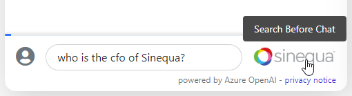
chat: A saved chat, to reload the previous messages, tokens and attachments. These conversations may beSavedChat(conversations manually saved by the user), or programmatically-constructed conversation starters (for example "take these documents and build a summary"). (thenullinput is needed if no other input is provided to the component)enableChat(default:true): Whether it is allowed to chat with ChatGPT (we may want to disable it sometimes, like when we just want to display a summary, or any desired message that we can setup with the prompt configuration).searchMode(default:false): When set to true, this enables "auto-search". This lets users trigger a Sinequa search query that constructs "attachments" (snippets of text from documents) that they can then inject in the conversation with ChatGPT. Auto-search is triggered directly from the Chat's input, by pressing the Tab key, or by click the Sinequa logo displayed to the right of the search bar.
query(default:SearchService.query): The query to interact with when making requests (like when searching for attachments while insearchMode).- All properties from
defaultChatConfigto override (model, UI, prompts, auto search properties)
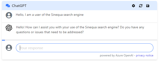
Here is the simplest possible usage of the chat component:
<sq-chat [chat]="null"></sq-chat>
Another example could be to provide the list of passages and ask for a summary:
const passages = this.searchService.results?.topPassages?.passages;
if(passages?.length) {
  const attachments = this.chatService.addTopPassages(passages, []);
  const prompt = `Please generate a summary of these passages`;
  const messages = [
    {role: 'system', display: false, content: prompt}
  ];
  this.chat = {messages, attachments};
}
<sq-chat [chat]="chat"></sq-chat>
Chat Settings
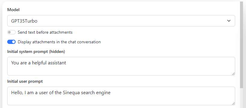
This component allows to edit a chat configuration, which corresponds to all properties from the ChatConfig interface.
It only requires the config input, and emits on reset when the user clicks on the Reset button.
<sq-chat-settings [config]="chatConfig"></sq-chat-settings>
Saved Chats
sq-chat offers the possibility to save a chat session in the User Settings. In order to load them back, the sq-saved-chat component can be used to display the list chats that have been saved.
The component requires no input parameter. It will only emit the SavedChat with the load input upon clicking on a chat name, and you can also delete them in this list if you wish.
Similar Documents Component
The SimilarDocumentsComponent is an Angular component that fetches and displays a list of documents similar to a given document. The similarity is determined by the DocumentSimilarityService.
<sq-similar-documents></sq-similar-documents>
Properties
| Name | Description |
|---|---|
| @input() documentId: string | The ID of the document for which to find similar documents. |
| @input() queryName: string | The name of the query to use when fetching similar documents. |
| @input() options: OptionsProps | An optional object of type OptionsProps that can contain additional parameters for the similarity service. |
@output()documentClick | An event that is emitted when a document in the list is clicked. The event payload is the SimilarDocument that was clicked. |
Methods
- ngOnInit()
Initializes the component and sets up a subscription to changes indocumentId,queryName, andoptions. When any of these inputs change, the component fetches the similar documents. fetchSimilarDocuments(documentId: string, queryName: string, options?: OptionsProps)
Fetches similar documents based on the provided document ID and query name. If an error occurs during the fetch, the list of similar documents is cleared.
Usage
Here is an example of how to use this component in a template:
<sq-similar-documents
  [documentId]="myDocumentId"
  [queryName]="myQueryName"
  [options]="{ expand: ['id', 'title', 'filename', 'fileext', 'authors'], params: { maxDocs: 3, minDocumentSimilarity: 0.5, maxDocumentSimilarity: 0.99 }, filters }"
  (documentClick)="handleDocumentClick($event)"
></sq-similar-documents>
In this example, myDocumentId and myQueryName would be properties in your component that contain the document ID and query name, respectively. handleDocumentClick would be a method in your component that handles the documentClick event.
options contains document similarity configuration settings.
expand: an array containing columns returned by the APIparams: document similarity settingsfilters: may contains query filters
How to cutomize?
In Angular, you can create a new component that extends SimilarDocumentsComponent to inherit its properties and methods. Here's how you can do it:
- Generate a new component. You can use the Angular CLI for this:
ng generate component CustomSimilarDocuments
- In your new component, extends
SimilarDocumentsComponent:
import { Component } from '@angular/core';
import { SimilarDocumentsComponent } from '@sinequa/components/similar-documents';

@Component({
  selector: 'app-custom-similar-documents',
  standalone: true,
  imports: [CommonModule],
  templateUrl: './custom-similar-documents.component.html',
  styleUrls: ['./custom-similar-documents.component.css']
})
export class CustomSimilarDocumentsComponent extends SimilarDocumentsComponent {
  // You can now use properties and methods from SimilarDocumentsComponent
}
- Now you can override methods or add new methods in your
CustomSimilarDocumentsComponent.