Modal Module
Features
The Modal module is divided into two parts:
- The generic part in
@sinequa\coreprovides service, and components declaration for the creation of popup modals, - The components in
@sinequa\componentsprovides overrides for the components in@sinequa\corefor styling, for Bootstrap (BsModalModule).
This documentation page focuses on the Bootstrap flavor components of Modal.
Please refer to the document of the core modal module for the usage of the generic module.
Import
import { LoginModule } from "@sinequa/core/login";
import { ModalModule } from "@sinequa/core/modal";

import { BsModalModule } from "@sinequa/components/modal"; // Bootstrap flavor of Modal

@NgModule({
    imports: [
        /*....*/
        LoginModule,
        ModalModule,
        BsModalModule, // Overrides login and modal components with Bootstrap components
        /*....*/
    ],
    /*....*/
})
This module is internationalized: If not already the case, you need to import its messages for the language(s) of your application. For example, in your app's src/locales/en.ts:
...
import {enModal} from "@sinequa/components/modal";

const messages = Utils.merge({}, ..., enModal, appMessages);
API usage
This module introduces the BsModal component that helps creating popup modal with Bootstrap styling.
This component provides the sq-modal selector that can be used to display a modal in the HTML template of your component
Example: The "New saved query" popup with BsModal
<form name="editSavedQuery" novalidate [formGroup]="form">
    <sq-modal [title]="'msg#editSavedQuery.title'" [buttons]="buttons">
        <div class="form-group sq-form-group">
            <label for="savedQueryName">
                {{'msg#editSavedQuery.name' | sqMessage}}
            </label>
            <input
                [sqValidation]="form"
                type="text"
                class="form-control"
                id="savedQueryName"
                formControlName="savedQueryName"
                spellcheck="off"
                sqAutofocus
            >
        </div>
    </sq-modal>
</form>
which yields the following popup
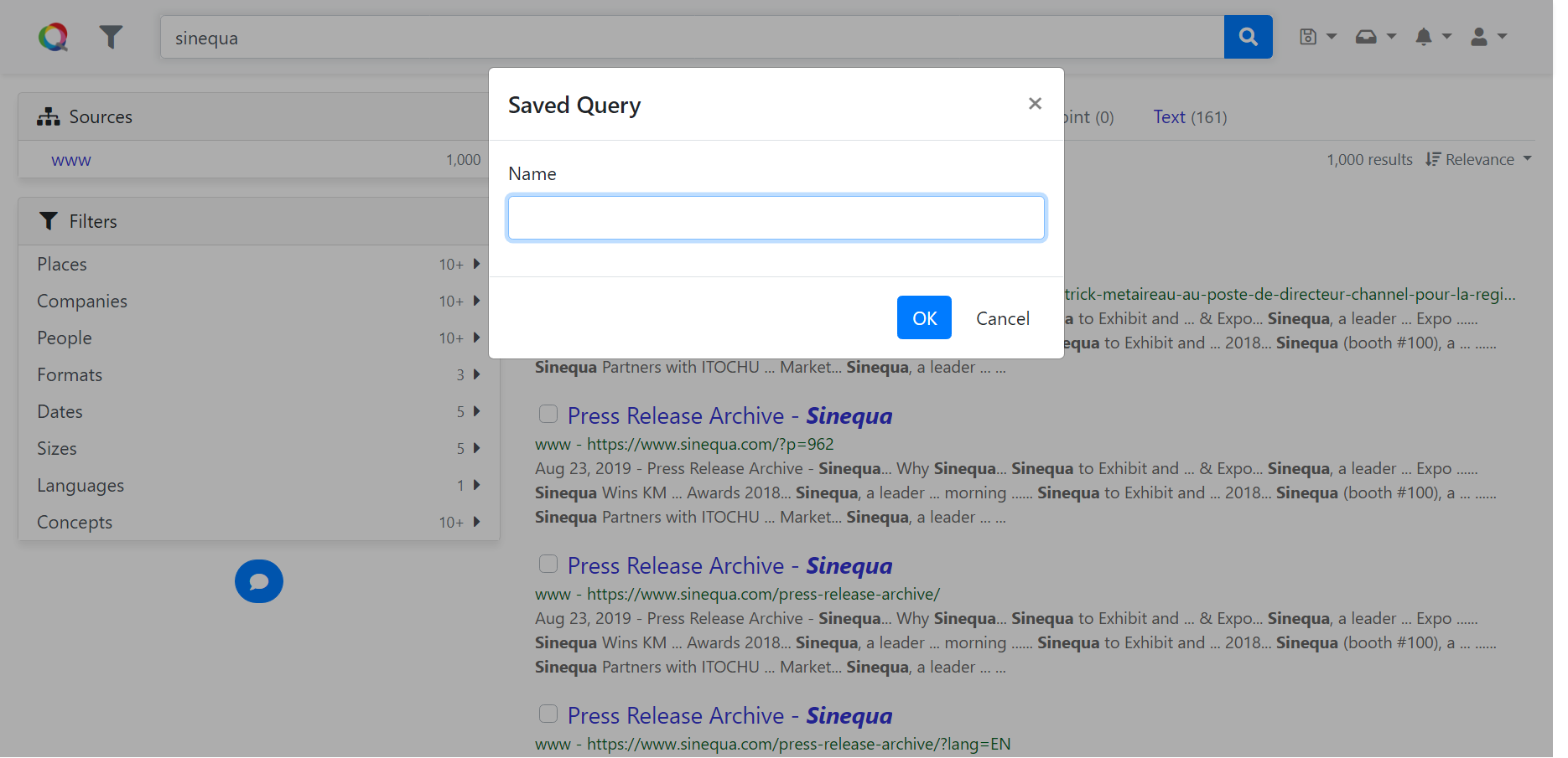 New saved query popup
The input of the components are
title: The title of the popup, could be internationalized (i18n) messagebuttons: The list of the buttons in the popup, each follows the interfaceIModalButton,showHeader: whether to show the header of the modal,trueby default,showFooter: whether to show the footer of the modal,trueby default.