Pepper
Pepper is a search & analytics app designed around a modular, interactive and collaborative dashboard.
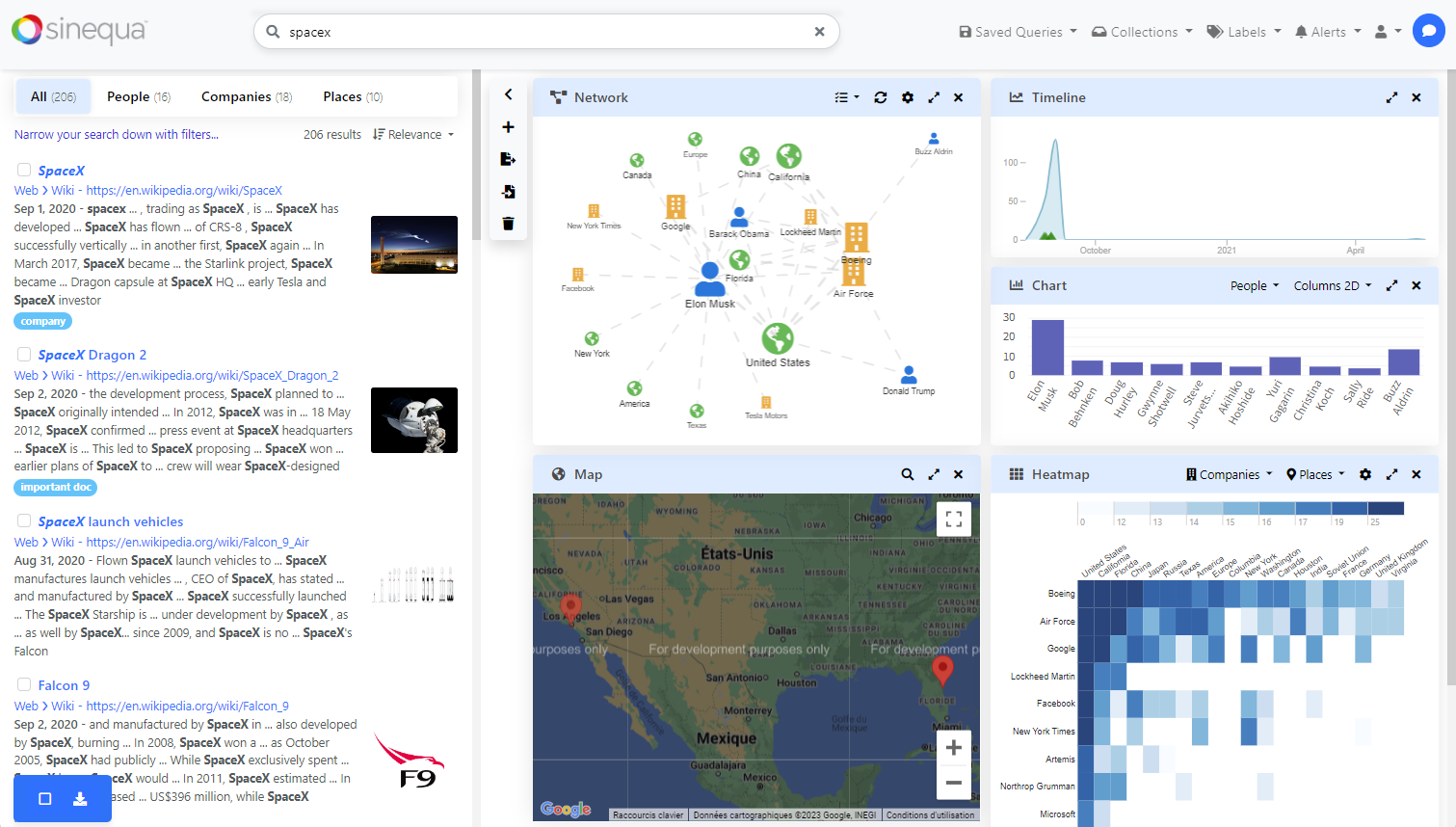
The Pepper SBA sample
Pepper has a single "search" route (which can easily replace the "search" route of Vanilla-Search if the "home" and "preview" routes are required).
Integrated search form
The search form of Pepper is more advanced than the one of Vanilla Search. Because of the reduced "UI real estate" of the dashboard, the search form integrates the filters and facets in addition to the traditional autocomplete.
This search form is composed of the following components:
- The
sq-search-formcomponent (from@sinequa/components/search-form), which displays the search input and the search button, and manages the expanded/collapsed state of the panel below. - The
sq-filters-viewcomponent (from@sinequa/components/filters), which displays the filters (if any) in normal mode or advanced mode (letting users customize their query more deeply). - The
sq-facet-containercomponent (from@sinequa/components/facet), which displays the list of available facets (aka "filters") and lets users click and open them. - The
app-autocompletecomponent (from the Vanilla Search application).
This search form can be customized by editing the app-search-form component of Pepper.
Dashboard
The dashboard of Pepper is based on the @sinequa/analytics/dashboard module, which itself is based on the angular-gridster2 library.
Dashboards can be customized by the user by dragging and resizing widgets and by adding new ones from a list of predefined widget types. A developer can easily add new widget types or configure the existing ones.
Pepper includes the following widgets by default:
- Network (from
@sinequa/analytics/network) - Google Maps (from
@sinequa/analytics/googlemaps) - Timeline (from
@sinequa/analytics/timeline) - Chart (from
@sinequa/analytics/fusioncharts) - Heatmap (from
@sinequa/analytics/heatmap) - Tag cloud (from
@sinequa/components/facet) - Money cloud and Money timeline (from
@sinequa/analytics/finance)
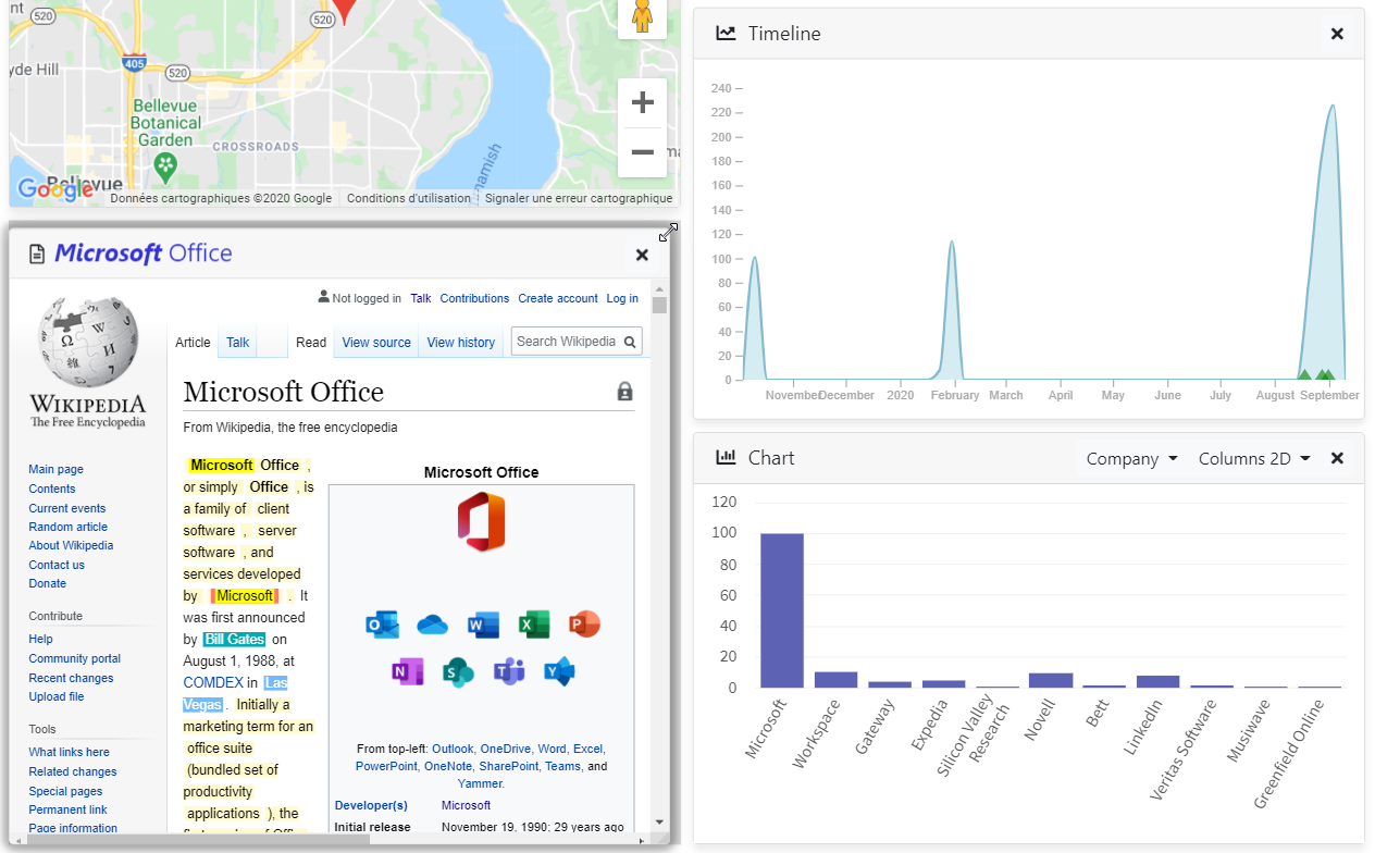
The dashboard also allows you to open multiple document previews by clicking on documents from the result list. When the dashboard is reopened, these previews are fetched again from the Sinequa indexes.
Architecture
Pepper's search route (app-search component) looks similar to Vanilla Search.
Pepper's dashboard is defined in the app-dashboard component, which is displayed in the app-search component:
<app-dashboard [results]="results"></app-dashboard>
The definition of the list of widgets and their configuration is done in the app-dashboard component. Its template looks as follows:
<sq-dashboard [dashboard]="dashboard">
  <ng-template let-widget>
    <sq-facet-card
      [title]="widget.state.title"
      [icon]="widget.icon"
      [collapsible]="false"
      [actions]="widget.actions"
      [ngSwitch]="widget.state.type">

      <widget-type-foo *ngSwitchCase="'foo'">

      <widget-type-bar *ngSwitchCase="'bar'">

      ...

    </sq-facet-card>
  </ng-template>
</sq-dashboard>
This snippet contains the following elements:
- The
sq-dashboardcomponent (from@sinequa/analytics/dashboard). This component handles the dashboard layout and configuration management. - The
ng-templateencapsulates one widget. Thesq-dashboardcomponent will create one instance of this template for each widget in the dashboard. - All widgets are displayed within an
sq-facet-cardcomponent (from@sinequa/components/facet). This component is used to display the widget title, icon and actions. - Within this card, an
ngSwitchdirective is used to display the appropriate widget component, depending on the type of the widget.
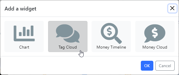
Internally, the app-dashboard component uses the DashboardService (from @sinequa/analytics/dashboard). This service handles the following tasks:
- Exporting and importing the dashboard state in JSON format.
- Displaying the "Add Widget" popup shown above.
- Creating new widgets based on a
WidgetOptionobject.
The app-dashboard component persists the state of the dashboard in the User Preferences.
Developing new widgets
Pepper is meant to be customized easily, especially to let developers create new types of widgets, either generic or specific to their project.
Adding a widget will impact different parts of the code, and the following must be considered:
- The widget must be displayed (within its parent component
app-dashboard). - The widget must be synchronized with other widgets and the results list.
- The widget might have properties that need to be persisted.
- The widget size must adapt to the dashboard grid.
Widget definition
A widget is defined by adding a new WidgetOption object to the list of options of the app-dashboard component. This object defines the following properties:
type: A unique identifier for the widget type.icon: The icon of the widget.text: The name of the widget (displayed next to the icon).state: An object that can be used to store a custom state of the widget (see below).init: A function that is called when the widget is created. This function can be used to initialize the state of the widget (see below).unique(default:true): A boolean indicating whether the widget is unique (only one instance of this widget can exist in the dashboard).maximizable(default:true): A boolean indicating whether the widget can be maximized (taking up the whole dashboard).removable(default:true): A boolean indicating whether the widget can be removed from the dashboard.renamable(default:false): A boolean indicating whether the widget can be renamed.rows(default:2): The number of rows the widget takes in the dashboard grid.cols(default:2): The number of columns the widget takes in the dashboard grid.
The widget's display must be implemented in the app-dashboard HTML template (see above). Adding a new component simply means adding a new "case" such as:
<my-custom-widget *ngSwitchCase="'my-custom-type'" [results]="results">
</my-custom-widget>
Widget creation / initialization
The creation of the widget can occur in different ways:
- By clicking the "Add Widget" button and selecting your widget type.
- On initialization, when a default dashboard is created.
- When another type of user action is taken (e.g., we open the preview when the user clicks on a document).
Add Widget popup
A custom widget will automatically be included in the "Add Widget" popup as soon as it is added to the list of WidgetOption objects in the app-dashboard component.
If you do not want your widget to be displayed in the popup, you can customize the addWidget() method of app-dashboard (there is already a special rule for excluding the preview widget).
Default dashboard
The list of widgets included in the default dashboard is defined in the app-dashboard component (defaultWidget property).
The default widgets include:
defaultWidgets = ['map', 'timeline', 'network', 'chart'];
Manual creation
Adding a widget programmatically (like when opening a document preview) can be done in 3 steps:
- Create a
WidgetOptionobject (see above). - Create a
Widgetobject by callingDashboardService.createWidget(option). - Add the widget to the dashboard by calling
DashboardComponent.add(widget). (Notice that theapp-dashboardcomponent has access to an instance ofDashboardComponent.)
Widget synchronization
The way the built-in widgets are designed is actually to avoid explicit synchronization, that is: to do nothing and keep the components independent from each other.
However, it is clear when using Pepper that some form of synchronization happens when the user interacts with a component. For example, if I use the map to filter the search results, all the other components that display parts of the results are updated.
The way it works is that the widgets respond only to an update of the global results. Widgets cannot talk to each other, but some user interactions (like selecting an area on the map) can trigger a refresh of the global results (which itself triggers a refresh of the widgets).
Similarly, widgets can listen to other types of global events. For example, the SelectionService keeps track of documents selected via their sq-result-selector checkbox (See Selection). If a widget displays a document in one form or another (like a pin on the map), it can update the pin display when the document becomes selected, and conversely select the document when the user clicks on the pin.
Widget persistence
Users expect that when they refresh the page, the dashboard is restored in the same state as they left it. This means that the state of the widgets must be persisted.
The dashboard component automatically persists any data stored in the widget.state object. This object is serialized in JSON format and stored in the user preferences.
To persist or not to persist
Not all of the state needs to be persisted. For example, your custom widget might look like the following:
<my-custom-widget *ngSwitchCase="'my-custom-type'"
  [constant]="'Hello world'"
  [results]="results"
  [parameter]="widget.parameter"
  [parameterPersistent]="widget.state.parameter">
</my-custom-widget>
This example shows different types of inputs that a widget can have:
- Constants: fixed values that are hard-coded or defined in the app configuration.
- Variables: Values that may change at any time (for example, the
resultsobject). - Parameters: values defined when the widget is created and stored in the
widgetobject (but lost or recomputed when you refresh the page). - Persistent parameters: parameters that are stored in
widget.stateand persisted in the user settings.
Only the minimum amount of information should be persisted in widget.state. If a complex object can be re-computed based on the state, it is better to do so than to persist it.
For example:
- If your component expects a
Resultsobject, do not store theResultsobject in the state. Instead, store theQueryobject and generate theResultsobject when the widget is created. - If your component expects a
Recordobject, store theidof the record and generate theRecordobject when the widget is created.
For example, in the standard components, the persisted items include:
- For all widgets: Widget size and position in the dashboard.
- For the preview widget: id of the opened document and the search query yielding that document.
- For the chart widget: Selected aggregation and chart type.
Initializing the widget
The definition of the WidgetOption is very important to properly initialize the state. For example:
option = {
  type: "my-custom-type",
  icon: "fas fa-chart-bar",
  text: "My custom widget",
  ...defaultOptions,
  state: {
    param: "Hello world",
  },
  init: (widget) => widget.otherParam = createComplexObject(widget),
}
In the above example, param is the default state (that can be later modified during the life of the widget). otherParam is a complex object that is generated when the widget is created and does not need to be persisted.
Note that the init method will also be called when the widget is restored from the user preferences to guarantee that otherParam is always defined.
Handling state changes
If the (persisted) state of your custom widget changes, it should be reflected in the user preferences.
The simplest way to achieve this is to call DashboardComponent.update(widget, state), where state is only a "patch" of the state that has changed.
For example, when the user modifies the chartType property of a chart widget, an event handler is called:
(typeChange)="dashboardComponent.update(widget, {chartType: $event})"
(In turn, the sq-dashboard component triggers a (changed) event handled by the app-dashboard component, which saves the state in the user preferences.)
Widget sizing
One difficulty in building widgets is that their size is strongly constrained by the dashboard, so the components cannot take their ideal size. They must be able to adapt to any size (for example, by forcing a width and height of 100% or by scrolling vertically or horizontally) or conform to an explicit size (in pixels) provided by the parent (sq-dashboard) via the widget.width and widget.height properties.
The built-in components behave differently in that respect:
- The network's canvas takes the available space using
width: 100%andheight: 100%. - The charts are explicitly resized when the dashboard is initialized or resized.
- The map's
heightis bound explicitly (i.e., the width is automatically 100%). - The heatmap and timeline are svg-based and are redrawn when resized. Therefore, the
widthandheightare explicitly bound.
For example a custom widget with a fixed size and scrollable content might look like:
<div *ngSwitchCase="'my-custom-type'"
  class="overflow-auto"
  [ngStyle]="{
    'height.px': widget.height,
    'width.px': widget.width
  }">
  content
</div>
If your component must be redrawn when its size changes, it is likely to need an interface similar to the timeline or heatmap components. Concretely, it will probably require explicit width and height inputs (probably with default values). The ngOnChange() will then catch any change of dimension from the parent and trigger the redrawing:
@Input() width = 600;
@Input() height = 400;

ngOnChanges(changes: SimpleChanges) {
    if(changes['width'] || changes['height']) {
        redraw();
    }
}
The width and height inputs may also be used in the template. For example:
<svg width="{{width}}" height="{{height}}">
   ...
</svg>