Modal Module
Features
This module helps creating popups to inform end-user of an information or to prompt for some input from the user. For example, the popup that is shown when creating a new user alert.
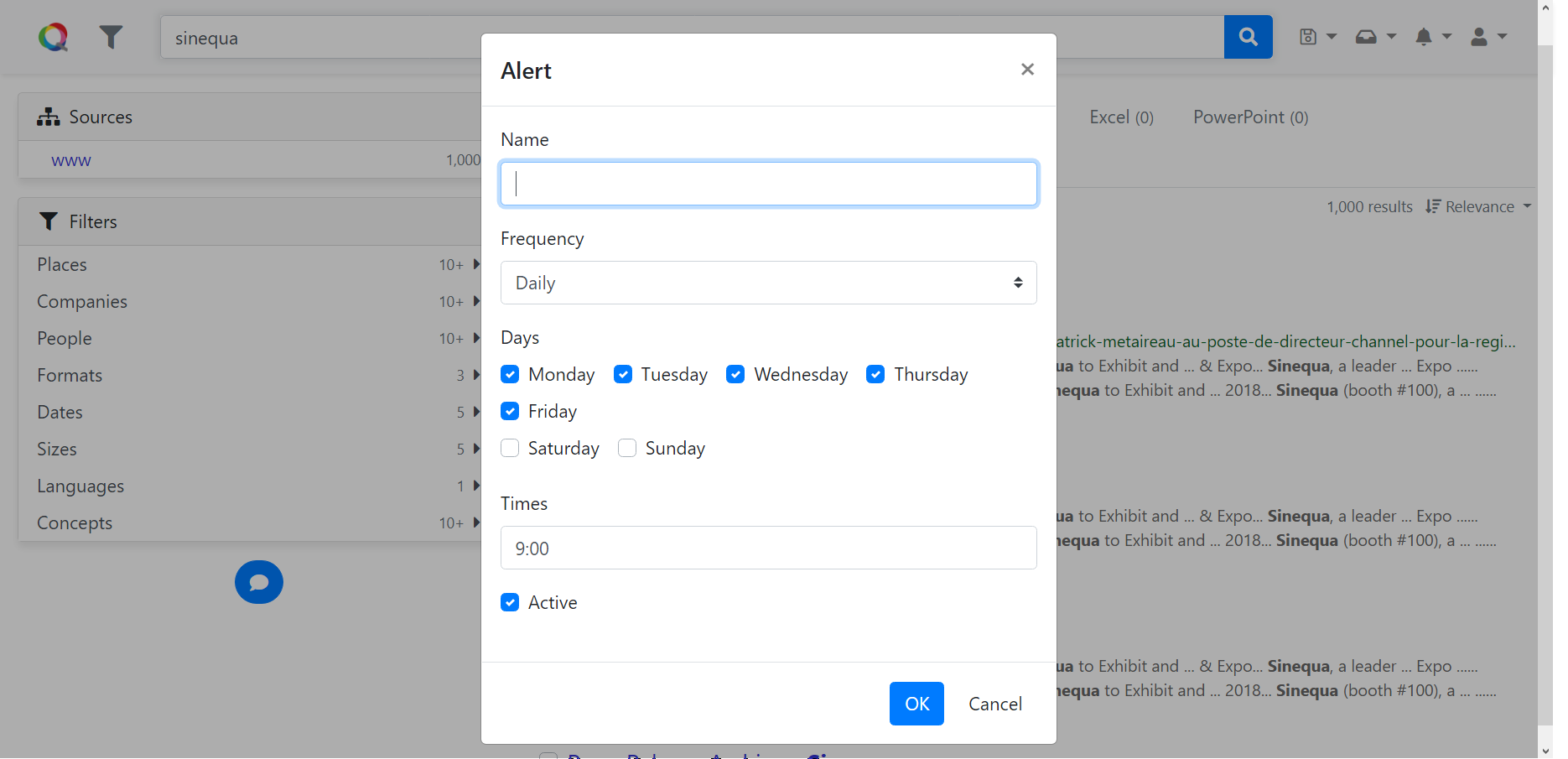 Create alert popup
Import
Add import { ModalModule } from "@sinequa/core/modal"; into your app.module.ts.
Include ModalModule in Angular import declaration of app.module.ts.
@NgModule({
    imports: [
        /*....*/
        ModalModule.forRoot(),
        /*....*/
    ],
    /*....*/
})
API usage
The most important declaration of this module is the ModalService which provides ways to rapidly create a popup and
to wait for the user interaction with the popup.
ModalService
The ModalService can be injected to your component when you need to inform user or to ask for user interaction
before executing a procedure.
The service provides four public methods that creates four commonly types of popup:
ModalService.oK() is the simplest way to create an informative popup.
Example 1: a component that create a simple popup with OK button to inform user
import { Component, OnInit, Input, OnDestroy } from '@angular/core';
import { ModalService } from '@sinequa/core/modal';

@Component({
  selector: 'my-component',
  templateUrl: './my.component.html'
})
export class MyComponent {

    constructor(private modalService: ModalService) {
    }

    /* some component logics */

    private someFunctionThatNeedsToInformUser() {
        this.modalService.oK('Hello world!');
    }
}
When the method someFunctionThatNeedsToInformUser() is called the following popup appears on the application.
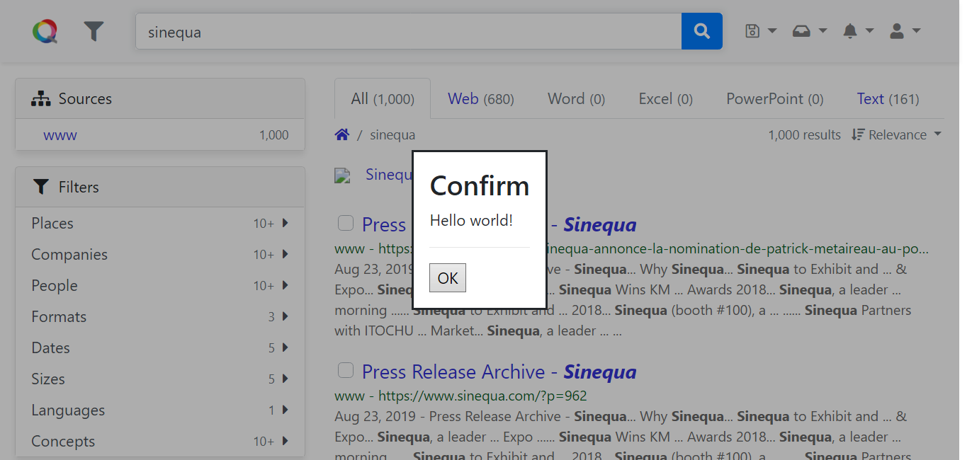 Ok popup
The signature of the method is
oK(
    message: string,                    // The message to display to user, can be internationalized (i18n) message.
    messageParams?: MessageParams,      // The format parameters for the message if i18n
    title?: string,                     // The title of the popup, could be i18n message.
    confirmType = ConfirmType.Success   // The type of the confirmation
): Promise<ModalResult>                 // A Promise to wait for user interaction
The valid values of ConfirmType are Success, Info, Warning, Error.
The next method is ModalService.oKCancel(), which creates a popup with two buttons OK and Cancel.
The signature of the method is
oKCancel(
    message: string,                // The message to display to user, can be internationalized (i18n) message.
    messageParams?: MessageParams,  // The format parameters for the message if i18n
    title?: string,                 // The title of the popup, could be i18n message.
    confirmType = ConfirmType.Info, // The type of the confirmation
    primaryButton = ModalResult.OK  // The primary button, ie. the auto-focused button, that will be clicked if user clicks Enter directly
): Promise<ModalResult>             // A Promise to wait for user interaction
Example 2: A warning popup with OkCancel
this.modalService.oKCancel('Here is some important information', {}, 'Info', ConfirmType.Warning);
Which yields
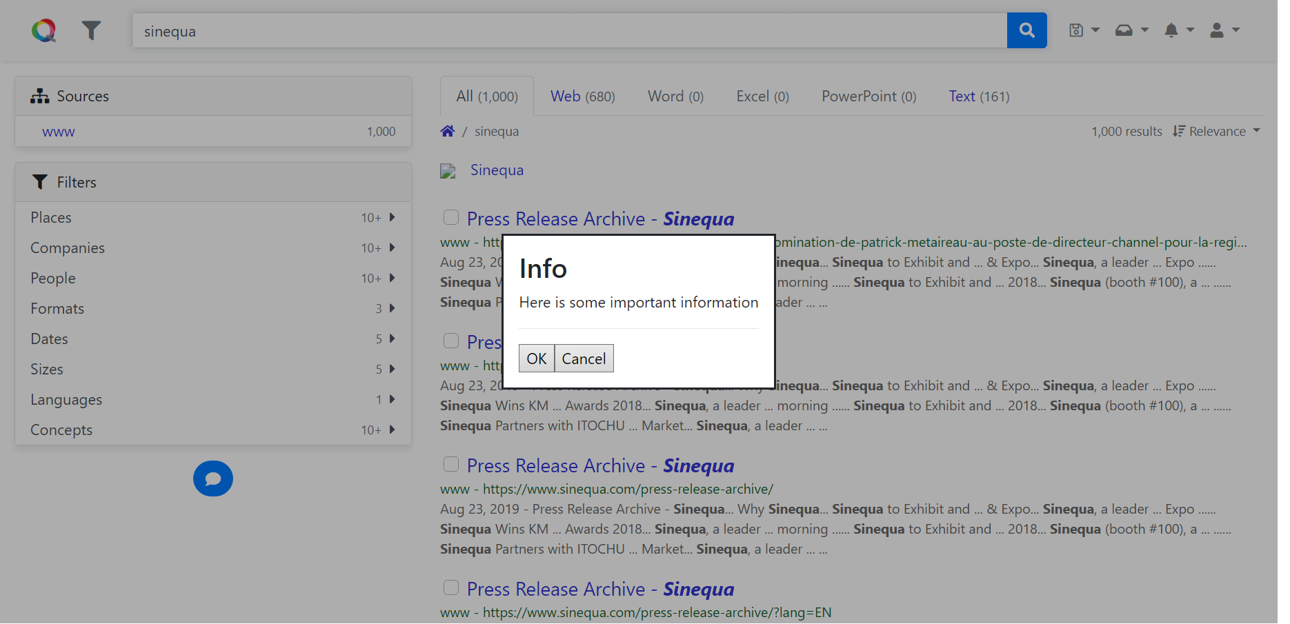 Ok Cancel popup
Alternatively, the ModalService provides the method yesNo() to create a popup with two buttons Yes and No, which is essentially the same as okCancel() but with different button naming.
The signature of the method is
yesNo(
    message: string,                // The message to display to user, can be internationalized (i18n) message.
    messageParams?: MessageParams,  // The format parameters for the message if i18n
    title?: string,                 // The title of the popup, could be i18n message.
    confirmType = ConfirmType.Info, // The type of the confirmation
    primaryButton = ModalResult.OK  // The primary button, ie. the auto-focused button, that will be clicked if user clicks Enter directly
): Promise<ModalResult>             // A Promise to wait for user interaction
Example 3: A question popup with YesNo
this.modalService.yesNo('Do you want to perform the operation ?', {}, 'Question', ConfirmType.Info);
Which yields,
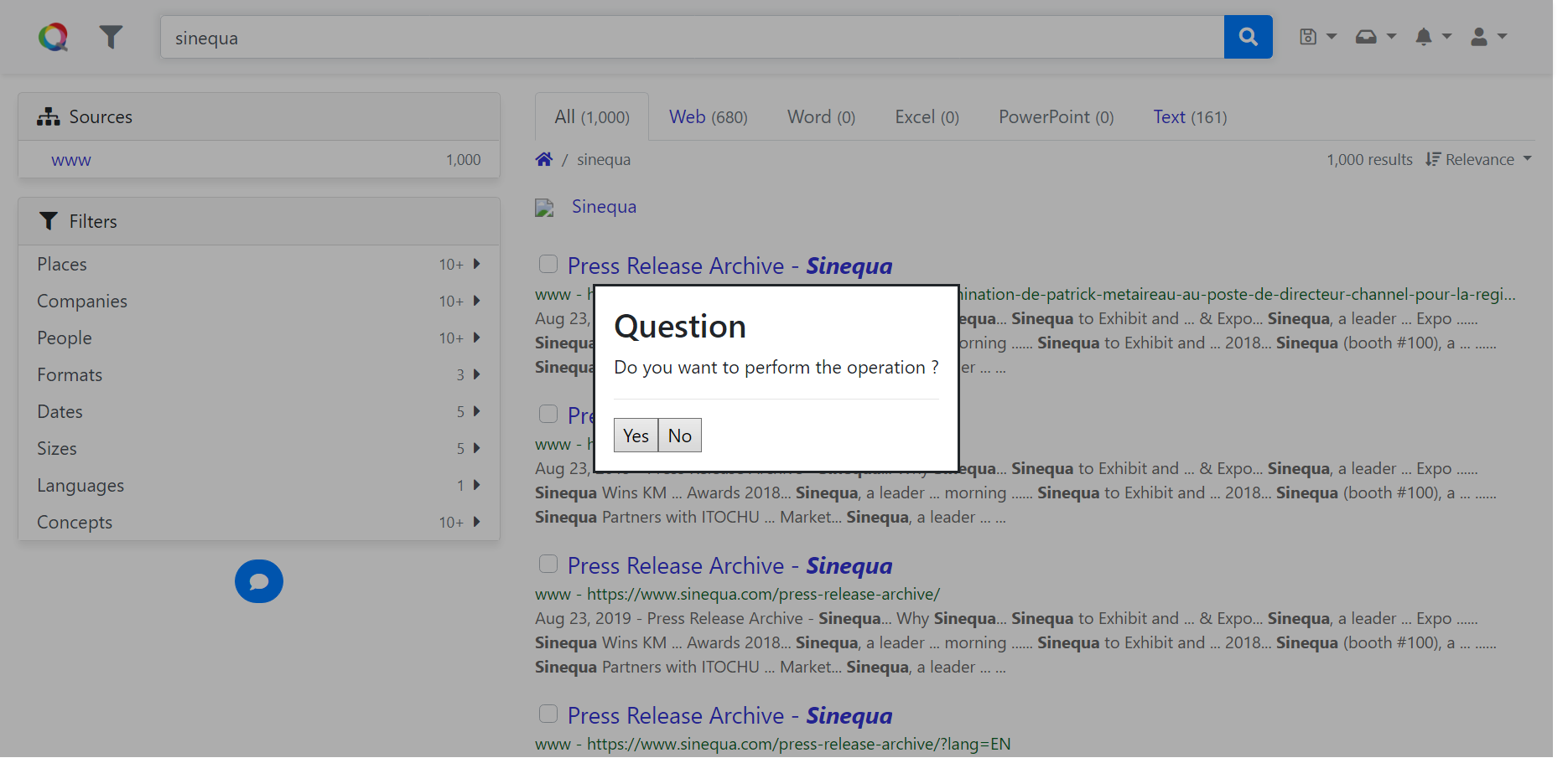 Yes No popup
Finally, if you want to create a popup that does not fit in those proposed by ModalService, you can use ModalService.confirm().
The signature of the method is
confirm(
    options: ConfirmOptions // The options to configure the popup modal
): Promise<ModalResult>     // A Promise to wait for user interaction
The input of this method is a ConfirmOptions
interface ConfirmOptions {
    title?: string;                 // The title of the popup, could be i18n message.
    message: string;                // The message to display to user, can be internationalized (i18n) message.
    messageParams?: MessageParams;  // The format parameters for the message if i18n
    confirmType?: ConfirmType;      // The type of the confirmation
    buttons: ModalButton[];         // The buttons to display on the popup
}
Each button of a popup is of type ModalButton,
which can be created by new ModalButtion(options).
The input of the constructor is of type IModalButton
interface IModalButton {
    result: ModalResult;    // The result associated with the button.
    primary?: boolean;      // Indicates whether this button is the primary button amongst a set of buttons.
    text?: string;          // The button text.
    visible?: boolean;      // Indicates whether the button is currently visible.
    validation?: FormGroup; // The validation `FormGroup` that should be tested when the button is
                            // clicked. The button will only perform its `action`
                            // when the validation is `valid`.
    anchor?: boolean;       // Indicats whether the button should be rendered with an `<a>` tag
                            // rather than a `<button>` tag.

    action?: (button: ModalButton) => void; // The action to perform when the button is clicked.
                                            // Buttons with `result` values other than `Custom`
                                            // also close the modal.
}
Example 4: A customized popup with ModalService.confirm()
this.modalService.confirm({
    title: 'Some random title',
    message: 'Hello world!',
    confirmType: ConfirmType.Info,
    buttons: [
        new ModalButton({
            text: 'Yeah wow',
            action: () => { },
            result: ModalResult.OK
        }),
        new ModalButton({
            text: 'Whatever',
            action: () => { },
            result: ModalResult.Ignore
        })
    ]
});
Which yields,
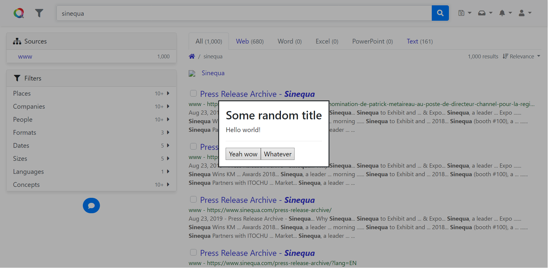 Custom popup
All these methods are backed by ModalService.open().
All the modals displayed by ModalService.open() are dynamically created, not by including them in the HTML template of the caller component.
The signature of this method is
open(
    component: Type<any>,       // The component represents the popup modal to be displayed
    config: ModalConfig = {}    // The configuration of the popup modal
): Promise<ModalResult>         // A Promise to wait for user interaction
The configuration of a modal is a ModalConfig
interface ModalConfig {
    panelClass?: string | string[];     // Classes that should be added to the `Overlay` pane.
    hasBackdrop?: boolean;              // Indicates whether a backdrop should be added when opening the modal.
    backdropClass?: string | string[];  // Classes that should be added to the backdrop.
    model?: any;                        // The data model that the modal will operate on.
    width?: string;                     // The CSS width of the modal.
    height?: string;                    // The CSS height of the modal.
    fullscreen?: boolean;               // Indicates whether the modal should occupy the screen width and height.
                                        // In this case  `width` and `height` are set to `100%`
                                        // and the `sq-modal-fullscreen` class is added to `panelClass`
    closeOnBackdropClick?: boolean;     // Indicates whether a click on the backdrop should close the modal. The default value is `true`.
}
As it is shown in the signature of ModalService.open(), any component can be hoisted by this method as a popup modal in the application.
The default popup component is injected via the Injection token MODAL_CONFIRM.
You can change the default popup component in the Angular provider declaration of your app.module.ts.
import { /*...,*/ MODAL_CONFIRM} from "@sinequa/core/modal";

@NgModule({
    /*....*/
    providers: [
        /*....*/
        { provide: MODAL_CONFIRM, useValue: MyConfirmComponent }
        /*....*/
    ],
    /*....*/
})
Or you can call your popup component directly with ModalService.open().
In effect, many of the popups used by Sinequa components are created using this method. Here are some examples of popup components:
| Component name | UI popup |
|---|---|
BsEditSavedQuery | New saved query |
BsManageSavedQueries | Manage saved queries |
BsEditAlert | Alert |
BsEditBasket | Basket |
When hoisting the modal popup with your own component, you may want to transfer data back and forth with the component.
For that you need to inject MODAL_MODEL into your component, and then transfer the data object to model property when calling ModalService.open().
Example 5: transferring data to custom popup component
/********* mypopup.component.ts *********/

import { Component, OnInit, OnDestroy, Inject } from "@angular/core";
import { MODAL_MODEL } from "@sinequa/core/modal";
/* ... */
@Component({
    /* ... */
})

export class MyPopup implements OnInit, OnDestroy {
    /* ... */
    constructor(
        /* ... */
        @Inject(MODAL_MODEL) public model: SomeDataObject,
        /* ... */
    ) {
        /* ... */
    }
    /* ... */
}


/********* some component calling mypopup.component.ts *********/

import { Component, OnInit, OnDestroy, Inject } from "@angular/core";
import { ModalService, ModalResult, ModalConfig } from "@sinequa/core/modal";
import { MyPopup, SomeDataObject } from "the/path/to/mypopup";
/* ... */
@Component({
    /* ... */
})

export class MyComponent implements OnInit, OnDestroy {
    /* ... */

    constructor(
        /* ... */
        private modalService: ModalService,
        /* ... */
    ) {
        /* ... */
    }

    private callMyPopup(): Promise<void> {
        const data: SomeDataObject = { /* ... */ };
        const modalConfig: ModalConfig = {
            /* ... */
            model: data,
            /* ... */
        }
        this.modalService
            .open(MyPopup, modalConfig)
            .then((popupResult: ModalResult) => {
                switch (modalResult) {
                    /* react to the modal result*/
                }
            });
    }
    /* ... */
}