FusionCharts Module
This module is an integration of the FusionCharts library.
Features
FusionCharts is a charting library which usage is permitted within the scope of a Sinequa-based project.
This module includes few components which expose a limited sample of the FusionChart functionalities. The FusionCharts library includes many rich and configurable charts which are not covered (see advanced customization below).
Import
Import this module in your app.module.ts and load the charts and themes that you need via the forRoot() method. An example of these imports is available in the Pepper application's app.module.ts.
import { FusionChartsModule } from '@sinequa/analytics/fusioncharts';

// Import FusionCharts library and chart modules
import * as FusionCharts from "fusioncharts";
import * as charts from "fusioncharts/fusioncharts.charts";
// Fusion is a light theme, Candy is a dark theme
import * as FusionTheme from "fusioncharts/themes/fusioncharts.theme.fusion";
import * as CandyTheme from "fusioncharts/themes/fusioncharts.theme.candy";

@NgModule({
  imports: [
    ...
    FusionChartsModule.forRoot(FusionCharts, charts, FusionTheme, CandyTheme),
FusionChart Component
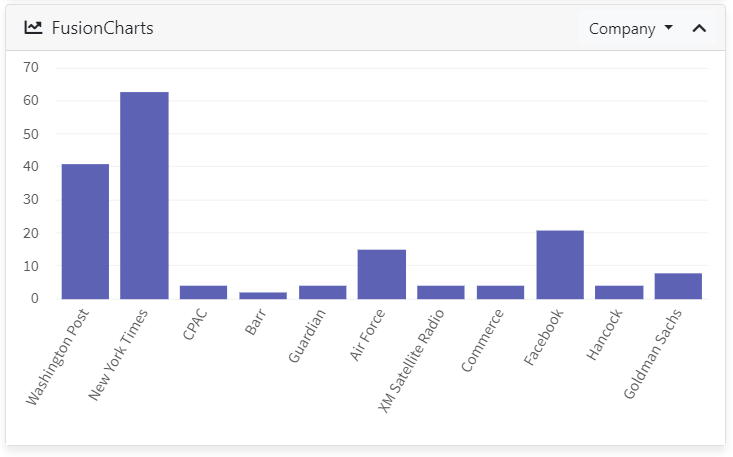
The sq-fusion-chart component displays a chart (multiple types are supported), given at least a Results input and the name of an aggregation (as configured in the query web service).
Chart type
Additionally, an input type can be specified to change the type of chart. Currently, only column2d, bar2d, pie2d and doughnut2d have been tested (and their "3d" equivalents). Other types listed in the FusionCharts documentation might work as well but could expect different types of input or options.
For example:
<sq-facet-card [icon]="'fas fa-chart-line'" [title]="'FusionCharts'">
    <sq-fusion-chart #facet [type]="'doughnut3d'" [results]="results" [aggregation]="'Company'"></sq-fusion-chart>
</sq-facet-card>
Displays the following:
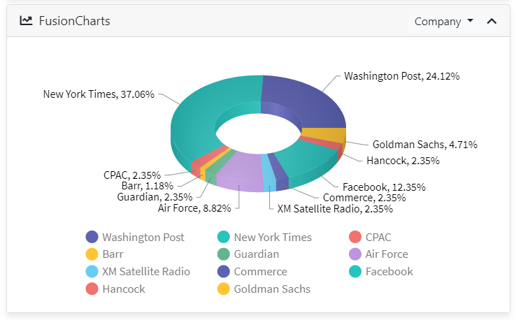
⚠️ We actually do not recommend using Pie or Doughtnut charts to display long-tail aggregations as in the example, since it can be misleading: Only the top ten values are displayed here, but the chart looks as if all these values make up 100% of the data.
Multiple aggregations
The component also accepts an input aggregations, which is the list of names of alternative aggregations that can be plotted instead of the primary aggregation. If provided, the facet header includes a drop-down menu allowing the user to select which aggregation he wants to plot.
<sq-facet-card [icon]="'fas fa-chart-line'" [title]="'FusionCharts'">
    <sq-fusion-chart #facet [results]="results" [aggregation]="'Company'" [aggregations]="['Company','Person','Geo']"></sq-fusion-chart>
</sq-facet-card>

Width and Height
The component accepts width and height parameters with the following defaults:
width = '100%'height = '350'(Note that the input is expected as astringand it should NOT contain a suffix likepx, although%works fine)
Chart options
A chart input can be provided to the component. It must have the same structure as in the FusionCharts documentation (this object is always nested within the dataSource object).
The default is:
export const defaultChart = {
    "theme": "fusion",
    "labelDisplay": "rotate",
    "slantLabel": "1"
}
(Note that these default values have the effect of tilting the x axis labels in the default Column2D chart)
Colors
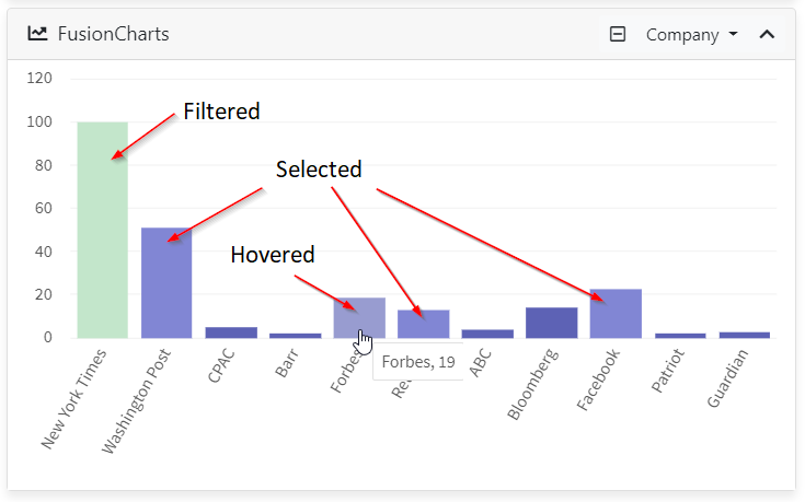
By default, a FusionCharts theme is used (it can be modified using the above chart options). However it is possible to specify your own color for displaying the data items:
defaultColor: When specified, will be used as the background color for the data items (eg. the bars of a bar chart).filteredColor(default:#C3E6CB): Displays the filtered items (items that have been clicked on to filter the results) in a distinctive color.selectedColor(default:#8186d4): Displays the items that belong to a selected document (managed by theSelectionService- see Selection Module) in a distinctive color.
MultiLevelPieChart Component
The sq-multi-level-pie-chart component displays a special type of chart that allows you to show symmetrical and asymmetrical tree structures in a consolidated pie-like structure. It presents the entire hierarchical data in a single-screen snapshot, which makes it a preferred choice over a tree view.
This chart type belongs to PowerCharts XT. Thus, it requires an additional import :
import { FusionChartsModule } from '@sinequa/analytics/fusioncharts';

// Import FusionCharts library and chart modules
import * as FusionCharts from "fusioncharts";
import * as charts from "fusioncharts/fusioncharts.charts";
import * as powerCharts from "fusioncharts/fusioncharts.powercharts";
// Fusion is a light theme, Candy is a dark theme
import * as FusionTheme from "fusioncharts/themes/fusioncharts.theme.fusion";
import * as CandyTheme from "fusioncharts/themes/fusioncharts.theme.candy";

@NgModule({
  imports: [
    ...
    FusionChartsModule.forRoot(FusionCharts, charts, powerCharts, FusionTheme, CandyTheme),
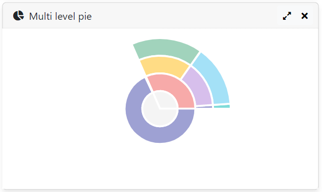
Its most basic usage is as follow:
<sq-facet-card [icon]="'fas fa-chart-pie'" [title]="'Multi level pie'">
    <sq-multi-level-pie-chart #facet [results]="results" [aggregation]="'Treepath'"></sq-multi-level-pie-chart>
</sq-facet-card>
Which displays the following
Custom data
This component has an input data, which implements the following interface Category :
export interface Category extends AggregationItem, TreeAggregationNode {
    label: string;
    originalLabel: string;
    value: number | string;
    tooltext?: string;
    color?: string;
    showLabel?: boolean;
    showValue?: boolean;
    category?: Category[];
}
⚠️ If provided, the component will plot this custom data and ignore the input aggregation even if it is defined.
<sq-facet-card [icon]="'fas fa-chart-pie'" [title]="'Multi level pie'">
    <sq-multi-level-pie-chart #facet [results]="results" [data]="data"></sq-multi-level-pie-chart>
</sq-facet-card>
Since custom data can require some specific processes different than default methods, it is possible to override the following inputs :
    /**
     * A function that returns true this component is already filtering the query
     */
    @Input()
    hasFiltered = () => {
        return this.facetService.hasFiltered(this.getName());
    }
    /**
     * A function that returns true the aggregationItem match a selected document
     */
    @Input()
    isSelected = <T extends AggregationItem | TreeAggregationNode>(item: T) => {
        if (this.isTree()) {
            return this.selectedValues.has((item as TreeAggregationNode).$path!.toLowerCase()) && this.selectedColor;
        }
        return this.selectedValues.has(Utils.toSqlValue(item.value).toLowerCase()) && this.selectedColor;
    }
    /**
     * Callback used to apply custom operations (sort, filter ...) on a tree nodes
     */
    @Input() initNodes = (nodes: TreeAggregationNode[], level: number, node: TreeAggregationNode) => {}
Width and Height
Same as the sq-fusion-chart component, it accepts width and height parameters with the following defaults:
width = '100%'height = '350'(Note that the input is expected as astringand it should NOT contain a suffix likepx, although%works fine).
Chart options
A chart input can also be provided to this component. It must have the same structure as in the FusionCharts documentation (this object is always nested within the dataSource object).
The default is:
export const defaultMultiLevelChart = {
    "theme": "fusion",
    "highlightParentPieSlices": true, // automatically highlight parent slices when you hover over the child pie slices
    "highlightChildPieSlices": false, // prevent child pie slices from getting highlighted, when you hover over the parent slices
    "showPlotBorder": true,
    "piefillalpha": 60,
    "pieborderthickness": 3
}
Additional useful inputs can be used to customize the component's display :
showLabels: (false by default) Show/hide ALL plots' label.showValues: (false by default) Show/hide ALL plots' value next to labels.showPercentValues: (false by default) f enabled along withshowValues, values of ALL plots will be shown as percentages.showToolTip: (true by default).plottooltext: ("$label, $value, $percentValue" by default) Configure the tooltip text of plots.
Colors
The same colors' choice is used, by default, in both FusionChart and MultiLevelPieChart components.
Advanced Customization
The sq-fusion-chart component is a wrapper of the fusioncharts directive. It takes the Sinequa data structures (aggregations), and converts them into a "datasource" object, which is the structure that the Fusion Charts library expects.
When advanced customizations are needed (custom types of charts or data structures), it is possible to use the fusioncharts directive directly. This directive is included in the FusionChartsModule, so the sample imports shown above work just the same.
<fusioncharts
    [width]="width"
    [height]="height"
    [type]="type"
    [dataSource]="dataSource"
    (initialized)="onInitialized($event)"
    (dataplotClick)="dataplotClick($event)"
    >
</fusioncharts>
This approach gives access to the full range of chart types and events supported by Fusion Charts, but requires you to generate the dataSource object and manage its lifecycle manually.