Timeline Module
Features
This module includes a Timeline visualization for temporal data based on the D3 library. The timeline can display continuous time series (as a line/area plot) or punctual events (as interactive symbols).
The module includes three components:
- A timeline component taking data as an input and displaying it, unaware of Sinequa's API and data structures.
- A "facet" component taking care of fetching, updating and pre-processing the data, and passing it to the timeline component.
- A "facet" Date component that can be used to filter the search results by date.
Import
Import this module in your app.module.ts.
import { BsTimelineModule } from '@sinequa/analytics/timeline';

@NgModule({
  imports: [
    ...
    BsTimelineModule
Timeline Component
Time series
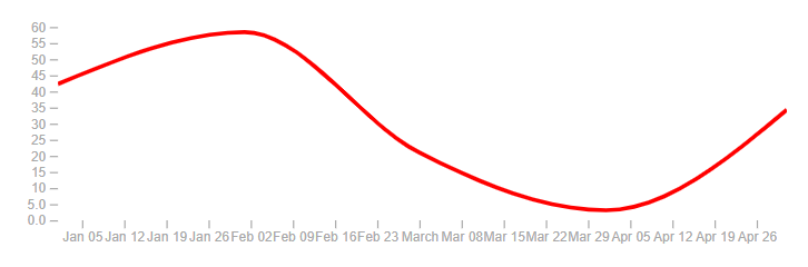
The sq-timeline component displays a SVG built with both D3 and Angular. Its most basic usage is as follow:
Additionally, the timeseries object (of type TimelineSeries) can take 3 additional parameters: lineStyles and areaStyles which allow to style the chart with css-like rules (SVG rules passed via ngStyle), and showDatapoints which allows to visualize the data points when hovering the timeline with the mouse.
this.timeseries = [
    {
        name: 'my series',
        dates: [
            ...
        ],
        primary: true,
        lineStyles: {'stroke': 'red', 'stroke-width': '3px'},
        areaStyles: {'fill': 'none'},
        showDatapoints: true
    }
];
You can combine multiple series. At least one must have primary: true to serve as reference for computing the x-axis.
this.timeseries = [
    {
        name: 'series 1',
        dates: [
            {date: new Date('2020-01-01'), value: 42.3},
            {date: new Date('2020-02-01'), value: 58.4},
            {date: new Date('2020-03-01'), value: 21.0},
            {date: new Date('2020-04-01'), value: 3.1},
            {date: new Date('2020-05-01'), value: 34.3},
        ],
        primary: true,
        lineStyles: {'stroke': 'red'},
        areaStyles: {'fill': 'none'},
        showDatapoints: true
    },
    {
        name: 'series 2',
        dates: [
            {date: new Date('2020-03-01'), value: 42.0},
            {date: new Date('2020-04-01'), value: 46.1},
            {date: new Date('2020-05-01'), value: 21.3},
            {date: new Date('2020-06-01'), value: 4.3},
            {date: new Date('2020-07-01'), value: 10.4},
        ],
        primary: true,
        lineStyles: {'stroke': 'green'},
        areaStyles: {'fill': 'none'},
        showDatapoints: true
    },
    {
        name: 'series 3',
        dates: [
            {date: new Date('2019-11-01'), value: 60.1},
            {date: new Date('2019-12-01'), value: 59.3},
            {date: new Date('2020-01-01'), value: 23.3},
            {date: new Date('2020-02-01'), value: 78.4},
            {date: new Date('2020-03-01'), value: 45.0},
        ],
        primary: false,
        lineStyles: {'stroke': 'blue'},
        areaStyles: {'fill': 'none'},
        showDatapoints: true
    }
];
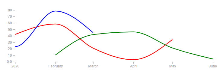 The X-axis is computed to fit the red and green series as they are primary series
It is also possible to change globally how the component renders these areas and curves by binding the curveType input property. By default, it is set to "curveMonotoneX", but any of the methods described on this page can be selected.
Events
In addition to timeseries, this component can display events, of type TimelineEvent:
<sq-timeline [data]="timeseries" [events]="events"></sq-timeline>
With:
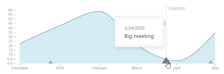
this.events = [
  {id: '1', date: new Date('2019-12-25'), display: 'Christmas!'},
  {id: '2', date: new Date('2020-03-24'), display: 'Big meeting'},
  {id: '3', date: new Date(), display: 'Now!'},
]
Like for the timeseries, it is possible to customize the size and style of each event with the following optional properties:
size(default: 6): Height of the marker in pixelssizeOpened(default: 12): Height of the marker in pixels when the event is selected (with a click)styles: Custom style object for this element, passed to the SVG element viangStyle.
this.events = [
  {id: '1', date: new Date('2019-12-25'), display: 'Christmas!', size: 10},
  {id: '2', date: new Date('2020-03-24'), display: 'Big meeting', sizeOpened: 20},
  {id: '3', date: new Date(), display: 'Now!', styles: {fill: 'red', stroke: 'orange'}},
]
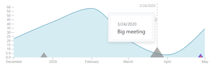
By default, when an event is selected, a tooltip is displayed, showing the event's date and display property. It is possible to pass a custom template to the component to display the event in a completely custom way:
{% raw %}<sq-timeline [data]="timeseries" [events]="events">
    <ng-template #tooltipTpl let-event>
        <div class="custom-display">
            <span>{{ event.display }}</span>
            <span style="color: red;">{{ event.date | sqDate }}</span>
        </div>
    </ng-template>
</sq-timeline>{% endraw %}

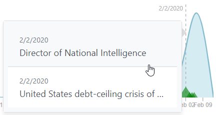
When there are too many events in the same timeframe, the events are grouped together under one marker. When the user zooms in or zooms out, the events are grouped/ungrouped appropriately. The tooltip diplays the list of events under one marker. Note that the size and style of the marker is the one of the first marker (chronologically).
Note that the X-axis is not resized in function of events (only the primary time series). A different implementation would be possible, to account for both the series and events.
Interactions
The component allows different types of interactions:
-
Zooming: Performed via the mouse wheel. Zooming is effective only along the X-axis. When zooming is finished, an event is triggered, so that the parent component can respond (for example by refreshing the data).
<sq-timeline [data]="timeseries" (rangeChange)="refreshData($event)"></sq-timeline>The
$eventin question contains the new minimum and maximum dates of the X-axis in an array ([Date, Date]).Zooming is enabled by default but can be turned off by binding
[zoomable]="false"to the component.It is possible (and recommended) to limit the possible zoom extent by binding the
minZoomDaysandminZoomDaysproperties. By default, these are set respectively to1(meaning we can zoom in to no less than 1 day) and36500(meaning we can zoom out to no more than 100 years).Finally, it is also possible to provide fixed dates for the X-axis (rather than auto-fitting to the data), by binding the
minDateandmaxDateproperties. If zooming is enabled, these will just be the initial scale. -
Selection: Performed by clicking and dragging the mouse over the chart. This allows to select a range of dates, which triggers an event so that the parent component can respond (for example by launching a new search).
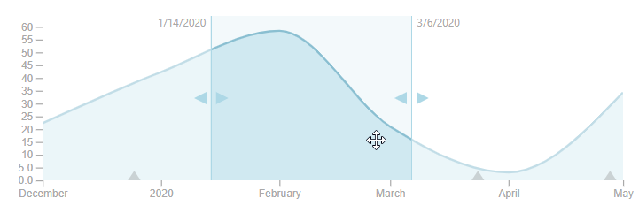
<sq-timeline [data]="timeseries" (selectionChange)="onSelectionChange($event)"></sq-timeline>The
$eventin question contains the new minimum and maximum dates of the selection in an array ([Date, Date]).Note that the selection is removed when clicking outside of the selected area.
-
Tooltip: As we have seen above, a tooltip is displayed when clicking on an event. Additionally, when the user is simply moving the mouse over the chart, a vertical line is displayed with the corresponding date.

This behavior can be turned off by binding
[showTooltip]="false"to the component.
Sizing
You can bind the width and height properties of the component (as numbers), although the component automatically fits the width of its parent container (thanks to the viewBox attribute). Therefore, modifying the width or height primarily affects the aspect ratio.
Additionally you can bind the margin property to adjust the space around the timeline. The default is: {top: 15, bottom: 30, left: 40, right: 15} (more space to the left and bottom due to the axes).
Facet Timeline Component
The sq-timeline component does a lot of work to render the timelines, events and manage the user interactions, but it does not know anything about the Sinequa services and data structures.
The sq-facet-timeline component is in charge of "feeding" the timeline with actual data for the timeseries and events, potentially coming from different sources
Time series
sq-facet-timeline requires at least the following inputs:
results: Generally binded toSearchService.results, which ensures thatngOnChanges()is called every time new results come in. This ensures data is refreshed at the same time as the results.timeseries: An array of configuration (one for each series). Different types of configuration are accepted:- Raw data: It is possible to pass directly a
TimelineSeriesobject (as seen above), which must then computed by another source/service. - A "simple" aggregation: In this case, the configuration (of type
TimelineAggregation) specifies the name of an aggregation to be plotted (of course this aggregation should be over a sourcedatetime column). Note that you can specify an aggregation that may or may not be included in the standard search (See the Include in standard search option of the aggregation in the administration). - A "combined" aggregation: In this case, the configuration consists of multiple
TimelineAggregationobjects. Each of them corresponds to a different "scale" of the same value. It is required to provide the list of scales corresponding to each aggregation. The component will respond to changes of scale (when the user zooms in or out) by querying the most appropriate aggregation. Combined aggregations are the only scalable way of displaying temporal information when the amount of data is enormous, without loosing any accuracy or performance.
- Raw data: It is possible to pass directly a
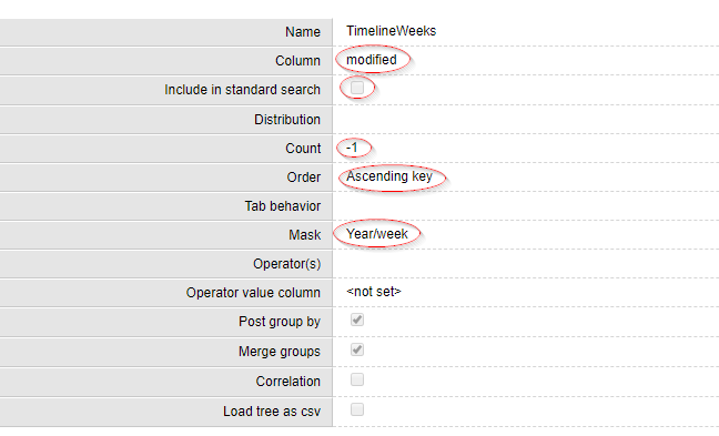 Sample aggregation configured in the admin. Note: 1) modified is a datetime column 2) The aggregation is not included in standard search 3) We do not truncate the data 4) The data will sorted by date 5) The resolution is a week
By default, a simple TimelineAggregation is configured, to display the Timeline aggregation configured in the default Query web service.
Therefore, the following displays the default aggregation:
<sq-facet-timeline [results]="results"></sq-facet-timeline>
A more complex configuration could be:
<sq-facet-timeline
    [results]="results"
    [timeseries]="[rawTimeseries, combinedAggregation, otherAggregation]">
</sq-facet-timeline>
With:
// TimelineSeries
this.rawTimeseries = {
    name: 'series 1',
    dates: [
        {date: new Date('2020-01-01'), value: 42.3},
        {date: new Date('2020-02-01'), value: 58.4},
        {date: new Date('2020-03-01'), value: 21.0},
        {date: new Date('2020-04-01'), value: 3.1},
        {date: new Date('2020-05-01'), value: 34.3},
    ],
    primary: true,
    showDatapoints: true
}

// TimelineCombinedAggregation
const aggregations = [
    {name:'timeline', aggregation:'TimelineYears', primary:true, showDatapoints: true},
    {name:'timeline', aggregation:'TimelineMonths', primary:true, showDatapoints: true},
    {name:'timeline', aggregation:'TimelineWeeks', primary:true, showDatapoints: true},
    {name:'timeline', aggregation:'TimelineDays', primary:true, showDatapoints: true}
]

this.combinedAggregation = {
    aggregations: aggregations,
    default: aggregations[0],
    maxNMonths: [-1, 5*12, 1*12, 2] // Infinite, 5 years, 1 year, 2 months
}

// TimelineAggregation
this.otherAggregation = {
    name: 'dates',
    aggregation: 'Date',
    primary: false,
    lineStyles: {stroke: 'lightGreen'},
    areaStyles: {fill: 'lightGreen'},
    showDatapoints: true
}
The above illustrates the three types of timeseries configuration that can be passed to sq-facet-timeline
We have already seen the structure and options of TimelineSeries.
TimelineAggregation requires the following parameters:
aggregation: The name of the aggregation configured in the Query web service.primary: Whether this is a primary series or not.
Additionally, the following parameters from TimelineSeries are optional and work in the same way (see above): name, areaStyles, lineStyles and showDatapoints.
TimelineCombinedAggregations requires the following parameters:
aggregations: An array ofTimelineAggregation. These aggregations configured on the server should typically be computed on the same sourcedatetime column but with different masks. The masks allow to modulate the resolution of the aggregation. Using a fine-grained mask (YYYY-MM-DD) potentially returns a lot of data unless we query the aggregation with a selection ("date between X and Y"), which is exactly what our component is doing to always offer optimum accuracy and performance.maxNMonths: An array ofnumber, each corresponding to the maximum number of months for a given aggregation (the array must be the same size asaggregations). These are the "breakpoints" at which the component will switch to an aggregation better suited to the current scale of the timeline. For example, if the X axis is 13.4 months long, the component will choose the aggregation with the minimummaxNMonthssuch thatmaxNMonths > 13.4. If the array is[-1, 48, 12, 2], then48is selected (-1is infinity).default: TheTimelineAggregationto initialize the view (it should typically be a coarse-grained aggregation, returning few values even for a large scale).
Note that the styling parameters and the primary input are still there but can be passed via each of the TimelineAggregation.
Events
sq-facet-timeline can also display events coming from different data sources:
- Raw data: It is possible to pass an array of raw
TimelineEventobjects, which must then be computed by another source/service. - The list of records in the current results: If a record has a "modified" date (or other sourecedatetime), it can be plotted on the timeline as an event. This allows the user to quickly visualize how the top, most relevant data is distributed in time, and filter this data accordingly. Furthermore, the component listens for selection changes from the
SelectionServiceand can modify the event styling for selected records (which makes it easy for a user to see where a selected record is placed on the timeline). - An aggregation of events: If a column of the index stores "events", they can be aggregated by the engine and displayed on the timeline. An "event" in that sense is a normalized field that contains a date and name/id. For example
(2020-02-14)#(VALENTINES DAY), which is the format of extraction of cooccurrences (but any format can be used). Note that Sinequa ES includes a very capable Text-Mining Agent that can extract date entities from text in a wide array of formats and languages. Event names can easily be extracted via a simple dictionary-based entity. It is then easy to configure a cooccurrence extraction for dates and event names.
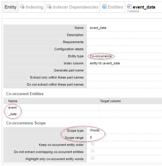 Sample configuration of a cooccurrence entity
By default, the list of records is configured to be displayed by their modified dates. Therefore, the following displays the list of records:
<sq-facet-timeline [results]="results"></sq-facet-timeline>
A more complex configuration could be:
<sq-facet-timeline
    [results]="results"
    [events]="[rawEvents, records, eventAggregation]">
</sq-facet-timeline>
With:
// TimelineEvent[]
this.rawEvents = [
    {id: '1', date: new Date('2019-12-25'), display: 'Christmas!'},
    {id: '2', date: new Date('2020-03-24'), display: 'Big meeting'},
    {id: '3', date: new Date(), display: 'Now!'},
];

// TimelineRecords
this.records = {
    field: 'sourcedatetime3',
    display: (r: Record) => `${r['shortTitle']} by ${r['authors']}`,
    styles: (r: Record, selected: boolean) => { return {fill: selected? 'red' : 'green'}; }
};

// TimelineEventAggregation
this.eventAggregation = {
    aggregation: 'Events',
    getDate: (item: AggregationItem) => new Date(item.value.toString().split(')#(')[0].replace('(','')),
    getDisplay: (item: AggregationItem) => item.value.toString().split(")#(")[1].replace(')','')};
We have already seen the structure and parameters of the raw TimelineEvent.
The TimelineRecords requires the field parameter, which specifies which column to use to place the record on the timeline. The display parameter is optional (by default, record.title is displayed). The styles parameter is also optional, and it allows to generate the TimelineEvent's styles property. Similarly, an optional size parameter allows to customize the size. Note that styles and size can each be a static value (size: 10) or a dynamic value, computed individually for each record (size: (record, selected) => selected? 10 : 5).
The TimelineEventAggregation requires the name of the aggregation configured on the server (aggregation), as well as two methods, getDate and getDisplay, which respectively extract a Date and display (string) from each AggregationItem object. In the example above, the events from this aggregation are supposed to be formatted as (2020-02-14)#(VALENTINES DAY) (hence the use of .split() and .replace()). Additionally, the size and styles parameters are also optionally available and work in the same way as above, with the difference that for the dynamic values the input argument is an AggregationItem instead of a Record.
Legend
The sq-facet-timeline component can display a legend sub-component. The legend's content, position and styles can be customized with the following parameters:
showLegend(default:false): Whether or not to display the legendlegendOrientation(default:'row'): Whether to display the legend in arowor acolumnlegendYOffset(default:3): An offset to position the legend markers vertically relative to the textlegendStyles: A list of styles applied to the legend container (can be useful to position the legend in the right position, add a border, background, etc.)legendEvents: By default the legend automatically displays the timeseries but no the timeline events. To display the events, add a list of "event types" (incl. name and styling).
<sq-facet-timeline
    [results]="results"
    [showLegend]="true"
    [legendEvents]="[{name: 'Events', styles: {fill: 'green'}}]"
    [legendYOffset]="3"
    [legendOrientation]="'column'"
    [legendStyles]="{position: 'absolute', 'top.px': 30, 'right.px': 20, 'padding-left.px':8, border: '1px solid lightgrey'}"
></sq-facet-timeline>
Note that the legend is available as a standalone component (sq-timeline-legend):
<sq-timeline-legend [data]="timeseries" [events]="eventTypes" [legendStyles]="{'justify-content': 'center'}">
</sq-timeline-legend>
Other parameters and events
We have seen the two most important inputs of sq-facet-timeline: timeseries and events. Other parameters are available. In fact, the following parameters (described before) are "forwarded" to the sq-timeline (using the same default values):
minDateandmaxDateallow to "hard-code" the X-axis extent (prior to any zooming).minAggregationDateandmaxAggregationDateallow to filter out dates from aggregations that fall outside of a time period.zoomable,minZoomDaysandmaxZoomDaysallow to specify the zoom behavior.width,heightandmarginallow to size the chart (which resizes itself to fill the width of the container).curveTypeallows to select the type of curve approximation from the D3 library.showTooltipallows to turn on or off the tooltip when hovering the mouse of the chart.
Note that sq-facet-timeline listens to the events triggered by sq-timeline:
-
When the user zooms in and out, a
rangeChangeevent is triggered. The facet captures this event and updates the data of anyTimelineCombinedAggregationin function of the new scale. -
When the user selects a range of dates by clicking and dragging the mouse over the chart, a
selectionChangeevent is triggered. The facet captures this event and filters the search accordingly, using theSearchService. The filter is applied to the metadata plotted by eachTimelineAggregation. For example, if we plot 2 time series corresponding to 2 aggregations computed on themodifiedandsourcedatetime3, the filter will bemodified BETWEEN x AND Y OR sourcedatetime3 BETWEEN x AND y. -
When the user clicks on a event, the tooltip showing the event's
displayparameter actually displays a clickable link. When the link is clicked, the component forwards the event to the parent by emitting aeventClickedevent (passing the clicked event as a parameter). The tooltip is automatically closed after the click. The parent can exploit this event is different ways:<sq-facet-timeline [results]="results" [events]="timelineEvents" (eventClicked)="timelineEventClicked($event)"></sq-facet-timeline>And:
timelineEventClicked(event: TimelineEvent) {
    // If the event is a record, we "open" it (eg. in the preview)
    if(event['record']){
        this.openedDoc = event['record'];
    }
    // If the event is an aggregation item, we filter the search with this item
    else {
        const item = event['item'] as AggregationItem;
        const aggregation = event['aggregation'] as Aggregation;
        this.facetService.addFilterSearch('Timeline', aggregation, item);
    }
}
Facet integration
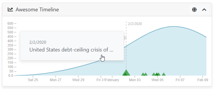
Finally, sq-facet-timeline is a facet component, and can therefore easily be embedded within a sq-facet-card:
<sq-facet-card [icon]="'fas fa-chart-line'" [title]="'Awesome Timeline'">
    <sq-facet-timeline #facet [results]="results" [timeseries]="timeseries"></sq-facet-timeline>
</sq-facet-card>
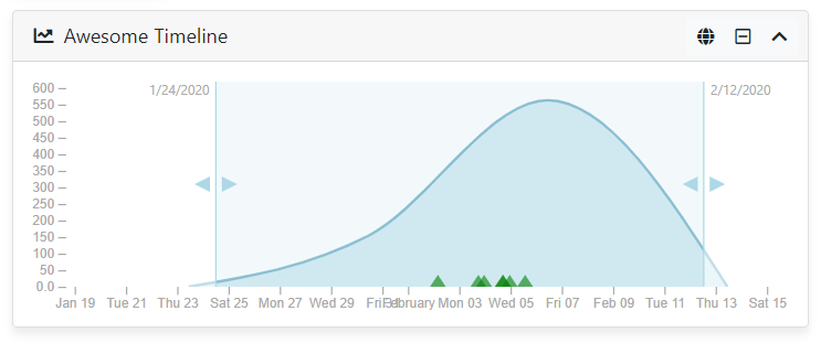
The component provides a "clear filters" action displayed in the facet frame. It is possible to add custom actions, by binding them to the [actions] input of sq-facet-card.
Customization
The two components documented above provide a great level of flexiblity, but there is a infinite number of ways one could customize this timeline. Rather than adding many inputs and a lot of complexity to the components' source code, they are designed to be simple and modular enough to be customized by overriding or modifying their code.
Styling
The timeline is pure HTML (actually SVG), so it is possible to change a lot of things by simply adding rules in your global stylesheet.
sq-timeline {
    .axis {
        line {
            stroke: #323232;
        }

        text {
            fill: #545454;
        }
    }
}
Templating
Modifying the Angular HTML templates allows you to easily add dynamic elements to the SVG. For example a legend could easily be added in the following way:
{% raw %}<g *ngFor="let series of data; let i=index" class="series" [attr.transform]="'translate('+(margin.left+i*50)+','+ (height-20) +')'">
    <line class="line" x1="0" x2="15" y1="0" y2="0" [ngStyle]="series.lineStyles"></line>
    <text x="20" y="5">{{ series.name }}</text>
</g>{% endraw %}
Note that you don't have to copy the entire component code to do this. Just use TypeScript's extends clause, with something like:
import {BsTimelineComponent} from '@sinequa/analytics/timeline';

@Component({
    selector: 'my-timeline',
    templateUrl: './my-timeline.html'
    styleUrls: ['./my-timeline.scss'] // Or just link the original stylesheet
})
export class MyTimeline extends BsTimelineComponent {}
Controller
If you need to modify the controller, you can also use the extends clause and only modify the methods that need to be modified. This approach means you must be comfortable with the way the component works internally.
For example, if you want to modify the axes properties, you could simply override the drawXAxis() or drawYAxis() methods:
@Component({
    selector: 'my-timeline',
    templateUrl: 'my-timeline.html'
    styleUrls: ['my-timeline.scss'] // Or just link the original stylesheet
})
export class MyTimeline extends BsTimelineComponent {
    drawXAxis() {
        const xAxis = d3.axisBottom(this.xt).ticks(5); // Only 5 ticks
        this.xAxis$.call(xAxis);
        this.xAxis$.selectAll(".domain").remove(); // Remove the axis line
    }

    drawYAxis() {
        const yAxis = d3.axisLeft<number>(this.y)
                        .ticks(5) // Only 5 ticks
                        .tickFormat(d3.format(".2s"));
        this.yAxis$.call(yAxis);
        this.yAxis$.selectAll(".domain").remove(); // Remove the axis line
    }
}
Facet Date Component
The sq-facet-date component allows users to filter search results by date using a date picker and timeline. This component integrates seamlessly with Sinequa's search and facet services.
Import
First, import the BsFacetDate component in your app.module.ts:
import { BsFacetDate } from '@sinequa/analytics/timeline';

@NgModule({
    imports: [
        ...
        BsTimelineModule
    ],
    ...
})
export class AppModule { }
Template
Add the sq-facet-date component to your template:
<sq-facet-date
        [results]="results"
        [query]="query"
        [aggregation]="'Modified'"
        [timelineAggregation]="'Timeline'"
        [showCount]="true"
        [displayEmptyDistributionIntervals]="true"
        [allowPredefinedRange]="true"
        [allowCustomRange]="true"
        [showCustomRange]="false"
        [replaceCurrent]="true"
        [timelineWidth]="250"
        [timelineHeight]="150"
        [timelineMargin]="{top: 15, bottom: 20, left: 30, right: 15}"
        [mask]="{
            value: undefined,
            units: [
                { text: 'msg#facet.date.mask.none' },
                { text: 'msg#facet.date.mask.yearMonth', value: 'YYYY-MM' },
                { text: 'msg#facet.date.mask.year', value: 'YYYY' }
            ]}"
></sq-facet-date>
Inputs
results: The search results to be filtered.query: The search query object.aggregation: The name of the aggregation to use for filtering.timelineAggregation: The name of the aggregation to use for the timeline.showCount: Whether to show the number of occurrences.displayEmptyDistributionIntervals: Whether to display items with count === 0.allowPredefinedRange: Whether to allow the use of predefined date ranges.allowCustomRange: Whether to allow the use of custom date ranges.showCustomRange: Whether to show the custom range date pickers and timeline.replaceCurrent: Whether to replace the current selection.timelineWidth: The width of the timeline.timelineHeight: The height of the timeline.timelineMargin: The margin around the timeline.mask: The mask configuration for date formatting.
Example
Here is an example of how to use the sq-facet-date component in a facet card:
<sq-facet-card #facet [icon]="'fas fa-calendar-alt'" [title]="'Date Filter'">
        <sq-facet-date
                [results]="results"
                [query]="query"
                [aggregation]="'Modified'"
                [timelineAggregation]="'Timeline'"
                [showCount]="true"
                [displayEmptyDistributionIntervals]="true"
                [allowPredefinedRange]="true"
                [allowCustomRange]="true"
                [showCustomRange]="false"
                [replaceCurrent]="true"
                [timelineWidth]="250"
                [timelineHeight]="150"
                [timelineMargin]="{top: 15, bottom: 20, left: 30, right: 15}"
                [mask]="{
                    units: [
                        { text: 'msg#facet.date.mask.none' },
                        { text: 'msg#facet.date.mask.yearMonth', value: 'YYYY-MM' },
                        { text: 'msg#facet.date.mask.year', value: 'YYYY' }
                    ]}"
        ></sq-facet-date>
</sq-facet-card>
This will display a date filter facet with a timeline and date pickers, allowing users to filter search results by date.
Customization
To customize the sq-facet-date component using the configuration file, you can follow these steps:
Configuration File
First, ensure that your configuration file (config.ts) includes the necessary facet configuration. For example:
import { FacetConfig } from '@sinequa/components/facet';
import { FacetDateParams } from '@sinequa/analytics/timeline';

export const FACETS: FacetConfig<FacetDateParams>[] = [
    {
        name: "modified",
        aggregation: "Modified",
        title: "msg#facet.modified.title",
        type: "date",
        icon: "fas fa-fw fa-calendar-day",
        parameters: {
            timelineAggregation: "Timeline",
            showCount: true,
            allowPredefinedRange: true,
            allowCustomRange: true,
            showCustomRange: true,
            replaceCurrent: true,
            displayEmptyDistributionIntervals: true,
            mask: {
                units: [
                    { text: 'msg#facet.date.mask.none' },
                    { text: 'msg#facet.date.mask.yearMonth', value: 'YYYY-MM' },
                    { text: 'msg#facet.date.mask.year', value: 'YYYY' }
                ]
            }
        }
    }
];
Usage
Next, use the configuration in your template by binding the facet input to the FACETS array from your configuration file:
import { FACETS } from './config';

@Component({
    selector: 'app-root',
    templateUrl: './app.component.html',
    styleUrls: ['./app.component.scss']
})
export class AppComponent {
    FACETS = FACETS;
    props = this.FACETS.find(facet => facet.name === 'modified')?.parameters;
}
<sq-facet-date
    [results]="results"
    [query]="query"
    [showCount]="props?.showCount"
    [timelineAggregation]="props?.timelineAggregation"
    [displayEmptyDistributionIntervals]="props?.displayEmptyDistributionIntervals"
    [allowPredefinedRange]="props?.allowPredefinedRange"
    [allowCustomRange]="props?.allowCustomRange"
    [showCustomRange]="props?.showCustomRange"
    [replaceCurrent]="props?.replaceCurrent"
    [mask]="props?.mask"
></sq-facet-date>