Heatmap Module
Features
This module includes a Heatmap visualization of 2-dimensional data based on the D3 library. This chart is available:
- As a simple component taking data as an input and displaying it, unaware of Sinequa's API and data structures.
- As a facet component, managing the transformation of an aggregation into the heatmap data, and displaying actions to customize this aggregation, as well as a settings panel.
- As a results view component (mostly for compatibility), directly based on the facet component, but displayed in a slightly different way since the component is not meant to live in a
sq-facet-cardwrapper (See Facet module).
Import
Import this module in your app.module.ts.
import { BsHeatmapModule } from '@sinequa/analytics/heatmap';

@NgModule({
  imports: [
    ...
    BsHeatmapModule
This module is internationalized: If not already the case, you need to import its messages for the language(s) of your application. For example, in your app's src/locales/en.ts:
...
import {enHeatmap} from "@sinequa/analytics/heatmap";

const messages = Utils.merge({}, ..., enHeatmap, appMessages);
Server-side setup
The heatmap can display two types of aggregations, configured on the server side (in the query web service):
-
Cross-distributions (or cross-correlations): By default the "Heatmap" aggregation configured in the default query web service is a cross-distribution. The engine dynamically computes the number of documents mentioning 2 values of metadata together. For example, we can compute the cross-distribution of the people and company columns which yields the following list:
-
Bill Gates/Microsoft;15(Bill Gates and Microsoft are mentioned together in 15 records) -
Elon Musk/Tesla;13(Elon Musk and Tesla are mentioned together in 13 records) -
etc.
⚠️ Note that these computations may scale poorly with the number of records/documents in the case of multi-valued columns and long documents (if a document contains 100 entities of each type, that means already 10000 unique combinations for a single document).
-
-
Cooccurrences: The Sinequa indexer can extract in a column the co-occurrences of two entities within a close neighborhood. In this case the aggregation is similar to any other 1-dimension distribution or correlation (used in list facets), except the data contains 2 values instead of one:
(Bill Gates)#(Microsoft);15(Bill Gates and Microsoft are closely mentioned together 15 times)(Elon Musk)#(Tesla);13(...)
Note that in both cases, the computation can be computationally expensive (especially cross-distribution) and return a lot of data. Therefore, it is recommended to uncheck the Include in standard search option of the aggregation (unless the heatmap is really meant to be displayed all the time) and set a reasonable count option (which can result in some sparsity in the heatmap).
The heatmap facet and results view take care of querying the server if the heatmap aggregation is not included in the standard search.
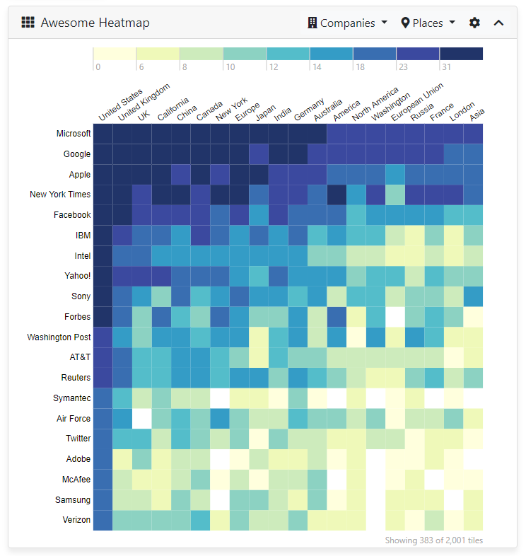
Heatmap Facet
The heatmap facet (sq-facet-heatmap) looks as the image above. It can be displayed with:
<sq-facet-card [icon]="'fas fa-th'" [title]="'Awesome Heatmap'">
    <sq-facet-heatmap #facet [results]="results" [fieldX]="'geo'" [fieldY]="'company'" [fieldsX]="['geo', 'company', 'person']" [fieldsY]="['geo', 'company', 'person']"></sq-facet-heatmap>
</sq-facet-card>
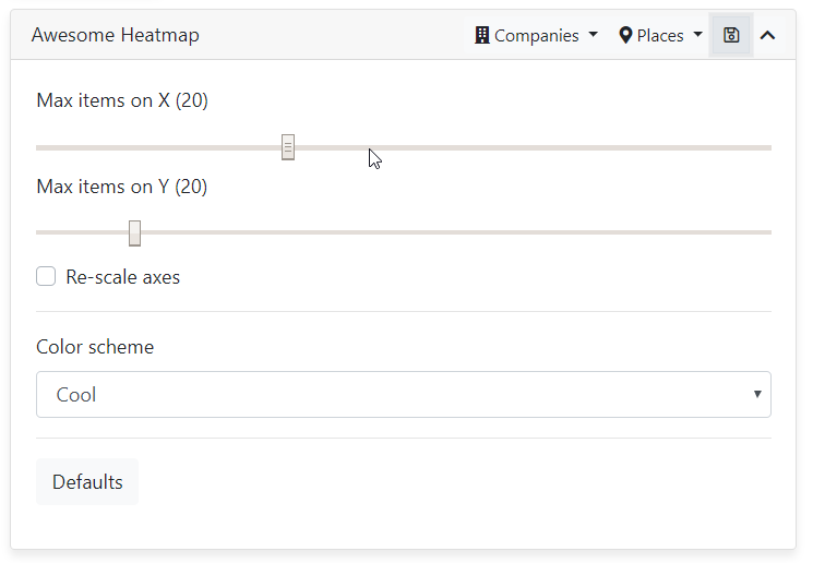
This facet includes a settings template which lets the user tune some of the heatmap parameters:
The sq-facet-heatmap component accepts the following inputs:
results: The current resultsaggregation(default:'Heatmap', the name of the default aggregation configured in the query web service): Name of the aggregation which contains the data.name: An optional name to identify the facet in the user preferences and breadcrumbs.fieldX(in cross-distribution mode): Default column to display on the X axis (parameter overriden in User Preferences).fieldY(in cross-distribution mode): Default column to display on the Y axis (parameter overriden in User Preferences).fieldsX(in cross-distribution mode): List of all columns available for the X axis.fieldsY(in cross-distribution mode): List of all columns available for the Y axis.fieldCooc(in co-occurrence mode): Name of the co-occurrence column.width(default:600): Default width of the chart (parameter overriden in User Preferences if user checks rescale axes). In any case the chart is resized to fit the container's width (the aspect ratio is respected).height(default:600): Default height of the chart (parameter overriden in User Preferences if user checks rescale axes).margin(default:{top: 100, bottom: 20, left: 100, right: 40}): Margins used to draw the chart while leaving space for the legend and axes.transition(default:1000): Number of milliseconds in a transition (which animate the axes).buckets(default:9): Number of quantiles used to split the data (= number of colors).colorScheme(default:'schemeBlues): Color scheme used to display the heatmap color gradient. All the schemes available are available here (parameter overriden in User Preferences).maxX(default:20): Maximum number of items on the X axis (parameter overriden in User Preferences).maxY(default:20): Maximum number of items on the Y axis (parameter overriden in User Preferences).itemsClickable(default:true): Whether the heatmap's tiles are clickable or not (resulting in filtering the search).axisClickable(default:true): Whether the items on the heatmap axis are clickable (resulting in filtering the search).highlightSelected(default:true): Whether the heatmap tiles should be marked as "selected" when a record containing these tiles is selected (which alters the tile's opacity).
Heatmap results view
The heatmap results view (sq-results-heatmap-view) is based directly on the sq-facet-heatmap component (by inheritance). The differences are the following:
- To use this component it is required to import the
BsResultsViewModulemodule in yourapp.module.tsand inject a list of results views and a default one via theforRoot()method. - Since the view is not wrapped inside a
sq-facet-cardcomponent, the list of actions is displayed above the view, including a button to toggle the settings panel. - The
sq-results-heatmap-viewcomponent accepts all the parameters of thesq-facet-heatmapcomponent, plus an additional optional one:selectViewwhich allows to change the current results view when an item is selected. For example,[selectView]="'List'"will switch to the "List" results view when a tile is clicked.
Heatmap component
The heatmap component (sq-heatmap) only takes care of displaying the chart. It accepts as inputs most of the graphical settings defined above, but it does not take care of querying the server for data.
When used in isolation, this component needs the data input, which is a list of objects implementing the HeatmapItem interface:
export interface HeatmapItem {
    x: string; // eg. Bill Gates
    y: string; // eg. Microsoft
    count: number; // 15
    value: string; // "Bill Gates/Microsoft"
    display: string; // "Bill Gates works at Microsoft"
    selected?: boolean;
}