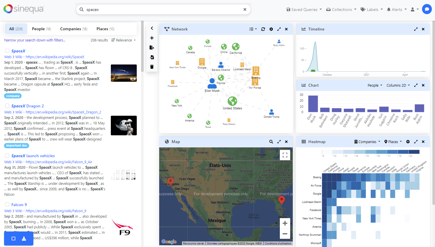
Dashboard Module
This module is an integration of the angular-gridster2 library.
Features
The module exports a component that takes in a list of widget configurations and displays these widgets within the gridster component. The component handles common operations such as resizing, adding & removing, renaming, and reordering widgets.
The usage of this component is illustrated in the Pepper application.

Import
Import the standalone dashboard component in your app.module.ts.
import { DashboardComponent } from '@sinequa/analytics/dashboard';

@NgModule({
  imports: [
    ...
    DashboardComponent
This component is internationalized: If not already the case, you need to import its messages for the language(s) of your application. For example, in your app's src/locales/en.ts:
...
import {enDashboard} from "@sinequa/analytics/dashboard";

const messages = Utils.merge({}, ..., enDashboard, appMessages);
Usage
The sq-dashboard component can be used with this minimal setup:
Notice that you can drag and drop the widgets by clicking on the card header.
In a more typical usage, widgets have a different type property that is used to determine what to display.
For example:
<ng-template let-widget>
  <div class="card h-100">
    <div class="card-header">{{widget.title}}</div>
    <div class="card-body" [ngSwitch]="widget.state.type">
      <span *ngSwitchCase="foo">This is a "foo" widget</span>
      <span *ngSwitchCase="bar">This is a "bar" widget</span>
    </div>
  </div>
</ng-template>
It is also recommended to use the sq-facet-card component from the Facet Module to encapsulate the widgets. This allows to display built-in "actions" to remove, rename and maximize the widgets:
<ng-template let-widget>
  <sq-facet-card
    [title]="widget.state.title"
    [icon]="widget.icon"
    [collapsible]="false"
    [actions]="widget.actions"
    [actionsFirst]="false"
    [ngSwitch]="widget.state.type">
    ...
  </sq-facet-card>
</ng-template>
Thanks to the facet-card API, many functionalities are supported out-of-the-box, like the display of the actions of the child "facet components" (marked with the #facet template variable).
Here is a more complete example with two different types of widgets and usage of the facet card:
Sizing
Notice that the sizing of the each type of widget needs to be handled differently, based on whether the component takes all the available space or a fixed given size. The widget.width and widget.height properties are computed by the dashboard component and recomputed upon resize. The horizontalPadding and verticalPadding inputs allow to subtract the size of the border and header of the widget.
Persistence
The widget configurations can be persisted in any storage system (including the browser local storage). Only the widget.state should be persisted, as the other properties are computed by the dashboard component.
Therefore, storing the widget configuration could be done like this:
save(widgets.map(widget => widget.state));
And restoring them with:
widgets = load().map(state => ({
  state,
  maximizable: true,
  removable: true,
  otherProperties: computeFromState(state)
}));
(Notice that we avoid storing properties and data that are constant and/or can be re-computed from the state)