Ngx Charts Module
This module is an integration of the ngx-charts library.
Features
This module is a wrapper of the open-source ngx-charts library. It allows to display simple charts plotting the data from aggregations (although the library may be used in different ways).
The module includes two components:
- A chart component displaying given input data, unaware of Sinequa's API and data structures. It supports different chart types from the ngx-charts library.
- A "facet" component taking care of pre-processing the aggregation data available in the results, and passing it to the chart component. Its API is similar to that of the List Facet component.
Import
Import this module in your app.module.ts.
import { NgxChartsModule } from '@sinequa/analytics/ngx-charts';

@NgModule({
  imports: [
    ...
    NgxChartsModule
Note that if you need to use the ngx-charts library but do not want to use our wrapper module, you can also import the modules you require directly from @swimlane/ngx-charts. For example:
import { BarChartModule, PieChartModule } from "@swimlane/ngx-charts";

@NgModule({
  imports: [
    ...
    BarChartModule,
    PieChartModule
Chart Component
The sq-ngx-chart component displays a chart (multiple types are supported), given some data as input, regardless of the data source (the component is unaware of Sinequa APIs and data structures).
Its basic usage is as follow:
<sq-ngx-chart
    [options]="options"
    [data]="dataPoints"
    (item-click)="click($event)">
</sq-ngx-chart>
The data input is a list of ChartDataPoint objects, a simple interface requiring only name and value properties:
this.data = [
    {name: "France", value: 123},
    {name: "Germany", value: 215},
    {name: "United States", value: 156},
    {name: "United Kingdom", value: 432}
]
The options input is an object of type ChartOptions, an interface requiring the following properties:
type(undefineddefaults to a vertical bar chart): Defines the type of chart to display. Available options:'horizontalbar','pie','advancedpie','piegrid','treemap','numbercard','gauge'.colorScheme(optional): Name of a color scheme used to plot the data (among the options:vivid,natural,cool,fire,solar,air,... see the source code)getItemColor(optional): Function taking as input the name of a data item (string) and returning a custom color.tickFormatter(optional): Function taking as input the value of a data item (number) and returning a formatted value.
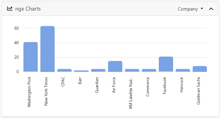
Facet Chart Component
The sq-facet-ngx-chart component displays an aggregation from the results as a chart. The user can click on items in the chart to filter the results.

This component requires at least a Results input and the name of the aggregation to work properly.
<sq-facet-card [title]="'Companies'" [icon]="'fas fa-building'">
    <sq-facet-ngx-chart #facet [results]="results" [aggregation]="'Company'"></sq-facet-ngx-chart>
</sq-facet-card>
List of inputs
The sq-facet-ngx-chart component accepts the following inputs:
results(required): TheResultsobject containing the aggregation that must be displayed.aggregation(required): Astring, containing the name of the aggregation (as defined in the query web service configuration) to plot in the chart.aggregations(optional): A list ofstring, containing the name of alternative aggregations. If provided, a dropdown menu will be automatically displayed in the facet frame to switch between these different aggregations.chartType(undefineddefaults to a vertical bar chart): Defines the type of chart to display. Available options:'horizontalbar','pie','advancedpie','piegrid','treemap','numbercard','gauge'.colorSchemeorcolors: By default a list ofcolorsis provided, containing a single color, resulting in all the chart items being drawn with the same color. It is possible to provide a custom list ofcolorswith multiple values instead. It is also possible to setcolorstonullorundefinedand instead provide acolorScheme(among the options:vivid,natural,cool,fire,solar,air,... see the source code).filteredColor(default:#C3E6CB): If thecolorsinput is provided, items which are filtered (have been clicked on to filter the results) will be displayed with this color.selectedColor(default:#7acce5): If thecolorsinput is provided, items belonging to a selected document (managed by theSelectionService- see Selection Module) will be displayed with this color.