AG Grid Module
This module is an integration of the AG Grid library.
Features
This module includes an integration of the AG Grid library to display data from Sinequa indexes in the form of a grid view. Note that this module uses the AG Grid Community library which is released under the MIT License.
The module exports one component which is a wrapper of the ag-grid-angular component provided by the library, and enriched with a custom toolbar.
Import
Import this module in your app.module.ts.
import { AgGridModule } from '@sinequa/analytics/ag-grid';

@NgModule({
  imports: [
    ...
    AgGridModule
This module is internationalized: If not already the case, you need to import its messages for the language(s) of your application. For example, in your app's src/locales/en.ts:
...
import {enGrid} from "@sinequa/analytics/ag-grid";

const messages = Utils.merge({}, ..., enGrid, appMessages);
Additionally, the AG Grid component requires various global stylesheets. Import at least the first one of the following, as well as the theme(s) that your application will use.
@import "/node_modules/ag-grid-community/styles/ag-grid.css";
@import "/node_modules/ag-grid-community/styles/ag-theme-balham.css";
@import "/node_modules/ag-grid-community/styles/ag-theme-alpine.css";
Configuration
The sq-ag-grid-view component can be integrated in an Angular template with the following minimal inputs:
<sq-ag-grid-view [results]="results" [columns]="columns"></sq-ag-grid-view>
In the snippet above,
resultsis aResultsobject containing the data to be displayed. A change in the results triggers a new rendering of the component.columnsis the list of columns to be displayed by the Grid. Each column definition is aColDefobject (see AG Grid Documentation). Only thefieldproperty is actualy required, and must correspond to a column (or alias) name existing in the record objects. The component creates automatically other properties of theColDefobject, namely:headerName,headerTooltip,filter,sortable,hide,width,cellRendererandtooltipValueGetter.
If the filter property is not provided for a given column, it is automatically guessed in function of the type of the column (eg. a "double" column will be set to use the built-in agNumberColumnFilter filter). Additionally, it is possible to:
- disable filtering for that column (
filter: false) - specify the built-in filter you wish to use (
filter: "agNumberColumnFilter") - use a Sinequa facet in place of the built-in filters (
filter: "facet"). Note that you need to configure an aggregation in the query web service for this to work. Facets are designed to work with theSearchService, so they will work best in the "Global Query" mode (see below).
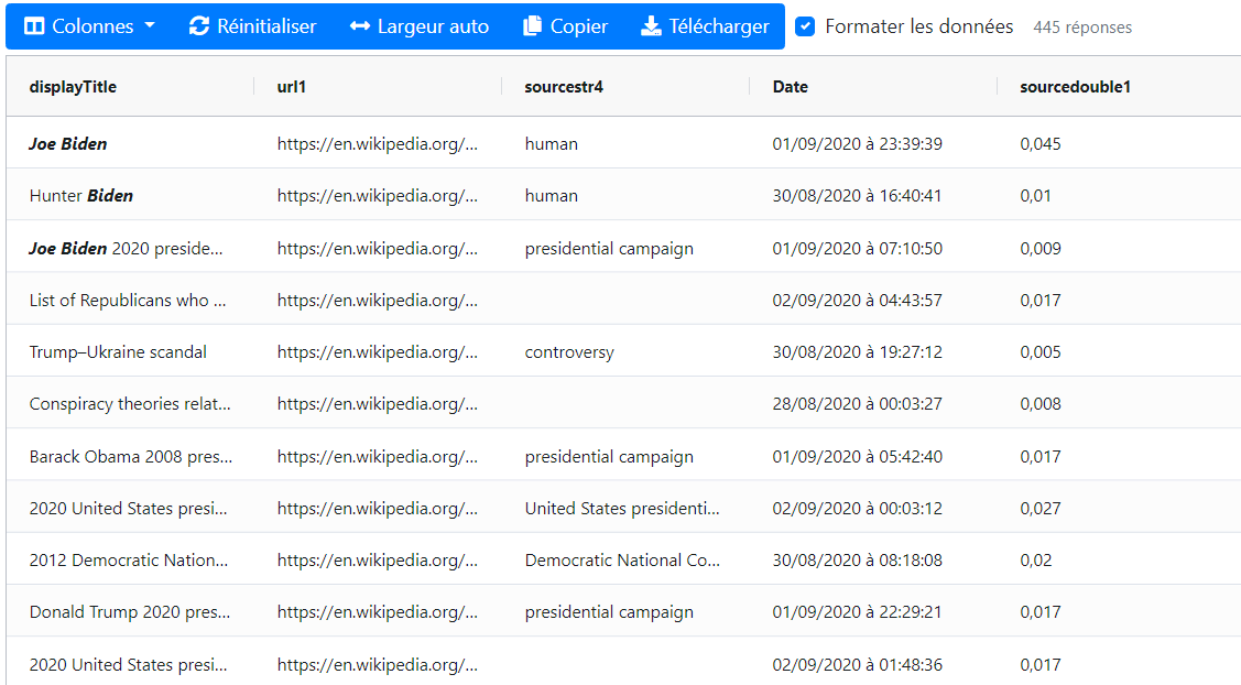
A sample configuration for the columns input could be:
columns: Column[] = [
    {field: "displayTitle", headerName: "Custom title"},
    {field: "url1"},
    {field: "modified"},
    {field: "sourcestr4"},
    {field: "sourcedouble1"},
    {field: "geo", filter: "facet"},
    {field: "docformat"}
]
Additionally the component can be configured with the following optional inputs:
query: AQueryobject to fetch data from the server (when scrolling down the list of results). ⚠️ If the query is provided, the grid works in the "Local Query" mode, and when omitted, the grid works in the "Global Query" mode using the search service query instead (see below).width(default:'100%'): The width of grid.height(default:'600px'): The height of grid.toolbarActions(default:["columnVisibility", "gridReset", "autosize", "copySelection", "downloadSelection", "formatContent"]): This parameter is a list ofstringand/orActionobjects that are displayed as a toolbar above the grid. The strings correspond to predefined actions supported by the component. It is possible to provide a custom combination ofstringandActionto fully customize this toolbar.showCounter(default:true): Whether or not to show the number of results next to the toolbar.formatContent(default:true): Whether or not to format the data (using theFormatService). This property is overriden by the user's preference once they make a choice.rowSelection(default:'multiple'): Whether the user can select one ('single') or multiple ('multiple') or no (undefined) row(s).displayCheckbox(default:false): Display checkboxes in the first column of the grid, to make row selection more intuitive.theme(default:'ag-theme-alpine'): Choice of the theme. Note that the corresponding stylesheet must be imported in your globalstylesheet(see above). The library provides a regular theme ('ag-theme-alpine') and a dense theme ('ag-theme-balham') when there is a lot of data to display. On top of this, each of these themes has a dark mode (append-darkto the above theme names).defaultColumnWidth(default:200): Default column width in pixels.defaultColDef: A defaultColDefwith properties applied to all columns (unless overriden in the column's definition).renderCell: A default cell renderer used for all columns (unless overriden in the column's definition). The default renderer uses theFormatServiceto format data.tooltipValueGetterA default function to generate a tooltip for each cell.exportValueGetterA default function to generate export data for each cell.
Understanding the "infinite" row model
Internally, the component is configured to use the "infinite" row model.
This means that the grid downloads only the bits of data that it needs to display. Concretely, when users scroll down the list of results, the component fetches more data from Sinequa (using pagination parameters) and displays them on the fly.
This configuration involves various steps:
-
The
ag-grid-angularcomponent is configured with the following settings:<ag-grid-angular
...
[rowModelType]="'infinite'"
[cacheBlockSize]="appService.ccquery?.pageSize || 20"
[blockLoadDebounceMillis]="300">This means that the data is downloaded from the server in blocks of 20 records (unless a different value is configured) and that to avoid flooding the server when scrolling fast, we wait for 300ms before downloading each block.
-
Row data is not passed directly to the grid. Instead, a
Datasourceobject is created:// Create a new datasource
this.datasource = this.makeDatasource();
// Apply to the grid
this.gridApi.setDatasource(this.datasource);This datasource is responsible for providing data asynchronously, taking into account the current state of the
queryas well as the pagination parameters, custom filters and sorting parameters that the ag-grid component provides. -
Our implementation of the
IDatasourceinterface is available in theSqDatasourceclass.At the moment, most of the complexity comes from the management of the wide range of filter types supported by AG Grid (
contains,equals,startsWith, etc.), which is translated into fielded search syntax (including regular expression for some of these filters).This class can be overriden or replaced to implement a different logic of data handling.
Global Query mode and Local Query mode
You can configure the component in 2 different modes, depending on whether or not you provide the query input parameter to the component (see above):
-
Local Query mode: If you pass a
Queryto the component, that query will be used by the grid to fetch more data. When the users scrolls down, or uses the grid's filters and sorts, this query is modified (inSqDatasource) to fetch more results, but the state of the application is not modified (if you refresh the page, your filters and sorts will be lost).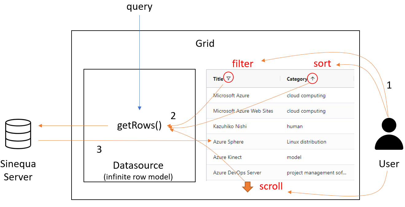 1) The user acts on the grid (eg. by adding a filter) 2) The grid calls the
 getRows()method to get data 3) The server responds and the grid displays the results -
Global Query mode: If you do not pass a
Queryto the component, it will useSearchService.queryand modify that query globally. This means that the filters and sorts defined in the grid are persisted in the URL, and therefore the state of the grid is preserved when the page is reloaded (as well as when using the back button). However, the pagination state is not persisted (or else it wouldn't really make sense to use the infinite row model).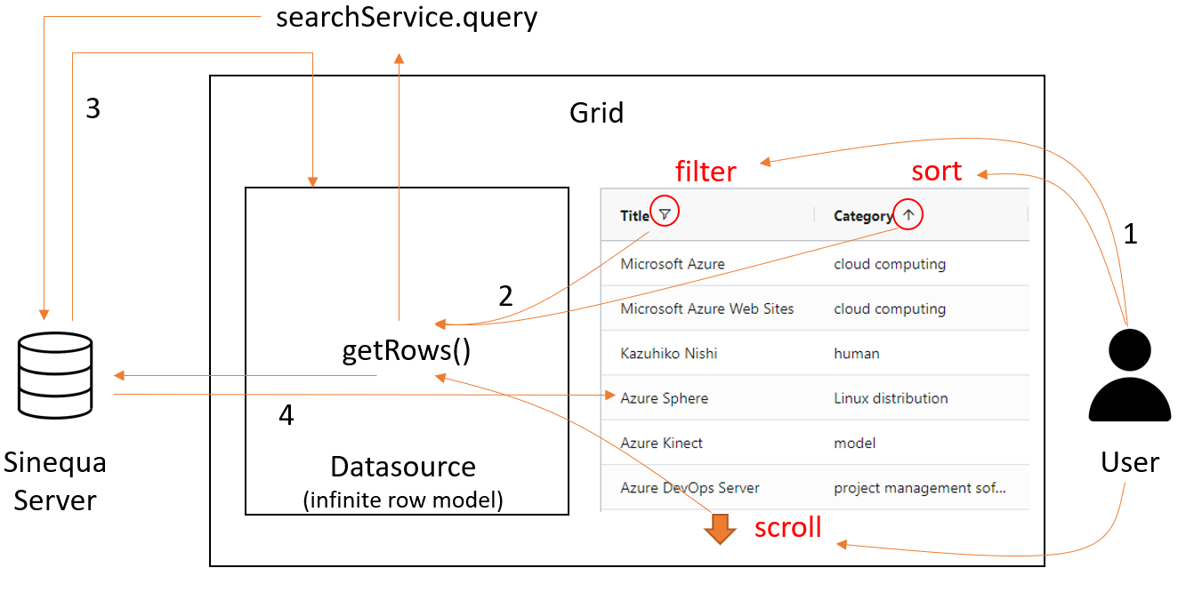 1) The user acts on the grid (eg. by adding a filter) 2) The grid calls the
 getRows()method to get data 3) The global query is modified by the search service, the grid gets new results and a new datasource is created 4) The pagination is managed like in the local query mode