MoreButtonComponent
The MoreButtonComponent handles overflowed filters and provides access to additional filter controls.
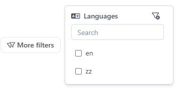
It is used by the FiltersBarComponent when there are more filters than can be displayed in the available space.
Features
- Displays overflowed filters in a dropdown or expandable area
- Integrates with aggregations and filter state
- Provides access to additional filter actions
Usage
Basic Example
sample.component.ts
import { MoreButtonComponent } from "@angular/atomic-angular";

@Component({
    selector: "sample-component",
    imports: [MoreButtonComponent],
    template: `
    <more-button />
    `,
})
export class SampleComponent {}
API Reference
Inputs
| Name | Type | Description |
|---|---|---|
count | number | Number of filters contained in the dropdown |
position | Placement | Position of the dropdown (default: bottom-end) |
includedFilters | string[] | Filters to only be included in the dropdown |
excludedFilters | string[] | Filters to exclude from the dropdown |
Schemas
Component Interaction
Store Interaction
Notes
- The
MoreComponentis automatically used by the filters bar when needed. - It ensures all filters remain accessible, even when space is limited.