FilterButtonComponent
The FilterButtonComponent represents an individual filter as a button, allowing removal or quick actions. It is used within the FiltersBarComponent to display each active filter.
Features
- Displays a single filter as a button
- Allows removal of the filter
- Can be extended for custom filter actions
Usage
<filter-button [name]="Geo" [column]="geo" />
tip
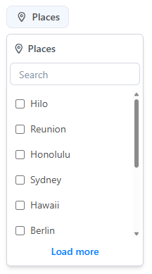
The height of the dropdown can be adjusted using the --agg-max-height CSS variable.
API Reference
Inputs
| Name | Type | Description |
|---|---|---|
name* | string | Name of the filter (required) |
column* | string | Column key for the filter (required) |
position | Placement | Position of the dropdown (default: bottom-start) |
name and column are required inputs for the component, because some filters can have the same column name but different values,
and the name is used to identify the filter in the UI.
Notes
- Typically used inside
FiltersBarComponent. - Integrates with filter state managed by stores.