Facet Module
We can now search our Sinequa indexes, but it would be nice to be able to filter the content based on its metadata. This is what facets are for.
The @sinequa/components library has a module for this: BsFacetModule (like the Search module, it is based on the Bootstrap library).
Importing the Facet Module
Like other modules, you have to import it in your app.module.ts file:
import { BsFacetModule } from '@sinequa/components/facet';

@NgModule({
  imports: [
    ...
    BsFacetModule
Unlike the BsSearchModule (and others), you do not need to use the .forRoot() method to pass configuration to the module (the method exists, but is optional).
Other prerequisites
The Facet module includes a service, the FacetService, but there is no need to inject it in your component. This service is used internally by the components of the Facet module to manage the facet data ("aggregations") and refine the search when the user actually clicks a facet item (behind the scene, the FacetService can modify SearchService.query and call SearchService.search()).
The list of aggregations needed to "feed" the facets is configured on the server-side in the Web services > Query configuration. On the server that we use for this training, about 15 aggregations are available (you can see the full list inside the Results object with your Browser inspector).
The Facet module depends on the Bootstrap CSS library, but since we already imported Bootstrap globally in the previous chapter, there's no need to do it again.
Facet module components
You can now insert some of the Facet module components in your component's template (app.component.html).
Facets are actually composed of two components:
- The outside "frame" or "card":
sq-facet-card - The inside content, which depends of the type of data or visualization:
sq-facet-list,sq-facet-tree,sq-facet-ngx-chart,sq-facet-range,sq-facet-timeline,sq-facet-refine, or in fact any other custom content you want!
We will start with a simple sq-facet-list:
<sq-facet-card [title]="'Companies'" [icon]="'fas fa-building'">
    <sq-facet-list #facet [results]="results" [aggregation]="'Company'"></sq-facet-list>
</sq-facet-card>
This should display something like:
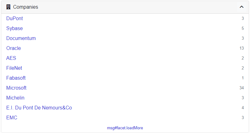
Notice the #facet tag. It is important, as it allows the sq-facet-card to display the "action buttons" of its content in the top-right of the facet.
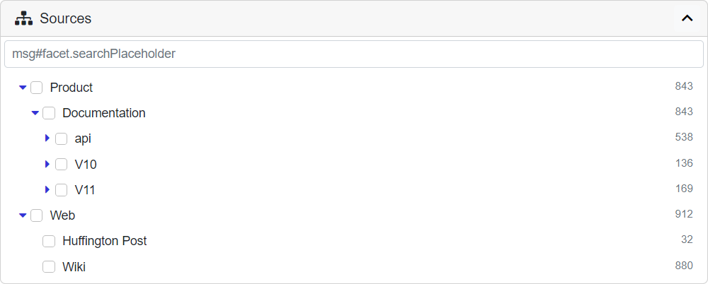
sq-facet-list also adapts itself automatically according to the data type. Here with a tree type:
<sq-facet-card [title]="'Sources'" [icon]="'fas fa-sitemap'">
    <sq-facet-list #facet [results]="results" [aggregation]="'Treepath'"></sq-facet-list>
</sq-facet-card>
The facet components have many options that can be passed via bindings. For example, here is the full list of options for sq-facet-list:
name: Internal name of the facet (Optional, by default the aggregation name is used)results: Results object (Required)aggregation: Name of the aggregation configured on the back-end (Required)query: A custom query to interfere when doing filtering actions (it uses by default the one from theSearchService)showCount: Show the number of occurrences (default:true)searchable: Allow to search for items in the facet (default:true)allowExclude: Allow to exclude selected items (default:true)allowOr: Allow to search various items in OR mode (default:true)allowAnd: Allow to search various items in AND mode (default:true)focusSearch: Whether after the page is loaded the HTML should focus on the search input (default:false)displayEmptyDistributionIntervals: Whether empty distribution intervals will be displayed if the aggregation is a distribution (default:false)acceptNonAggregationItemFilter: Whether filtered items which don't match an existing aggregation item should be added to filtered list (default:true)replaceCurrent: Whether the previous "select" is removed first (default:false)expandedLevel: The level to expand up to when this is a tree type of data (default:2)
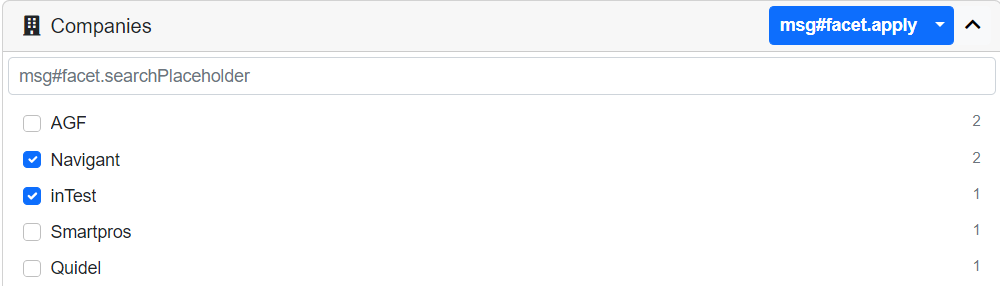
In real projects, you probably would not want to enable all these options at once. We can deactivate exclusion and the "AND" mode with:
<sq-facet-list #facet [results]="results" [aggregation]="'Company'" [allowExclude]="false" [allowAnd]="false"></sq-facet-list>
Now the facet should look something like this when you select multiple items:
Please refer to the library documentation for more information.