Designing a responsive SBA
So far we have not paid too much attention to the application's look & feel.
In this chapter, we will improve the styling and layout of the app, and while we are at it, we will make it responsive, meaning it will be usable on devices of size (mobile, tablet, desktop,...). As we would rather not reinvent the wheel, we are going to use the Bootstrap library extensively.
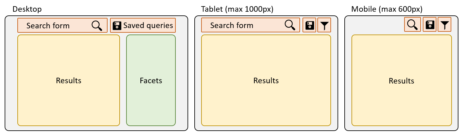
Screen sizes
The first we should think about is: what should our application look like on devices of different sizes? How many different variants should we support?
In this tutorial, We'll assume 3 different sizes (mobile, tablet and desktop), with the following layouts:
First off, we need to tell Bootstrap about these screen sizes. In your styles/app.scss, insert the following maps before importing Bootstrap:
// Overriding Bootstrap variables
$grid-breakpoints: (
    xs: 0,
    sm: 600px,
    lg: 1000px
);

$container-max-widths: (
    sm: 800px,
    lg: 1200px
);

// Bootstrap styles
@import "~bootstrap/scss/bootstrap";
Styling the Search component
Of course, there are many ways you could design your component. We propose the following sample code:
<div class="search container">
    <div class="row">
        <!-- Navbar -->
        <nav class="navbar col-12 d-flex">
            <a [routerLink]="['/home']">
                <h1>🔍 Hello Search</h1>
            </a>
            <app-search-form class="flex-grow-1 position-relative mx-3" style="min-height: 41px;"></app-search-form>
            <ul class="navbar-nav navbar-right">
                <sq-saved-queries-menu></sq-saved-queries-menu>
            </ul>
        </nav>

        <ng-container *ngIf="searchService.resultsStream | async as results">

            <!-- Results -->
            <div class="col-lg-8">
                <sq-tabs [results]="results"></sq-tabs>
                <sq-loading-bar></sq-loading-bar>
                <div *ngFor="let record of results.records" class="record">
                    <a href="#" (click)="openDocument(record)">
                        <h3 [innerHtml]="record.displayTitle || record.title"></h3>
                    </a>
                    <a href="{{record.url1}}">
                        <div class="source">{{record.url1}}</div>
                    </a>
                    <p *ngIf="record.relevantExtracts" [innerHTML]="record.relevantExtracts"></p>
                </div>
                <sq-pager [results]="results"></sq-pager>
            </div>

            <!-- Facets -->
            <div class="col-lg-4">
                <sq-facet-card [title]="'msg#facet.treepath.title'" [icon]="'fas fa-sitemap'">
                    <sq-facet-list #facet [results]="results" [aggregation]="'Treepath'"></sq-facet-list>
                </sq-facet-card>

                <sq-facet-card [title]="'msg#facet.company.title'" [icon]="'fas fa-building'">
                    <sq-facet-list #facet [results]="results" [aggregation]="'Company'" [allowExclude]="false"
                        [allowAnd]="false"></sq-facet-list>
                </sq-facet-card>

                <sq-facet-card [title]="'msg#savedQueries.savedQueries'" [icon]="'fas fa-save'">
                    <sq-facet-saved-queries #facet [maxQueries]="5"></sq-facet-saved-queries>
                </sq-facet-card>
            </div>

            <!-- Footer -->
            <div class="col-12">
                <hr>
                <span [sq-action-buttons]="{items: languageActions}"></span>
                <button class="btn btn-success" (click)="savedQueriesService.createSavedQueryModal()">
                    <i class="fas fa-save"></i>
                </button>
            </div>
        </ng-container>
    </div>
</div>
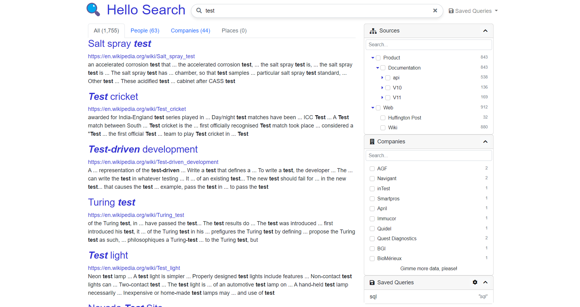
Your app should look like this on a large screen:
Try resizing your screen to see what happens when hitting the different breakpoints we specified at the beginning.
Notice a few things in the code:
- We put the search form inside the
<nav>(of course, you can make a different choice) - We display the results, facets and footer only if there are results (with the
<ng-container *ngIf="searchService.resultsStream | async as results">element) - We wrapped our components inside
.container,.rowand.colelements. These are standard Bootstrap classes (see Grid system). - We used size modifiers, like the
-lg-incol-lg-8. This means that this rule will apply only on large screens. On small screen, the rule reverts to a regular.colelement.
However, our initial specifications are not met for medium and small screens! If you reduce the size of the screen, you notice that the filters are not hidden, they have just been wrapped under the results. Also, we need some buttons in the navbar to toggle the visibility of the facets and the search form...
UI Service
What we want to achieve requires more than CSS rules. We need our Angular code to be aware of the screen size, and be able to add/remove components depending on the size bracket.
Fortunately, the SBA framework includes a service to do just that: The UIService from @sinequa/components/utils.
The service needs to know what are the screen size breakpoints in use. To provide them, open your app.module.ts and add the following (notice they are the same breakpoints we defined in our CSS):
import { SCREEN_SIZE_RULES } from '@sinequa/components/utils';

...
// Screen size breakpoints (must be consistent with Bootstrap custom breakpoints in styles/app.scss)
export const breakpoints = {
    lg: "(min-width: 1000px)",
    sm: "(min-width: 600px) and (max-width: 999px)",
    xs: "(max-width: 599px)",
}

...
    providers: [
        ...
        {provide: SCREEN_SIZE_RULES, useValue: breakpoints}
    ],
Now you can import the service in your search.component.ts:
import { UIService } from '@sinequa/components/utils';

...
    constructor(
        ...
        public ui: UIService
    )
We need to fix our Saved Queries menu, which by default works with different breakpoints. In your search.component.html, add these parameters:
<sq-saved-queries-menu [autoAdjustBreakpoint]="'lg'" [collapseBreakpoint]="'xs'"></sq-saved-queries-menu>
Facet management
On medium and small screens, we want the facet to be hidden by default and to toggle their visibility by clicking a button in the navbar.
Let's add a boolean property in the search.component.ts that will store the visibility state.
import { UIService } from '@sinequa/components/utils';

...
export class SearchComponent {
    ...
    _showFacet: boolean = false;

    ...
    get showFacet(): boolean {
        return this.ui.screenSizeIsGreaterOrEqual('lg') || this._showFacet;
    }
Notice that facets will always be visible on large screens, but hidden (by default) on small screens.
Now, modify the search.component.html:
<!-- Facets -->
<div class="col-lg-4" *ngIf="showFacet">
Your facet should now be hidden on small screens... But you have no way to show them again!
Let's add a button in the navbar to take care of this. We also need to hide the results when the facets are shown:
<!-- Navbar -->
<nav ...>
    ...
        <h1>🔍<span *ngIf="ui.screenSizeIsGreaterOrEqual('lg')"> Hello Search</span></h1>
    ...
    <button class="btn btn-light" (click)="_showFacet = !_showFacet" *ngIf="ui.screenSizeIsLess('lg')">
        <i class="fas fa-filter"></i>
    </button>
    ...
</nav>

    ...
    <!-- Results -->
    <div class="col-lg-8" *ngIf="ui.screenSizeIsGreaterOrEqual('lg') || !_showFacet">
(Notice that we also remove the title on small screens.)
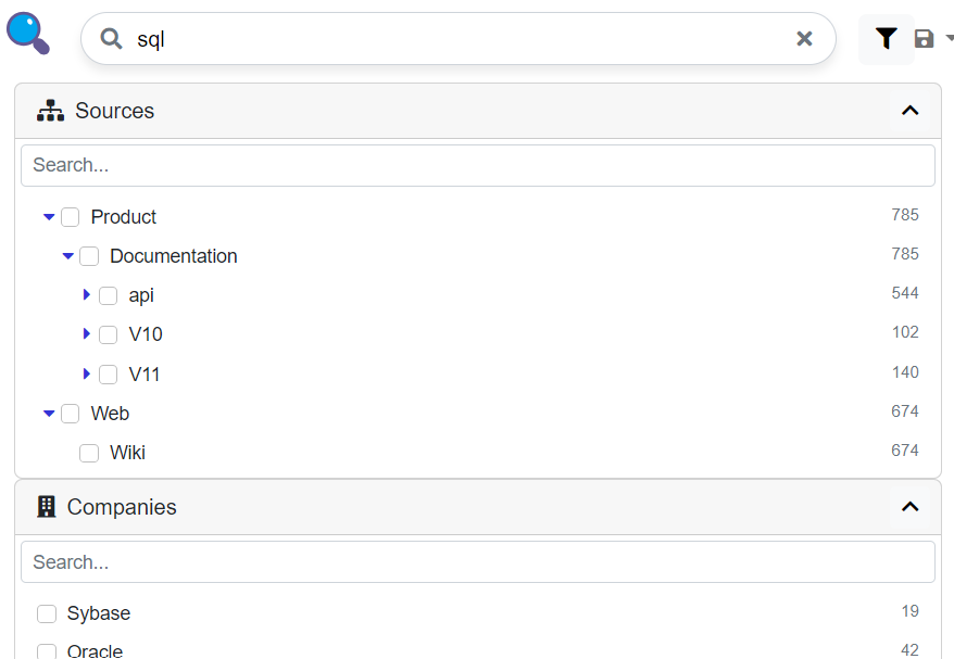
Your app should now look like this on medium and small screens, when you turn on the facet visibility:
Search form management
On the smallest screens, the navbar is very crowded... We almost cannot see anything in the search form...
Let's piggy-back on the facet button feature: We will show the form on medium or large screens OR if the facets are shown:
<!-- Navbar -->
<nav class="navbar col-12 d-flex px-2 px-sm-0">
    <a ... *ngIf="ui.screenSizeIsGreater('xs') || !showFacet">
        ...
    </a>
    <app-search-form class="flex-grow-1 position-relative mx-sm-3" style="min-height: 41px;" *ngIf="ui.screenSizeIsGreater('xs') || showFacet"></app-search-form>
    <button class="btn btn-light ml-auto" ...>
        ...
    </button>
    <ul ... *ngIf="ui.screenSizeIsGreater('xs') || !showFacet">
        ...
    </ul>
</nav>
This is what you should have on small screens:
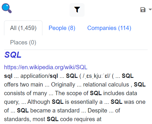
And when toggling the facets:
Of course, we could go much further in this exercise of making the application responsive and good-looking. We also left out the Home route and other details, like menus, autocomplete, etc.
But the main tools for making your application responsive have been illustrated:
- CSS rules (media queries, via Bootstrap classes, or directly in your
app.scss) - Angular logic and
UIServiceto toggle the visibility of elements via state variables.